


To explore gender-based semiotics, I swapped Johnson’s Nursing Pads and Triumph & Disaster’s shaving cream for men. The final results of swapping the signifiers drastically change the intended target audience and create new significance.
The men’s shaving cream takes on a whole new target audience with its now feminine style. It encompasses the common myth that pink is for girls and blue for boys. With the light pink and the swirls strong signifiers for females, it reflects the idea of beauty, femininity and nurturing whilst losing the male audience based on social construction. The males shaving cream has lost its class, and would be considered cheaper and for females could be compared to females brands like Gillette Venus.
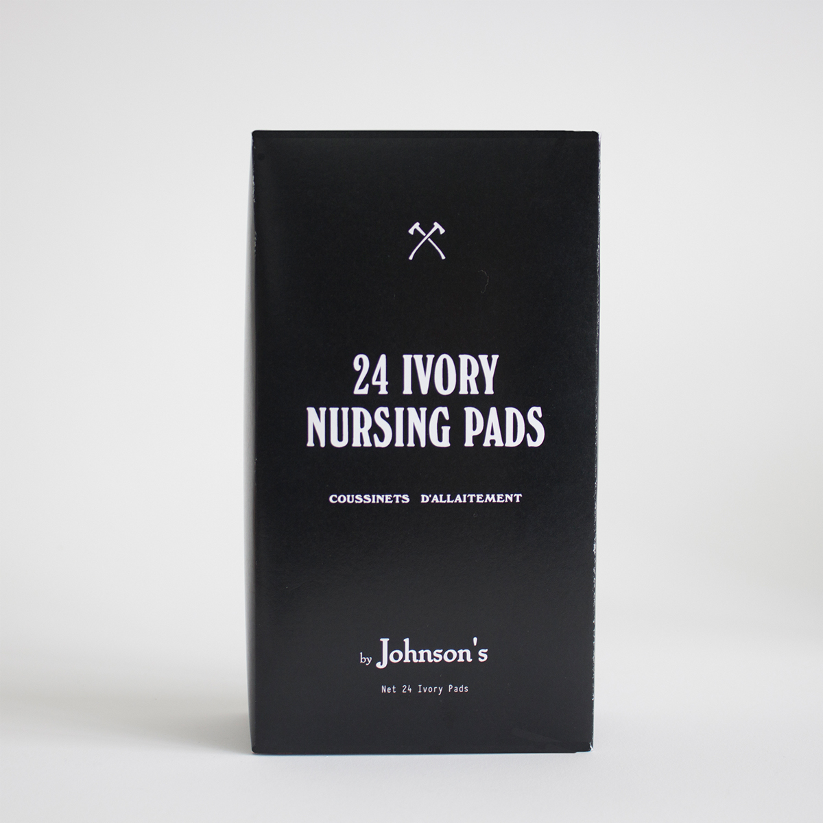
The nursing pads have become minimalistic and simplistic, incorporating a sense of class. However by keeping the signifier of the axes it represents a masculine myth where axes are typically associated with males dominance based on their strength. By incorporating this symbol with the bold typeface it suggests that females have power and strength throughout the breastfeeding period, a symbol that is not usually associated with the nurturing caring stages of motherhood.


