Newspaper photo essays and picture essays
with proposed layout concepts
with proposed layout concepts

This image was taken when the other team members went to the bar and I wanted some free time.
While walking around the property I crossed the main highway to a small town called Barkley East, saw the image and took it for myself. I emailed the image to a colleague who showed it to someone and it appeared in the follow day's paper.
I was very surprise because up to that point the use of such a large image was quite rare. As I was never one of their newspaper photographers or for any of their titles I was quite pleased with the use of the image.
This image has become one of my best selling fine-art canvasses, I have turned this image into a potassium dichromate print as well which was very well received by the local market.
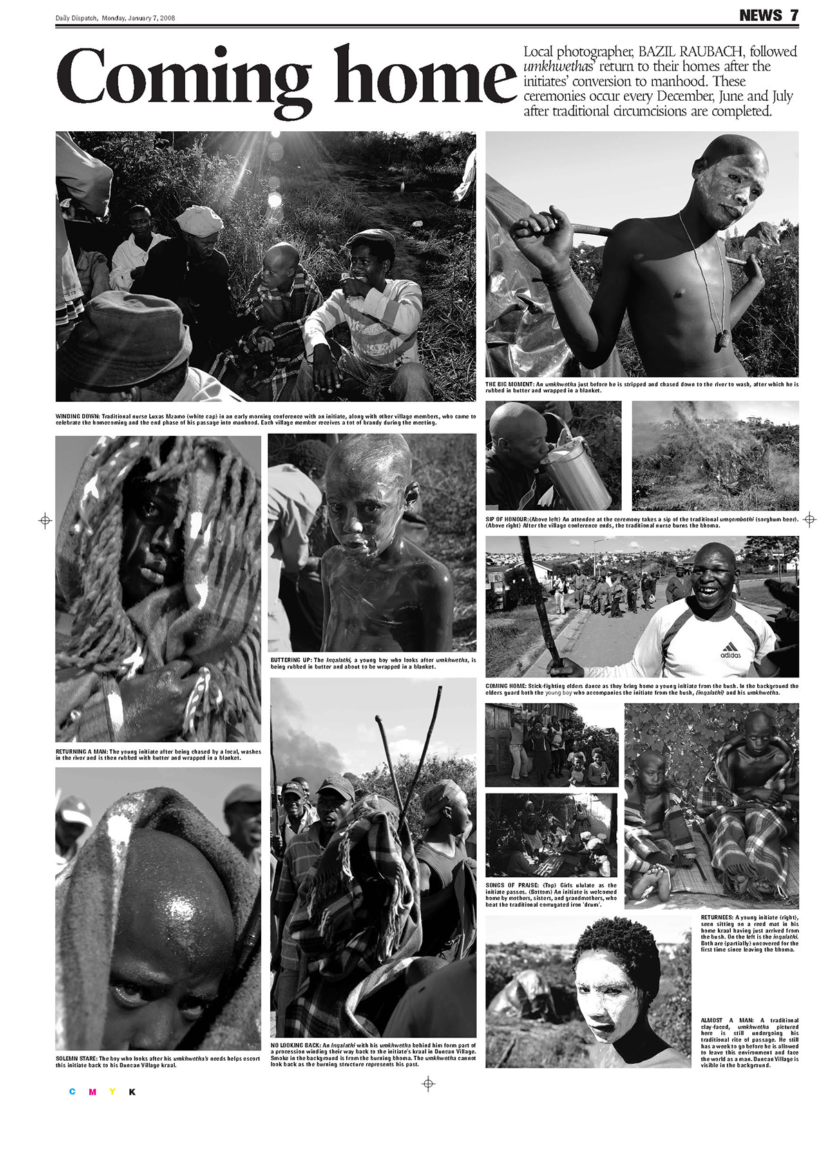
Newspaper spread highlighting a traditional ceremony that plays out twice a year in the province live in.

Like the very first image, on one of my personal explorations in a small city named Queenstown, I found a train graveyard.
"I question the wisdom of ignoring the historical value these trains represent. When I see the piles of tangled metal debris outside scrap metal merchants I can’t help but think that it’s a dirty profit. If we don’t attach some value to our collective past then maybe there will be no co-operative future."
see: http://www.friendsoftherail.com/phpBB2/viewtopic.php?f=109&t=3336

Another on of those image taken on the ECape tour, again while everyone else was taking time off and putting their feet up I did a little exploring.
I saw the church and wanted to get inside and see what looked like a fascination piece of local history. I have been back a number of times.

A picture page of waterpolo pics taken at a local tournament, I did the layout and images.
I will be the first to admit that the design is very 'middle-of-the-road' but that was their style, most of the design was mediocre which was a real pity before it was diluted by a succesion of visually illetrate editors and ego-driven meglomaniacs – the original design style was quite lovely.
A small fortune was spent by the company to generate a simple but effective style guide only to have it completely dismantled by those who should have known better.
I still have a slew of emails from the editor who oversaw the project and the editors who followed. They make fascinating reading...

Front page from the ANC manifesto launch in East London.

One of South African treasures, a group of 'gogos' (grannies who as not much more than teenagers in the 60's formed a group still performing today called the Mahotella Queens
original email from features editor.
original email from features editor.
Gill Moodie GillM@dispatch.co.za
11/23/08 to me
I hear you might have been at the Mahotella queens last night.
11/23/08 to me
I hear you might have been at the Mahotella queens last night.
I’d love a couple of pics to use as a stand-alone for Monday’s paper!
Gill
Gill
Features editor
Daily Dispatch
35 Caxton Street
East London
Daily Dispatch
35 Caxton Street
East London
See; The Mahotella Queens are a South African singing group formed in 1964 (and still together today) comprising Hilda Tloubatla, Nobesuthu Mbadu and Mildred Mangxola. The group is noted for their clear three-part harmonies, Mbaqanga township music and fast-paced mgqashiyo dancing.The Queens were formed by the famed South African talent scout Rupert Bopape, at Gallo Record Company, in 1964, and would go on to have many hits at Gallo's African music division, Mavuthela. Throughout the 1960s, the Queens' line-up usually comprised Hilda Tloubatla, Juliet Mazamisa, Ethel Mngomezulu, Nobesuthu Mbadu and Mildred Mangxola.
They were backed by the Mavuthela house band, the Makhona Tsohle Band (comprising several talented instrumentalists including Marks Mankwane on lead guitar and West Nkosi on saxophone), and fronted by the deep-voiced Simon "Mahlathini" Nkabinde. After 1971, growing competition from rival groups saw the Queens' line-up fluctuate considerably, and after a string of mildly-successful late '70s hits, the original fiveOne of South African treasures, a group of 'gogos' (grannies who as not much more than teenagers in the 60's formed a group still performing today called the Mahotella Queens


My layouts are the ones on the right.
The clumsy and clunky layouts on the left were by someone with no design training but lots of enthusiasm.
'EC pupils go back to chaos', was very poor typography, their heading completely diluted the impact of what they were trying to say.
I changed it to: Back to school anarchy' If you read the story it was clear that it was anarchy.
I further changed the proportions of the image versus the 'Misery' headline. Those round corners and awful coloured blocks were quite tasteless and very dated.
Looking at current South American, Spanish and East European newspapers – it is clear that this is where a lot of new and exciting design is originating, South Africa is sadly not creating a world-leading layout in this segment.
The use of those dated flashes, awful rubber-stamped look and complete lack of understanding of how colour functions on newsprint, is in part what lets the design down on the left.
As a newspaper layout sub-editor, being able to project and organise news is critical to producing a page that functions well, with solid entry points, organised structure and not diluting the masthead would seem to be obvious.
Using a deep red over a deep cyan flash renders the information useless and very difficult to read.
I also found the balance of the elements on the layouts on the left to be particularly poor, by butting the black bar screaming 'Misery' you render your masthead obsolete. Looking at the black misery block I can't see the masthead, it just cancels it out!
I separated the two elements and used the image as a buffer. As the front cover is tabloid-size, folding the front cover was not a real issue to anyone other than the street sellers who fold paper showing the headline to potential buyers.
On the second layout, that horrible red block with black smudge and a couple of papers front page serves absolutely no purpose at all. The main story is 'Ntini calls it a day' Added the tacky rubber-stamp thing just compounds the problem.
Understanding how to present the news is critical to the front cover, having sub-editors that never worked as a journalist, photographers or sub-editors for a period long enough to appreciate and understand the news they are layout means you just have technicians that can drive a mouse and draw blocks.
The proportions of headlines versus the amount of copy is as important as the hierarchy of news. The lead should be bigger than the second lead, which in turn is larger than the third lead.
Understanding the visual centre of the page and not adding too much prominence to inferior stories and making sure that the photography does not dilute the page it appears on or in fact the facing page.
The brief was I understand it was so loose and the person in charge wasn't sure what he wanted and only suggested elements that he didn't like after being presented with a layout. I supplied the alternative layouts to a senior staff member, but everything went pear-shaped before any real decisions were made.
The background was the papers were collectively doing badly, shedding readers and subscribers at an alarming rate, one of the newspaper presses was being de-commissioned and the concept of a joint paper was being punted.
The colourways on the left were to mark each section of the paper with a colour but the truth is the colours were generally awful with little or no understanding of how they would reproduce.
I used the existing press' Pantone printed colour charts to plot the colours of the section with colours that reproduce well on the said press. I also used the actual newspapers master grid to organise the shapes and forms to ensure easy production workflows which further maximises the photographer's (not my pics).


The above two layouts were at the direct request of the then Features editor, and quite possibly one of the best edittors I have ever worked with, Gill Moodie. Going through her email's to me suggested at the time they were in a bottleneck and on a very tight deadline, not being happy with what they had at the time.
I was supplied a number of concepts, this having the strongest masthead and still true to the newspaper's current style philosphy.
As there was little or no copy other than headlines and basic entry points to the front page, a tradition of poor use good images on the front page on the companies tabloids I chose images that had both news value and drama for the front concepts..

School life, a short lived publication and tanked by the powers to be. That was a real pity because in a small city such as East London and it's surround, there is very little effective school sport coverage.
This was an alternative layout to the existing layout, something brighter and more effective was called for.
Part of it's demise was based on almost zero advertising which in hind sight suggested a particularly poor business model was used with little or no 'business 'accum' attach to the success of the project. The editor who followed canned this project almost immediately, which although a solid business decision, it effectively ended the life of a really promising publication that huge support from the local schools.

I used this image from my files, for no other reason other than it was dynamic, effective and not a traditionally used image.
Schoolboy rugby and to be fair most school sports lends itself to being used creatively and should be fun.
The idea that the only images that should be used ares those in perfect focus and sterile or academically acceptable misses the opportunity for a front cover that fires the imagination.
I have often argued that editors that are visually illiterate should not be the individual making photographic decisions. I mean that is like taking a liberian and making them editor, they can shuffle paper but they have never been at the coalface. That's also as dangerous as taking a newspaper comp from the cold type department and making them a sub-editor, they will do exactly as they are told but they never will understand what it is they NEED to do because quite frankly, they can only follow orders and no matter how effecient and capable they are at using the software on hand.
Newspaper groups have downsized and crippled their effectiveness for the sake of profit. They have also rendered themselves obsolete. Today, although I have a library of books discussing the beauty of newspaper design, the theory of design and the importance of the grid, I log-on a read the news online because out local newspaper has monday's news on Wednesday and wednesday news on Saturday.


I used a large number of my own adverts, photographs and graphics
in the mock-ups. I also used some great graphics from stuff sent to
me by a couple of layouts guys in the states.
in the mock-ups. I also used some great graphics from stuff sent to
me by a couple of layouts guys in the states.


