Design Objective: Rebrand Texas A&M University's New Student Conference to better fit within the modern brand aesthetic. Depart completely from the old mark and create a new identity that will be supported primarily by the Texas A&M brand at large.
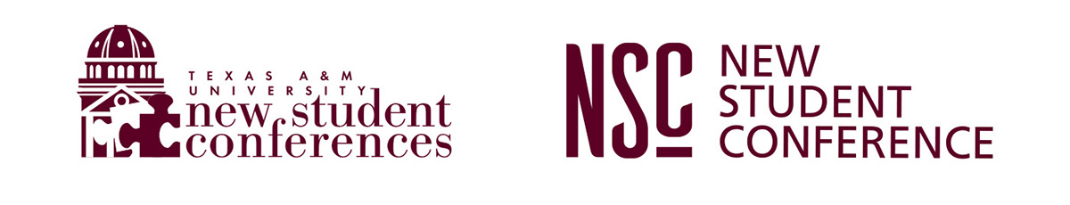
The old (left) and the new (right)
Process: The previous NSC logo had some problems. The dome and puzzle piece illustration made the logo overly complex and severely limited the scalability of the mark. The typography was awkwardly kerned, poorly placed, and much too small to be legible when the mark was scaled down.
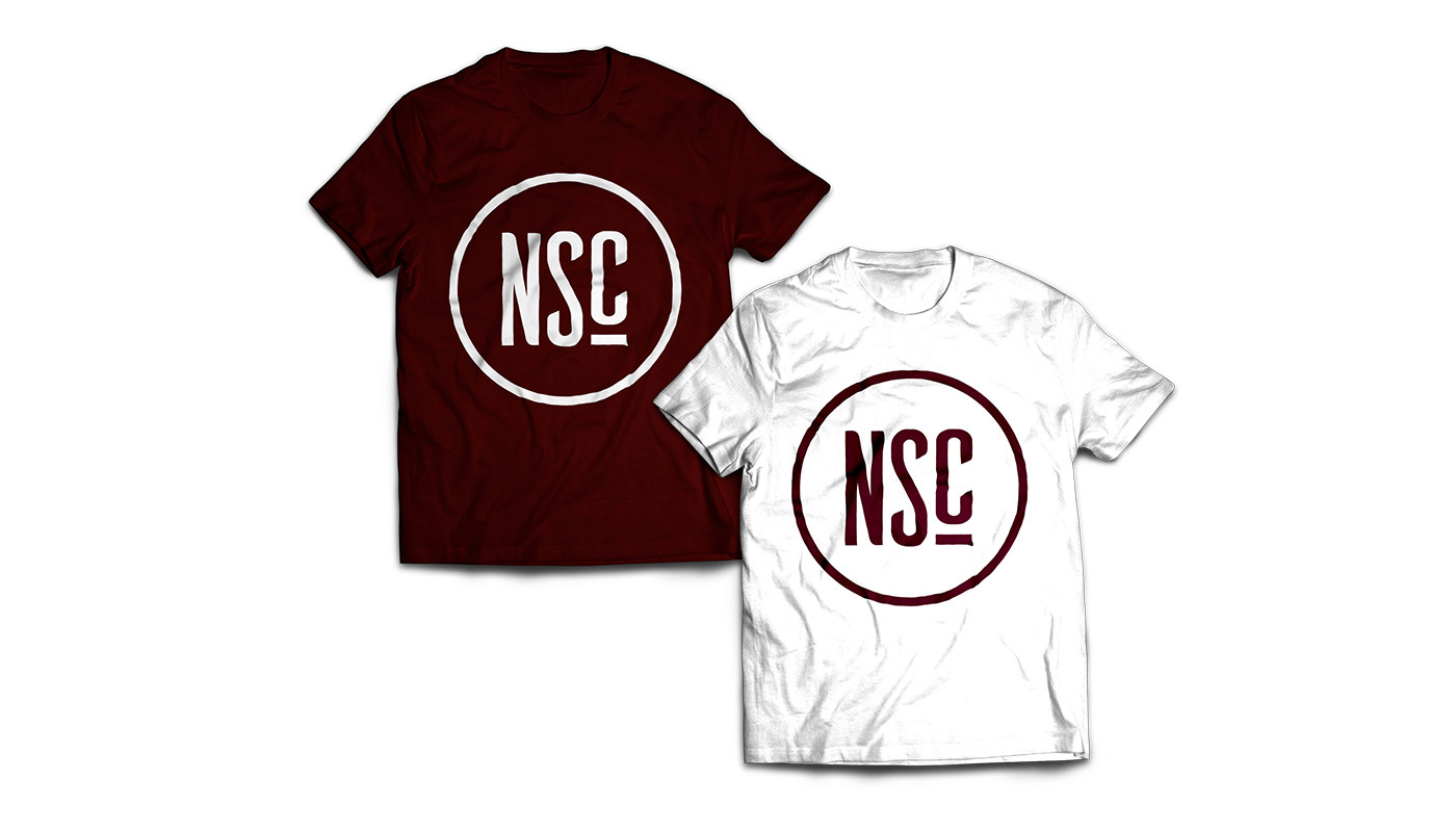
In contrast, the new NSC logo is a minimal, non-illustrative mark. The words 'New Student Conference' were shortened to NSC – an initialism widely used in association with the conferences – and the wordmark was brought to equal prominence as the logo. A circular mark was also created as a more evenly scalable alternative to be used on secondary communications.