Corporate Identity
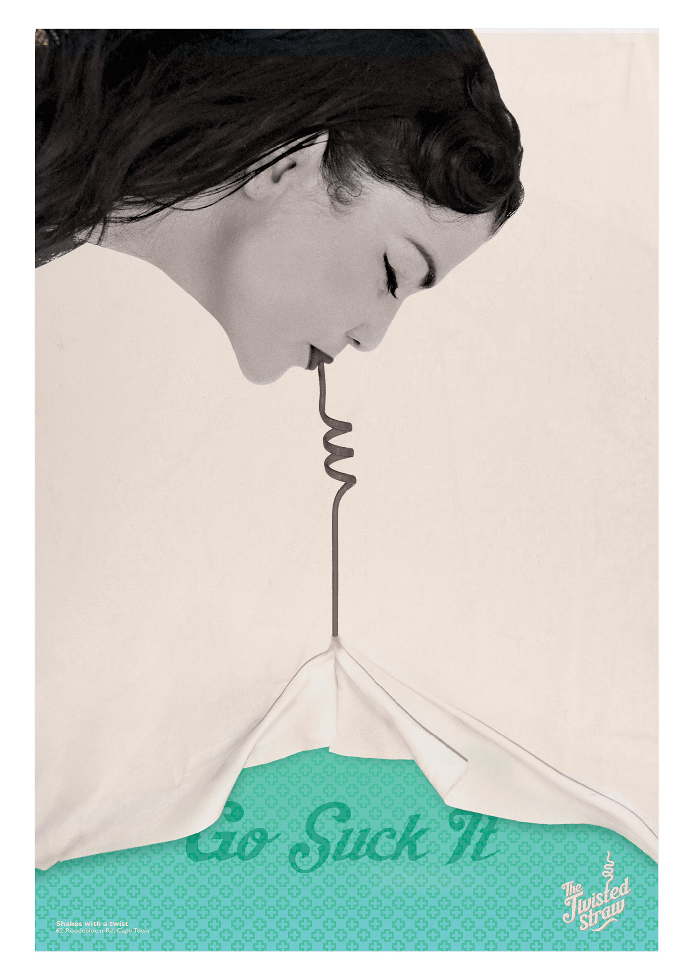
The brief was to conceptualize, redesign and rebrand the identity of a local shop. I discovered that my local spazza shop used to be a
soda fountain in the 1950’s. This inspired The Twisted Straw. I reimagined the store as a retro milkshake bar, but now with an edge,
serving shakes with a boozy twist.

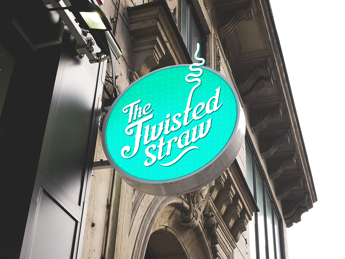
The logo is designed with a classic feel; the base font used is Aisha script, which has been altered to create the logo.
It has a 50’s style but the little spikes on the font give it a cheeky feel so you know its not any old diner.


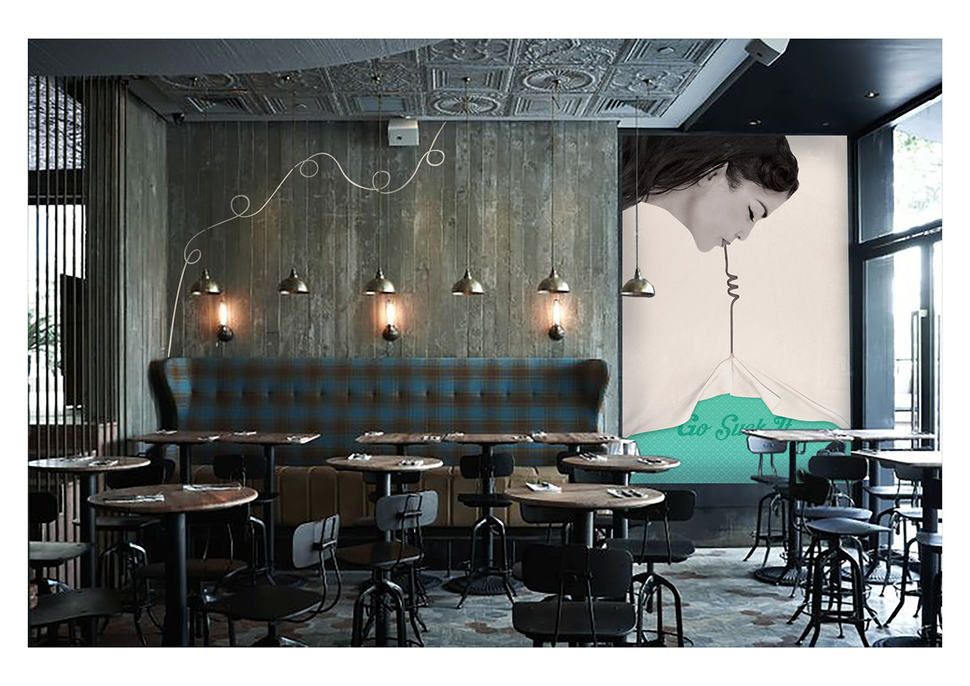
The brand CI, it includes colour palette, fonts, logos and design elements. The Twisted Straw is an edgy brand and fun should be had when designing,

‘Go suck it’ is the brands tagline and is to be used on promotional items, uniforms and design relating to the brand.