Redesign of the game development society's logo and creation of a website.
As we are quite small, I thought that redesigning the logo and setting up a webpage would help us attract more people. Especially since the old design was not exactly eye-catching:

I knew I wanted to use slanted Letter Gothic Std, with the characters spaced out because I enjoy the look of it. I started out by using a gamepad icon I found on the noun project as a placeholder (flaticon is also a great place for that), and went on Flat UI Colors to try out some colour options. It was a hard task, as sometimes the colours would not clash but something still seemed off.
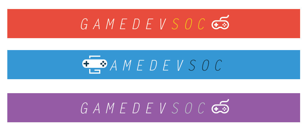
I settled on the blue version, as the colours seemed to have the most coherence and it looked not too childish but not too strict either. I added the bottom text to add more information about the society; it uses the medium variant of Letter Gothic Std. I believe it adds equilibrium to the whole design, since before its addition the stylised 'G' attracted the attention of the viewer only to the left (see the topmost image).

Regarding the 'G': I wanted to keep a gamepad in the design, but didn't want it to be separate from the text. I realised that the 'G' could be transformed to look like a cable. The squareness of the letter adds a bit of a retro feel to the design, too. The dark blue used for the buttons is the same as the one used for 'soc': the fact that it is used on the far left and right of the design, rather than in just one area, makes it look like a more integral part of the logo.
(Also, while writing this I finally found out what was causing the tiny alignment problem you can see on the gamepad's D-pad: align to pixel grid should be disabled when creating the document, or alternatively, turned off in the transform panel. I'll have a lot of fun changing it everywhere.)

The flyers had a few constraints: they had to be square so that I could print more of them on an A4 sheet, and I had to have a white background for easier printing. This required a change in the logo's colours. I really like how the center square turned out: it uses the three colours in a way that is clear and concise.

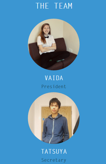
Finally, I made a simple webpage that includes event information and a description of the society. I wanted to keep it simple. It makes greater use of the dark blue shade; again, variations on Letter Gothic are used. The website is built in Bootstrap, which handles scaling on mobile devices wonderfully.