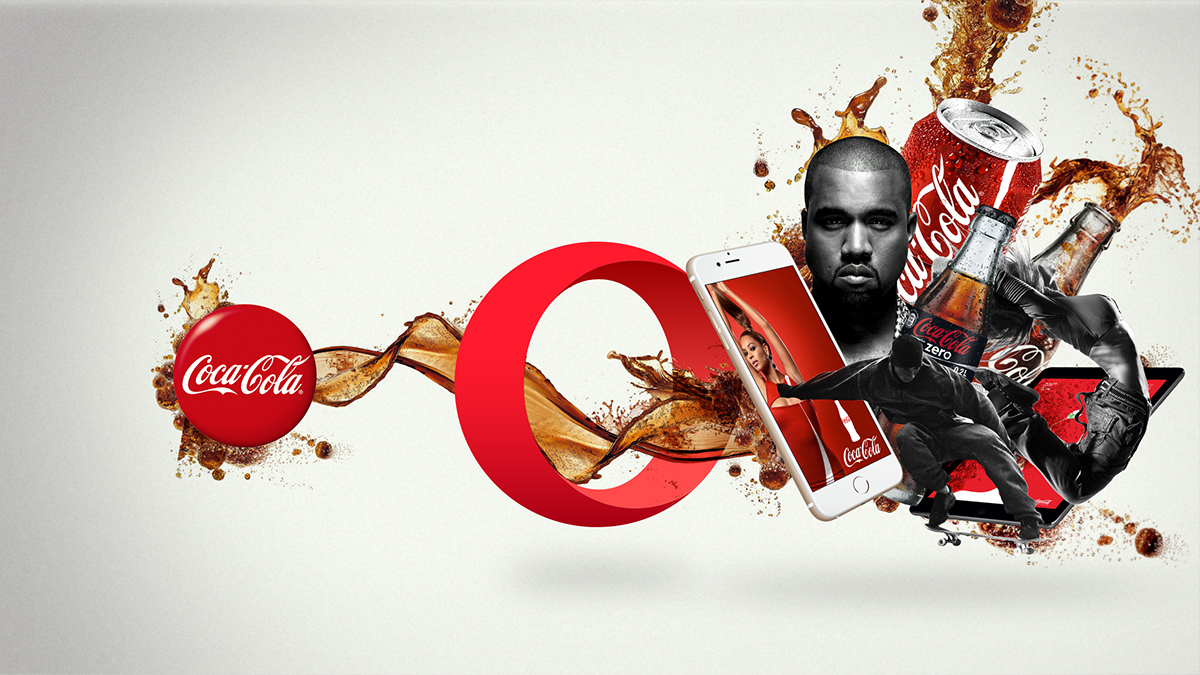
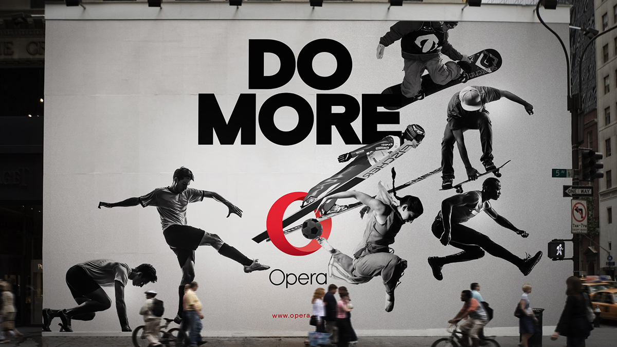
Opera is one of the top 5 browsers in the world. Their USP is a unique technology that compress data with no quality loss, giving users more content for less data usage. Opera have focused their strategy on this advantage and landed the strapline Do More. Do More reflects Opera´s goal of making more people able to experience what they want, when they want it. Our goal was to visualise this strategy and create an identity that’s contemporary, ideal for the digital app world, and recognisable as the red Opera O.
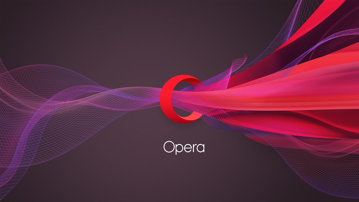
Opera´s logo is no longer a typographic O. The new logo represents a portal through which data is compressed and released on the other side as more content for Opera´s users. This portal metaphor on compression is used abstractly to represent the company´s values and advantages in illustrations, making the logo an active tool in Opera´s communication.