Salto Treningssenter is a gym in Hokksund – a small town in Buskerud, Norway. They had plans to rebuild and renovate during 2016/17, and decided therefore to renew their strategy and visual identity. They wanted a new business and communication strategy together with a comprehensive visual identity that communicates the concept better outwards to the citizents of Øvre Eiker and gathers the people internally at Salto.
This is a bachelor assignment at the University College of Southeast Norway. This is a collaboration between Herman Andreassen, Ingrid Hagelund, Ingrid Vestby Fredriksen and myself. We began this adventure early february 2016 with creative and strategic workshops with four representatives from Salto Treningssenter, and went on to create GIGA maps, brainstorm and have an online survey as well as conducting an interview with the habitants of Hokksund. The first investigation was ment to give us a sense of how people assosiated the current visual identity, while the interviews were ment to inform the designgroup on how much knowledge the people in the local community had of the brand. With good help from our supervisors we managed to create a new concept for Salto Treningssenter: Training no matter shape (Trening uansett form)
Core Message
"Everyone is welcome at Salto Treningssenter regardless of physical shape, level and ambition. Through a wide offer and professional guidance will each find a workout method customized them"
Design
Logo
The logo is dynamic and full of movement. It has a soft expression to emphasize that Salto Treningssenter is an inclusive gym. The logo has a distinct look and is easy to remember.

Color Palette

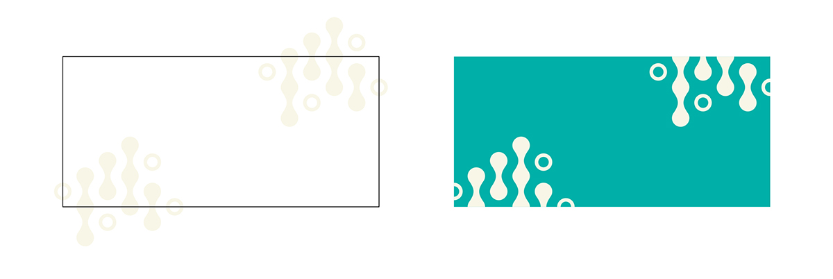
Graphic Element
The graphic element is build up of the letter "o" from the logo, and Fibonaccis aspect ratio. We can connect the visual identity with training and the concept "no matter shape" through associations with pulse, movement, weights and shapes.

Interior


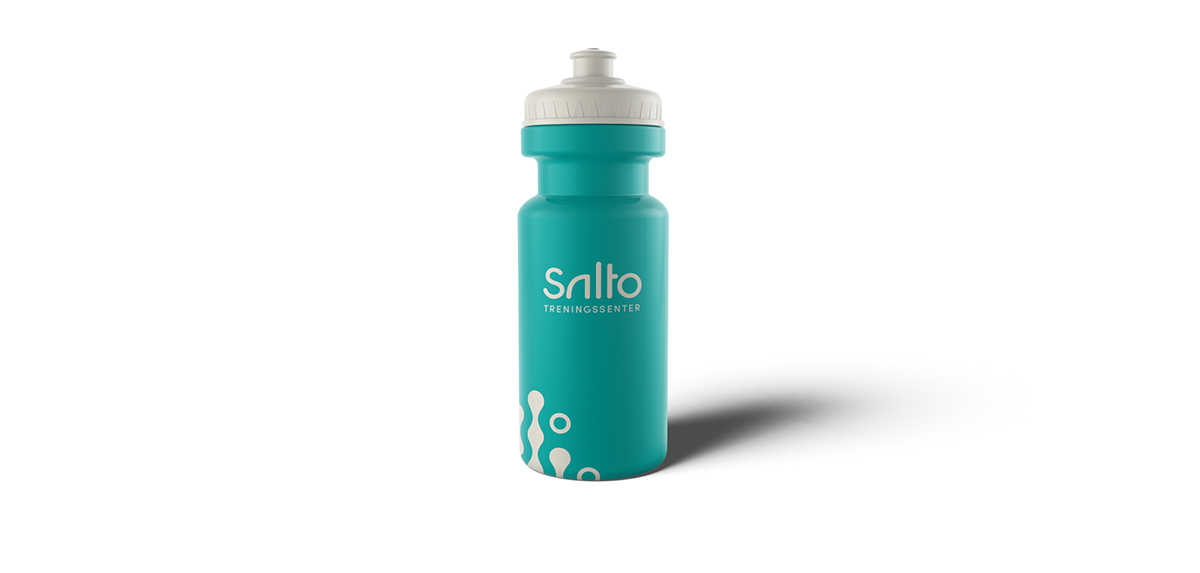
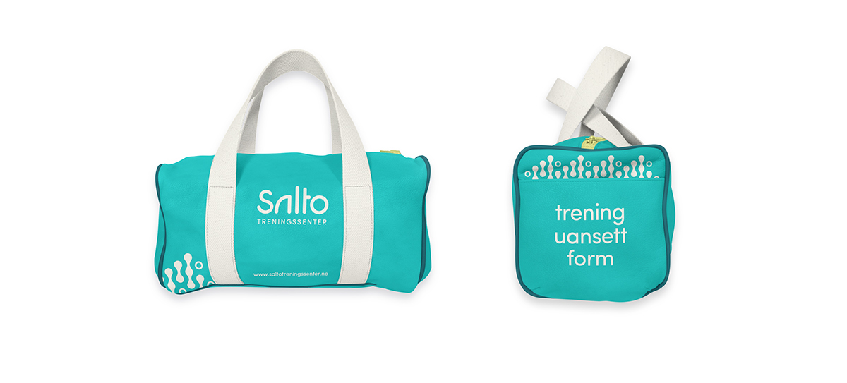
Merchendise


Campaign
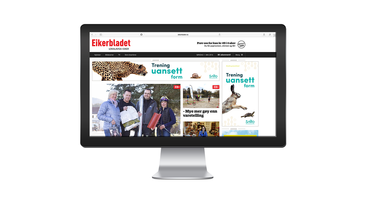
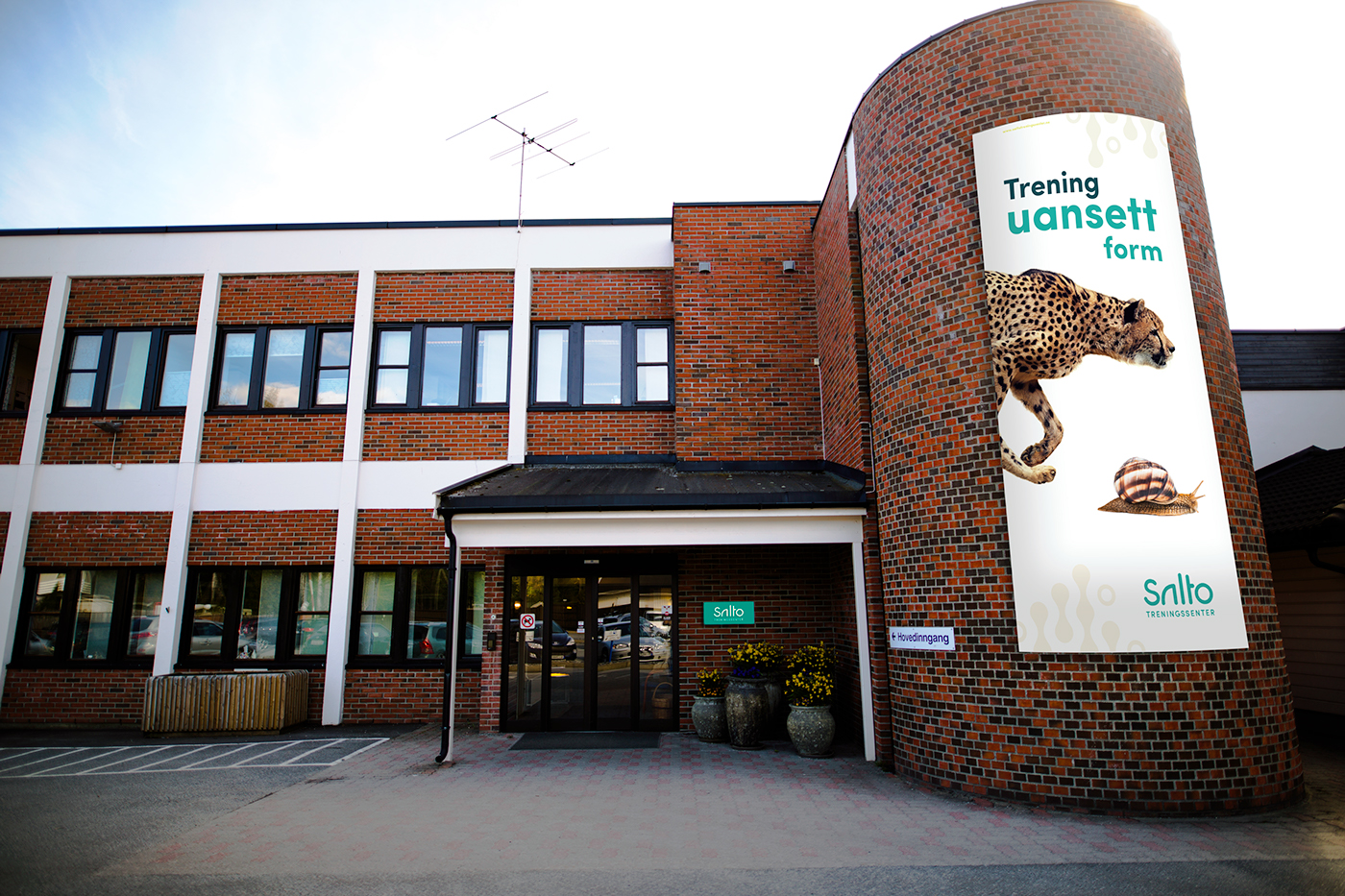
When we look at general advertising for gyms in Norway we see the same everytime - perfect, happy people. In the new strategy we have decided to avoid focus on body and size. Instead we created campaigns that were slightly different. We play on contrast in human traits - but not by showing people - but by showing animals. The idea is that everyone is welcome at Salto no matter shape. No matter if you feel like a cheetah or recognize yourself more in the snail - Salto Treningssenter has got an offer for you.


Communication
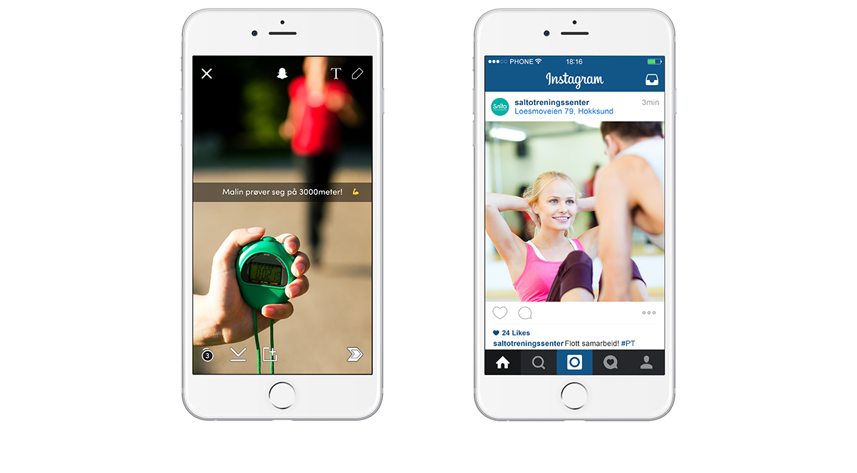
The designteam decided, because of the large audience, to devide the group into several communication targets. We will try to reach the younger ones with online ads and social media, and the elderly through direct marketing and use of postcards and newspapers.

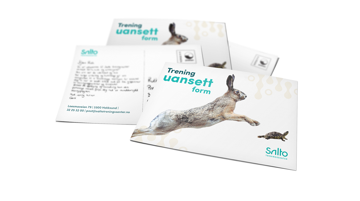
Postalia


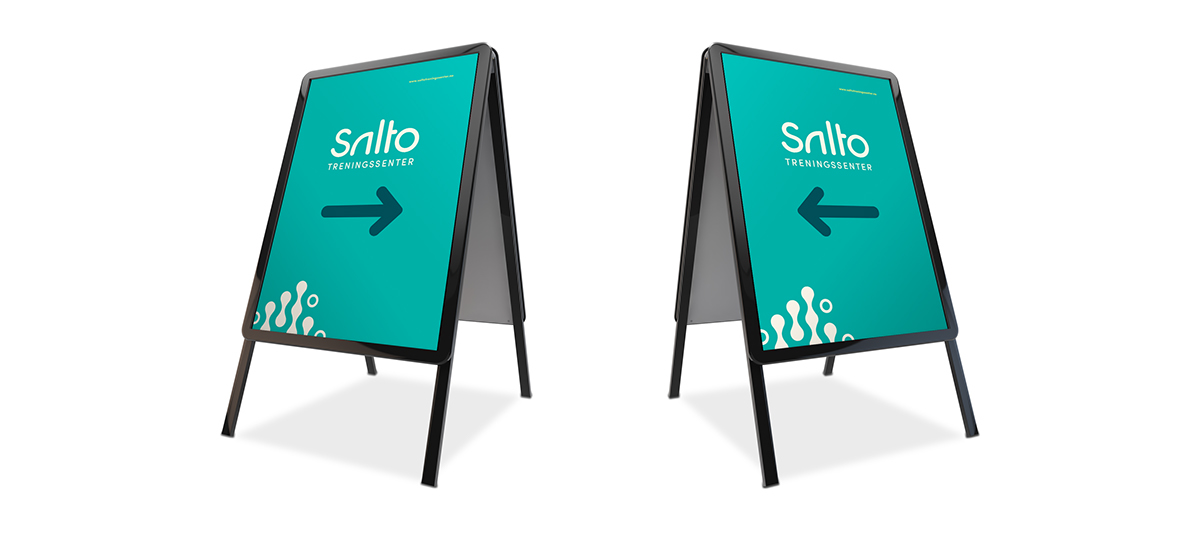
Sign
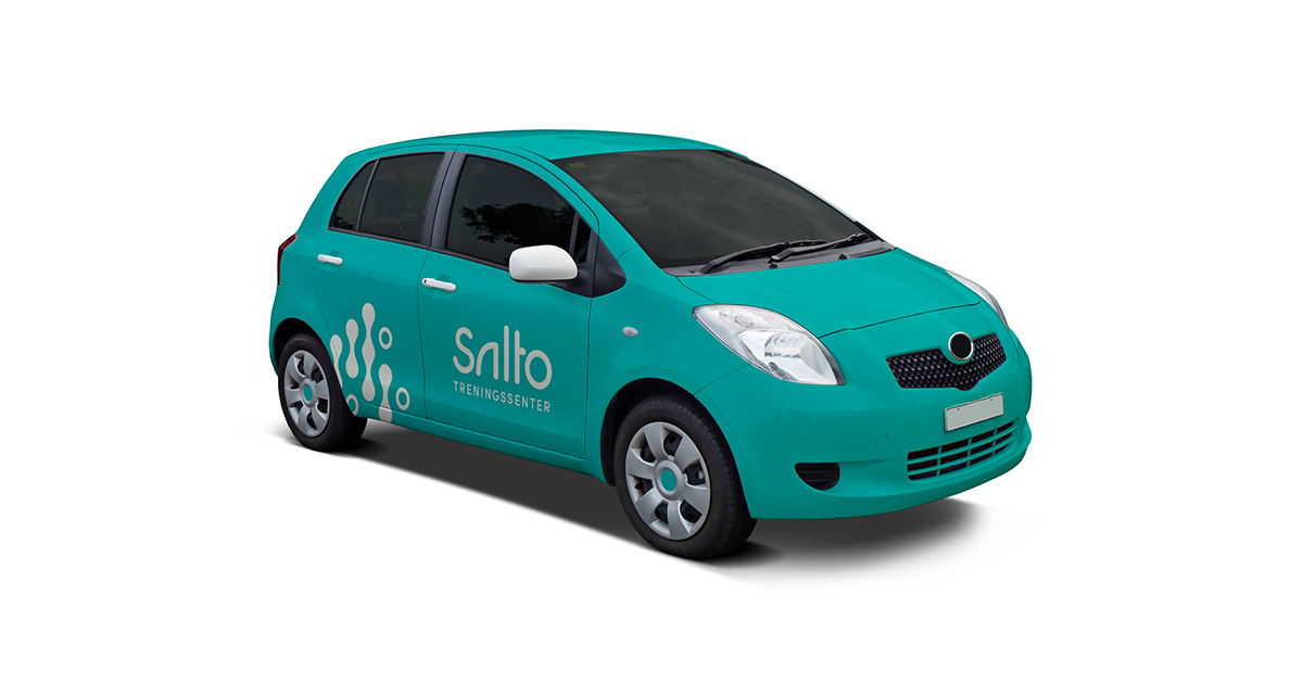
Car
It is essential for Salto Treningssenter to be visible in the local community. Therfore we created a suggestion for a car.