OLIO CITY
Visibility of system status
The system should always keep users informed about what is going on, through appropriate feedback within a reasonable time.
The process for date filtering lacks visibility of system status. In this example, the user chooses the 17th and the results are then filtered. Upon closing the date dialogue there's no indication we're filtering for the 17th. Furthermore, on swipe up, the 'Select Date' dialogue is pushed away, compounding the lack of appropriate feedback for the user.
Filtering is not the only aspect where basic usability principles are not met by the system. Appropriate feedback within a reasonable time can also describe cognitive load. The level of detail offered in both content, menu items and filtering impacts the cognitive debt. Reordering information architecture, introducing progressive disclosure for filtering and a pass over the UI could help usability here.

Match between system and the real world
The system should speak the users' language, with words, phrases and concepts familiar to the user, rather than system-oriented terms. Follow real-world conventions, making information appear in a natural and logical order.
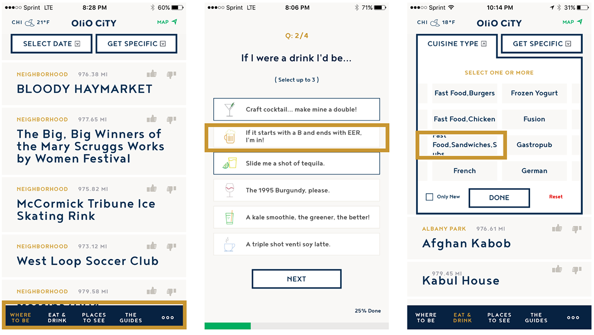
Olio City removes unfamiliar concepts and translates them into conventions the user will be familiar with. However, this often is taken to the extreme creating a very long learning process. This is evident in the on boarding process that over does playful terminology making it a pain to get through. Simple iconography here would suffice. Additionally, the colloquialness of language used spills into the main navigation. I would offer iconography here to save real estate and shallow the need to read throughout the app, or at least use the 'DO - EAT - SEE' convention used on many inner screens.
User control and freedom
Users often choose system functions by mistake and will need a clearly marked "emergency exit" to leave the unwanted state without having to go through an extended dialogue. Support undo and redo.
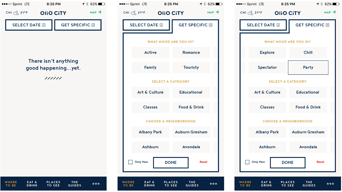
In the following example, there are no results showing. The user might assume its due to the 'Get Specific' filtering, however, there is no indication of this on the filter dropdown. Even when the filter is open, there is no indication the filter is active. On swipe left, it becomes clear that 'Party' filter is selected. There is no visual indication it's actioned unless the filter is within the scrollable filter container. Being able to understand and exit from an unwanted action is vital to usability of the app. The way filtering is used on this app MUST be addressed or it will be abandoned by the user.
Consistency and standards
Users should not have to wonder whether different words, situations, or actions mean the same thing. Follow platform conventions.
This usability statement can encompass things like accessibility. In the first screen, the 'Map' and 'Reset' text is close to illegible (Apple recommended 13pt). The color consistency is also thrown out here, 'Reset' is the same color as 'Delete' used in other panels within the app and indicate a problem or error. The subsequent screens show inconsistency in naming conventions, for example 'My Favs' is referred to a 'My Bookmarks' when drilled into.

Error prevention
Even better than good error messages is a careful design which prevents a problem from occurring in the first place. Either eliminate error-prone conditions or check for them and present users with a confirmation option before they commit to the action.
Paying close attention to null results with informative copy is vital to keep users engaged and see the benefit of using this tool. It's a great way to educate users. In this first screen we should see info about bookmarking, how it's done and why it's helpful. One of the app paint points is the filter menu and it's a cause for error. Hitting reset will only clear the third line of filters. As noted earlier, the lack of indication the filter is active outside of this menu it the biggest issue.

Recognition rather than recall
Minimize the user's memory load by making objects, actions, and options visible. The user should not have to remember information from one part of the dialogue to another. Instructions for use of the system should be visible or easily retrievable whenever appropriate.
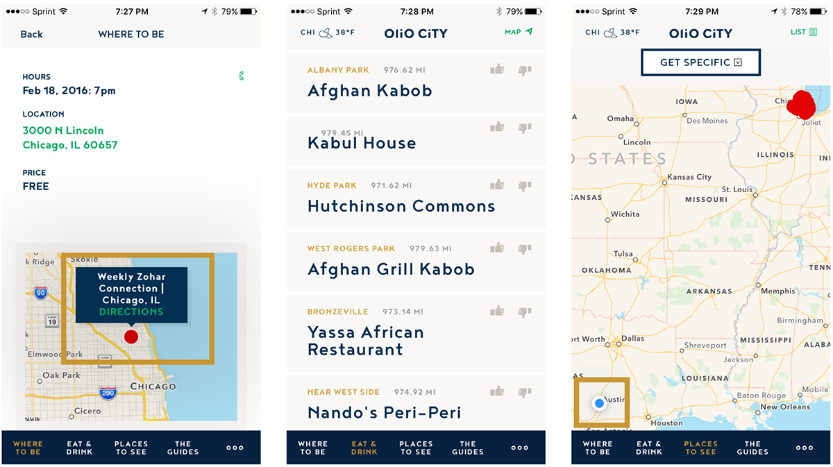
On the detail screen, the user has to remember to tap onto a red location dot to bring up a dialogue which contains the button for directions. This should be pulled out and used as a button. In the second screen we have a filter for 'Bar' however, there is no indication of this, again the user must remember they have a filter on. This is even still the case if they move to 'Places to See' and go back to 'Eat and Drink'. Finally, the map will zoom out to show your location and the results every time you drill into view a venue. If I'm researching a city from another location, this mean I have to remember where I was and what I was just viewing.
Aesthetic and minimalist design
Dialogues should not contain information which is irrelevant or rarely needed. Every extra unit of information in a dialogue competes with the relevant units of information and diminishes their relative visibility.
There is a sense of over kill with language used and UI components. Font sizes are erratic negatively on usability. Compared next to two competitor apps, we can see how much 'room' there is between navigation mainly based around iconography to reduce the cognitive debt and shift focus on the core content. Their font is consistently sized and very well spaced to reduce clutter. Moving toward icon based navigation and tidying up font sizes and spacing would help a great deal bring this app up to 'par'.

Help and Documentation
Even though it is better if the system can be used without documentation, it may be necessary to provide help and documentation. Any such information should be easy to search, focused on the user's task, list concrete steps to be carried out, and not be too large.
Use null results to educate on searching. Invite the user to personalize after their first use, rather than part of the on-boarding and use that time to help the user understand your app. The landing 'Filter' advise is not specific and does not point at the filters themselves. It's important for you to educate the user on the filtering within the site. Here are some very informative on-boarding screens from Google which helps to educate and personalize.


