Providing clarity, direction and engagement.
Client: Caribou
Location: Auckland, New Zealand
Industry: Consulting

Brand Metaphor
The caribou have excellent vision, can see clearly in every direction and are exceptional navigators. Their keen eyesight enables the herd to move with one purpose towards their intended destination.
An excellent metaphor for the clear vision I will bring to help an organisation identify and reach its strategic goals.
Solution
Our approach was to create a concept design which allows us to have the flexibility to adapt to multiple possibilities.
We work over the premise that we need to achieve a professional brand with a solid background but at the same time needs to be fun, fresh, creative, energetic, etc. Our proposal was to unify all these concepts/values to create a strong, brave and unique visual identity. Our strategy for creating a clear difference between Caribou and its competitors was to work with a contemporary visual proposal. We developed a confident brand through decisions in morphologies, typographies, tagline, colours and with a flexible visual identity.
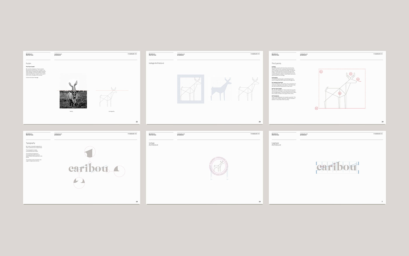
The ‘horns hands’
We used the metaphor of ‘horns hands’ because the main service of ‘Caribou’ is to help clients to achieve their goals through a clever strategy. The hands instead of horns means that ‘Caribou’ contains and support their clients throughout the process.
A clear and clever message.
01 Body / We decide to work with the whole animal for two reasons: the first one is because the brand doesn’t omit anything, it’s honest & committed. The second reason is that if we work only with the head of the Caribou, we will be communicating that the animal is dead. We want to reflect in every detail that we are alive and with lots of energy.
02 Standing / The Caribou standing give us the feeling that the brand is supported by an experienced background.
03 Looking at the front / This is not random. The ‘Caribou’ has a perspective in the future and growth of the clients. This means that we have a positive attitude with a clear vision.
04 The ‘horns hands’ / We used the metaphor of ‘horns hands’ because the main service of ‘Caribou’ is to help clients to achieve their strategic goals. The hands insted of horns means that ‘Caribou’ contains and support their clients.
05 The balance / Inside of the isologo we can visualize a pyramid. This means that ‘Caribou’ helps their clients to achieve a balance in every field of their business.
Colour values
We decide to work with a broad colour palette. This brings to the brand a fresh, creative and dynamic soul.
From the colour psychology, gray is the color of commitment. Green is the colour of balance and growth. Blue is the colour of trust and peace. Pinkis unconditional love and nurturing. Gold is the colourof success, achievement and triumph.
Our Work
Brand Design
Concept Development
Illustration
Print Design
Visual Identity
Web Design
Concept Development
Illustration
Print Design
Visual Identity
Web Design


