UNIVERSAL DECLARATION OF HUMAN RIGHTS (PHOTO CAMPAIGN)

The Universal Declaration of Human Rights was founded by the UN in 1948 as a result of the Second World War. It is an international document that states basic rights and fundamental freedoms to which all human beings are entitled.
PROBLEMS
A few of the problems of the current presentation of the document is that it looks outdated. The way it's laid out is done in a manner that doesn't seem interesting (or easy!) to read. Because of the outdated aspect of it, people don't automatically find it relevant, which they should considering that the rights are still recognized today. The UDHR has yet to be made into an easy to read, striking, memorable, and significant. There are many things happening in the world today that might not be so overlooked would these articles be more well known, everyone should be aware of their rights.
GOALS
With this in consideration, my goals for representing the UDHR are:
◦ Portray the UDHR in a way that is eye catching, something that you want to read
◦ Keep a positive tone to it, rather than negative
◦ Ignite curiosity in the viewer, make them want to find out more
◦ Portray the UDHR in a way that is eye catching, something that you want to read
◦ Keep a positive tone to it, rather than negative
◦ Ignite curiosity in the viewer, make them want to find out more
RESEARCH & PROCESS
Center for Civil & Human Rights (Atlanta, GA)
I had the opportunity to visit the Center for Civil & Human Rights in Atlanta and the organization of the center was a big part of my inspiration for my approach to the project. Some of the things I noticed and liked about the design of the exhibition and the information in the displays:
◦ The engagement and interactivity with the exhibitions makes it a personal experience for each visitor.
◦ The white room, displaying positivity, to show that the civil rights movement was a success.
◦ The treatment throughout doesn’t feel like it’s manipulating the viewer but rather letting them figure out their feelings and opinions on their own.
◦ The white room, displaying positivity, to show that the civil rights movement was a success.
◦ The treatment throughout doesn’t feel like it’s manipulating the viewer but rather letting them figure out their feelings and opinions on their own.

Basquiat
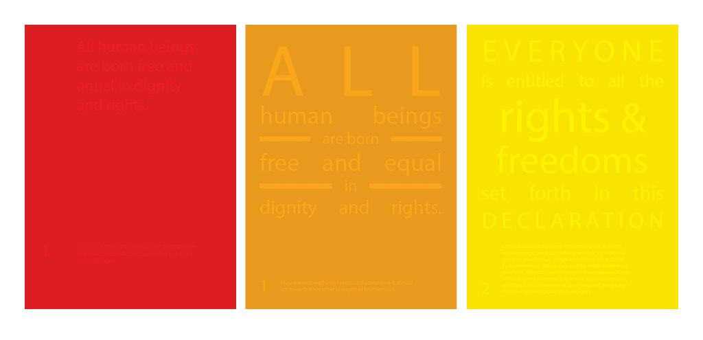
Basquiat once described his work by saying "I cross out words so you will see them more: the fact that they are obscured makes you want to read them". I thought this would be an interesting approach to explore. I've noticed in general that people value more the things they have to work for rather than those things that are given to them. Especially today where our brain processes less words than we did in the past, character limits of the social media age, and the "tldr" attitude is so prominenet, being drawn to read something becomes special.

Above the Influence & Adult Swim
The Above the Influence campaign (cir. 2008) and the Adult Swim bumps are two which I found to be successful apporaches at information (both serious and not-serious). Above the Influence would have odd music with weird drawings to promote thier anti-drug campaign. Whether it was a successful campaign or not, I noticed every time the commercials were aired everyone would stop what they were doing and pay attention because it was something odd and different, and I know many people that looked up the organization just because the commercial had left them wondering. Likewise, the first time I watched Adult Swim the things I loved the most were the text bumps with random information. Even if it was simply a black screen with white text, I was always drawn to read what was on the screen. It didn't need an introduction or an explanation but people still read them, and if there would be a link or a tag, most people I know were drawn to look it up.
The Above the Influence campaign (cir. 2008) and the Adult Swim bumps are two which I found to be successful apporaches at information (both serious and not-serious). Above the Influence would have odd music with weird drawings to promote thier anti-drug campaign. Whether it was a successful campaign or not, I noticed every time the commercials were aired everyone would stop what they were doing and pay attention because it was something odd and different, and I know many people that looked up the organization just because the commercial had left them wondering. Likewise, the first time I watched Adult Swim the things I loved the most were the text bumps with random information. Even if it was simply a black screen with white text, I was always drawn to read what was on the screen. It didn't need an introduction or an explanation but people still read them, and if there would be a link or a tag, most people I know were drawn to look it up.
Curiosity is what is being sparked through both the Above the Influence and Adult Swim's way of treating their information. No introductions or explanations show confidence in their opinion or information they're wanting to broadcast. I think it's approapriate for the UDHR to find a similar approach because those rights are universal and should not need to be explained.

Color Use in Serious Topics
For a while now I've been following Jessica Walsh's letstalkaboutmentalhealth / 12 kinds of kindness project. I find that the illustrations and quirky color use are less common for a serious topic, like mental health, which can then make it an apprachable subject to discuss. Likewise, I think that a similar treatment to a topic like civil and human rights can enhance a person's idea of finding out more and being advocates for keeping to the articles in the UDHR.

Color as Order

PROGRESS

Jenny Holtzer
After my first apprach I discovered Jenny Holtzer's work after consulting with my professor. The approach is similar, but Holtzers makes more sense in the terms of adding a serious approach to not so serious writing. It wasn't as successful in my first approach because the UDHR is serious already. As a series it also became overwhelming and not as interesting to read as I had hoped.

After looking at more of her work, I noticed her usage of typography in regular objects. Like the adult swim and Above the Influence commercials, Holtzers words needed no introduction or explanation, and engaged the viewer to read them and maybe remember them when they were using those objects in the future.

My last bit of research was looking at photography trends with objects and text as inspiration and for technical approach. In addition, I recently attended a lecture by Stefan Sagmeister which was about not overlooking beauty when designing. He mentioned the difference it makes for people to be in beautifully designed places as opposed to the avergae ones, so I think it's important to consider aesthetics for viewing.

FINALS
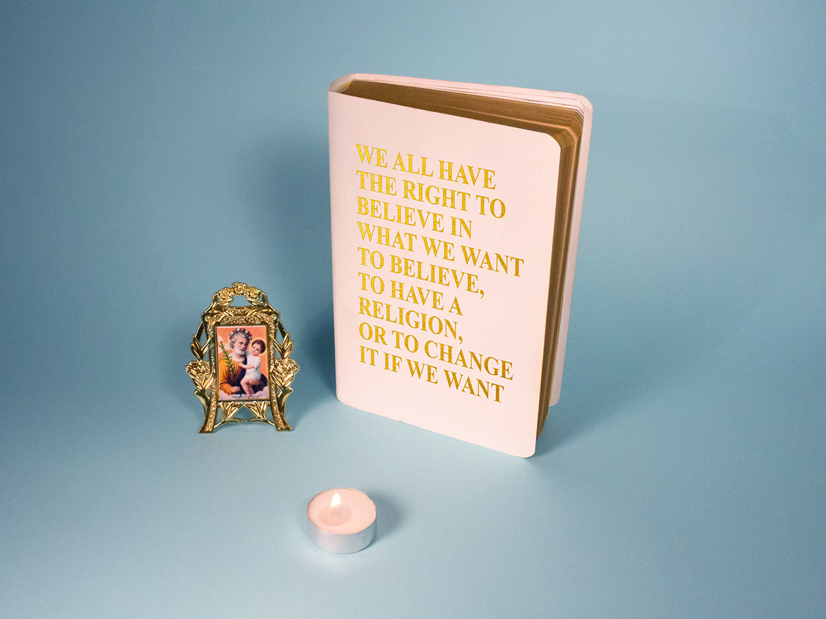
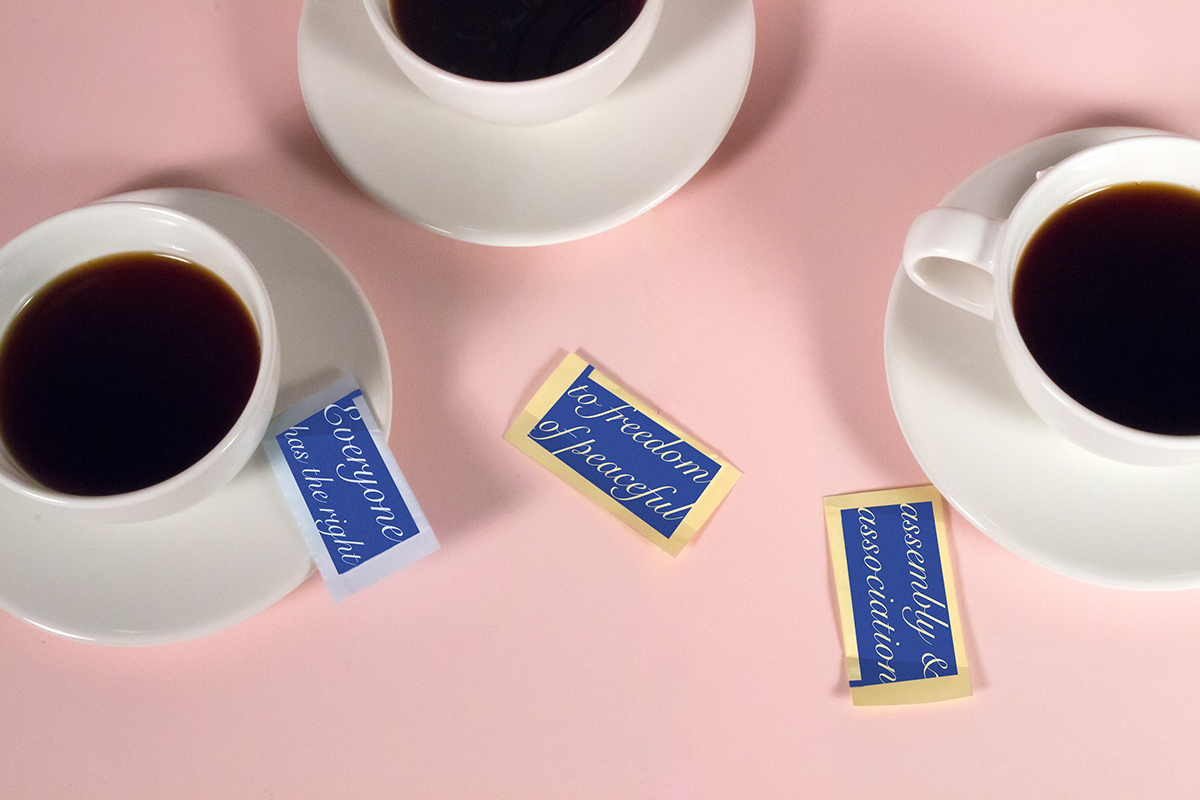
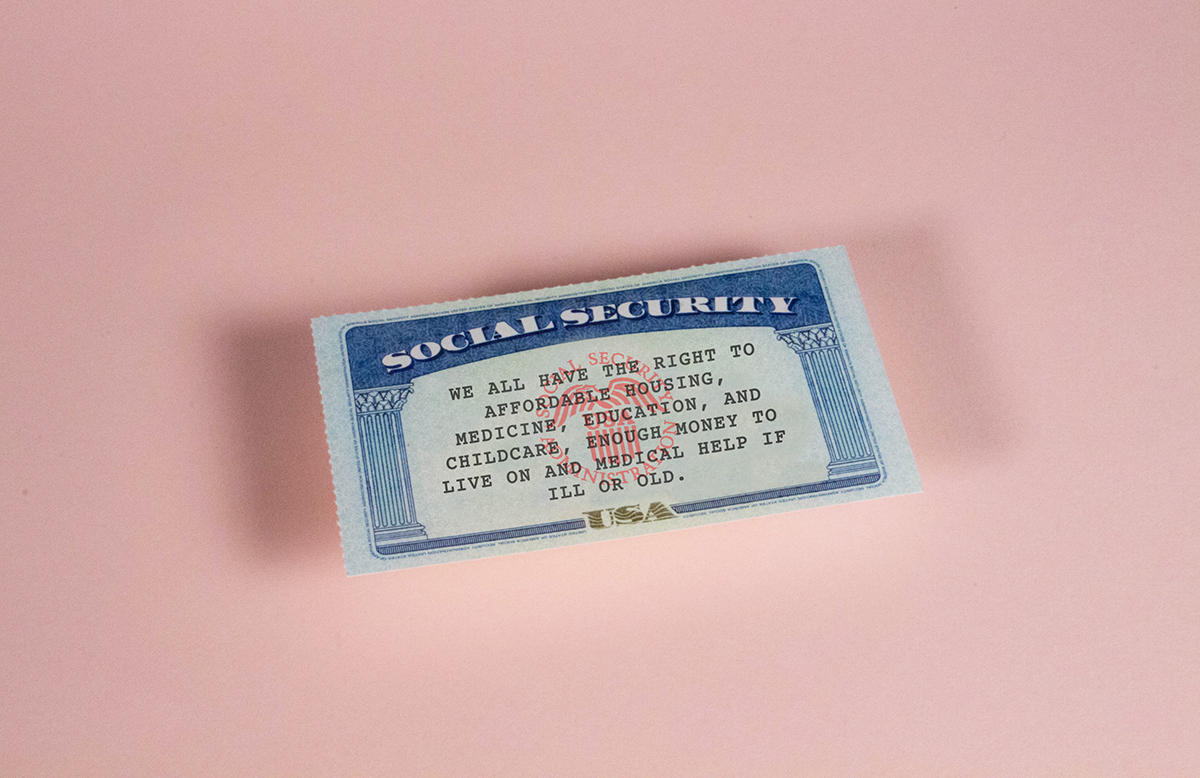
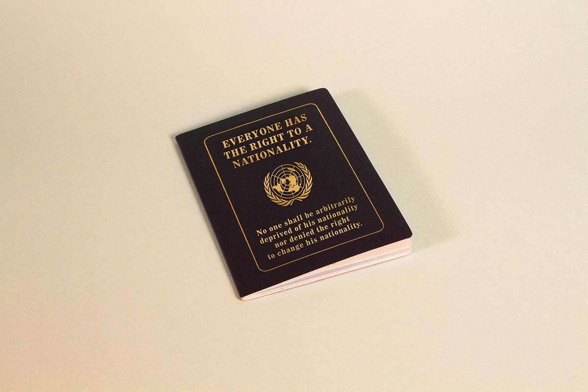
My approach to the final implementations were a photograph series which disaplay the articles within objects they are related to. These photographs can be implemented in many different formats: a gallery, a book, social media, subway advertising, etc. They are also work well at different sizes. Some, like the knife, are meant to be seen and for the viewer to lean in to read.
This implementation shows the way that these rights are embedded into our everyday life and should always be considered in that way.
