Background
I'm currently working with Watchtower Benefits on a project to build out high fidelity clickable prototypes for a new set of features and a flow that they're testing with customers.
Watchtower Benefits, to give some background, is a three-person startup currently working on transforming the antiquated healthcare benefits brokerage market. Their tool is online platform that facilitates and streamlines the RFP process for healthcare brokers. Essentially a healthcare broker will put together a RFP with a company's information (size, benefit types), and send it out to different insurance companies to bid on.
Traditionally the broker would then have to manually collate all of these PDFs (as they roll into their inbox) into an Excel spreadsheet to compare them in a normalized way. But with Watchtower Benefits, the PDF is sent directly to the platform, and the "data uploading" is automated. Essentially the system parses these [differently-formatted] PDF's for around 140 unique normalized attributes, allowing the broker to spend less time making comparison spreadsheets, and more time seeing how the different plans compare—conducting things like basic volume analyses.
• • •
In my last project with Watchtower Benefits, I helped them streamline the interface for their main RFP comparison screen. Basically, what the RFP comparison screen shows is X number plans (as vertically-formatted cards) across 30 or so different attributes, organized in an accordian-based legend on the left side of the screen.

Challenge
So what were we building? Ultimately it's a new "feature" that completes their current product, and expands it in scale to more closely match the mental model of healthcare brokers. We called it the "sold plan" flow.
When a broker is done comparing all of these different insurance policies, they ultimately have to make a selection—choosing which insurance carrier they want to buy products from. Once a plan is marked as sold, the broker has to reupload a PDF of the sold policy (as opposed to the policy in the RFP), since the actual policy may actually differ from the sold proposal (terribly convoluted, and inefficent—I know...). The team wanted to protoype a flow to show what that entire interaction looked like—going from the RFP comparison view, marking the sold products, arriving at the Policy Comparison screen, and finally getting a broker to upload PDF's for the sold plans. They wanted to make sure it felt like a "process"—that [crucially] the new Policy Comparison screen (whose functionality mirrors the RFP comparison screen) felt "different enough" from the RFP screen.
Sketching
A semi-solid understanding of the features we wanted the platform to have was essentially where the team left off after our initial whiteboarding session. With these features in mind, we ended for the day, and I went home to think about implementing these different features. My first step—once I have a general idea of the key requirements—is to start sketching. Essentially the sketches allow me to imagine various configurations of the main features. Sketches also often help you figure out what the additional constraints are, since you start to realize how much is truly involved.

Discussion + Feedback
When I had made my initial set of sketches, the team and I regrouped to look at the sketches. Although the screens I had drawn were incomplete, looking at them allowed us to start thinking about some of the additional constraints involved in the flow. One issue that quickly came up was this idea of "difference," The team had been pretty adamant that the new Policy Comparison screen look significantly different than the main policy comparison screen, since they wanted users to undersyand they had entered a new state—or segment of the process.
"make sure they look different enough"
My issue with that was that the new Policy comparison screen was going to be displaying fundamentally identical information to the RFP comparison screen. To me it didn't make sense to create an entirely new screen and display format when the information was essentially the same. So the question arose: do we make the Policy Comparison screen replace the RFP comparison screen (ie. an irrevocable state change), or do we make a new screen for it? In other words, one screen or two?
"one screen or two screens?"
This was a source of a lot of discussion, but there were a couple of constrains that made the decision easier. For one, after the broker has marked their sold products—they would need the ability to change those products they've marked sold ("last minute we decided to go with Unum for our AD+D"). This would have to be allowed even while they are in the policy comparison state (ie. "after the fact"). They should also be able to reference the RFP comparison while in the policy comparison state, since there may be information they need to make their decisions.
In other words, any state change we implemented would require some amount of forgiveness, and because brokers might need to reference past information to make their decision, it didn't make sense to have a waterfall process. It would make more sense to have separate screens.
The team and I decided that marking products as sold would create the policy comparison screen, but it would retain the RFP comparison screen for reference (in my wireframes I came up with a pretty awesome solution for this problem, using a dropdown nav to switch between states). We also decided that it should be easy to change the sold products, even after the policy comparison screen has been created, since there would inevitably be some amount of user error.
Finally, a caveat: In our discussions there was no "testing" per se, but because the goal was to quickly design a MVP, the team was good about giving me feedback on the things they did and didn't understand—things that felt unclear to them. Since all of them were former health insurance brokers, and they're good critical thinkers, I think we were able to iron out some of the general and domain-specific usability kinks during our sessions—since our discussions were essentially co-creation workshops.
Goals + Constraints
After our discussions, I had a firmer set of requirements and constraints to work from:
- Create a more scalable global navigation
- Make the RFP screen feel different enough; it should feel like a new screen
- Indicate that a new screen is being created
- Show user they have been taken to a new screen
- Display both the RFP and Policy comparison screens, in a non-redundant way
- Display both the RFP and Policy comparison screens, in a non-redundant way
- Allow the user to mark a combination of products to mark as sold, before completing RFP
- Allow the user to change sold products after completing their RFP
From these requirements, I was able to do some medium-fidelity wire-framing to clarify the flow
Wireframing
Wireframing wasn't done in a traditional testing-geared sense. For us, it was a way of thinking about the product at a medium level of fidelity. I created some quick wireframes in Sketch, to show some of the key states the product would go through as a broker marked products as sold.
Wireframing helped me solve some of the problems associated with the project. Although I decided to go with two separate screens for the policy comparison and RFP comparison screens, I nested them under a shared dropdown in the main nav (ie, an arrow would appear when the policy comparison screen is created) to reduce the amount of perceived redundancy, and to indicate that these were similar but separate states.
In my wireframes I also tried to solve the issue of onboarding, by having a persistent right hand column appear with steps and directions on what to do once a product was uploaded. I also had a single drop zone for uploading policies. In our discussions later, this proved to be somewhat unworkable; although the right hand column did make sense, if users had multiple policy documents, having to upload separate products on separate screens would have been too confusing.

I did something a little different with these wireframes with yellow highllighting. It isn't so much an annotation, as much as a way of showing the key variations between screens—since
Similar to how we had discussed the sketches, our discussion of the wireframes helped us decide what about the design was working, and what needed help. Again, although there was no user testing, the iterative nature of our discussion meant that I was able to make a lot of changes and improvements when working in the higher fidelity stage.
The final high fidelity MVP prototype solves a lot of the problems we uncovered during our whiteboarding sessions.
Project-Level Actions: The project name is turned into a button, that shows and hides a dropdown. The pattern uses the name of the project to make it clear these are project-level actions. I borrowed the pattern from sites like Trello and facebook. Placing the project name near the home button also doubles as a "bread-crumb-like" indication of where you are.

Product-Level Actions: Currently Watchtower's main dashboard has product-level actions, but they are hidden behind a fairly nondescript dropdown arrow. I changed this to a "more" button with three dots

Flexible Product Selection: The need for users to select different policies for different products required some kind of persistent global state. In this case, a modal with drop-downs made the most sense to me. Users could pick between different products, or decline for specific products. Inline validation with arrows shows them where they're at in the process.

The File Manager: Because users might have to upload many policies and multiple versions of the same policy, it made sense to create some kind of file manager, where users could see what products they had selected, and what files they needed to correspond to those files. What's great about the file manager is that it works to handle proposal documents as well, so a messy waterfall process (document management) now becomes more centralized.
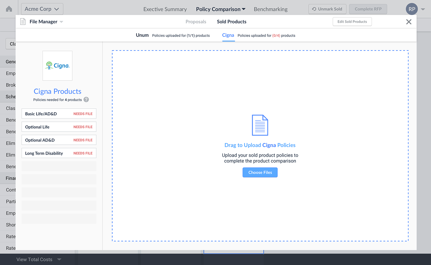
The UI pattern for this file manager comes from Wordpress' media library and media item detail. It's almost like a new page, but it is presented as a fullscreen modal to signify that it lives "above" the entire file uploading process—that it is more global.
Final Prototype:
Linking all of these separate features together in a prototype allowed us to really get a sense for what the flow would look like. Although it's not perfect, and still requires plenty of revision, it has helped the team get a sense for how the product could evolve to more accurately match the user's mental model for the brokerage process.


Takeaways:
1) Stay medium fidelity longer: I made the mistake of designing the "file manager" entirely in sketch, at high fidelity. This took a lot longer than some smart white-boarding would have, and ended up costing me a lot of time. I should have been working at lower fidelity.
2) Managing "States" in Sketch is hard: This might have been the single most challenging element of my workflow: creating states that I can toggle as named layers. The layer naming system in sketch is really messy, and it was very hard to keep track of where my assets were living. Finding a best practice for creating states (without duplicating art boards for every screen), or creating symbols—this is something I need to figure out how to do better.

