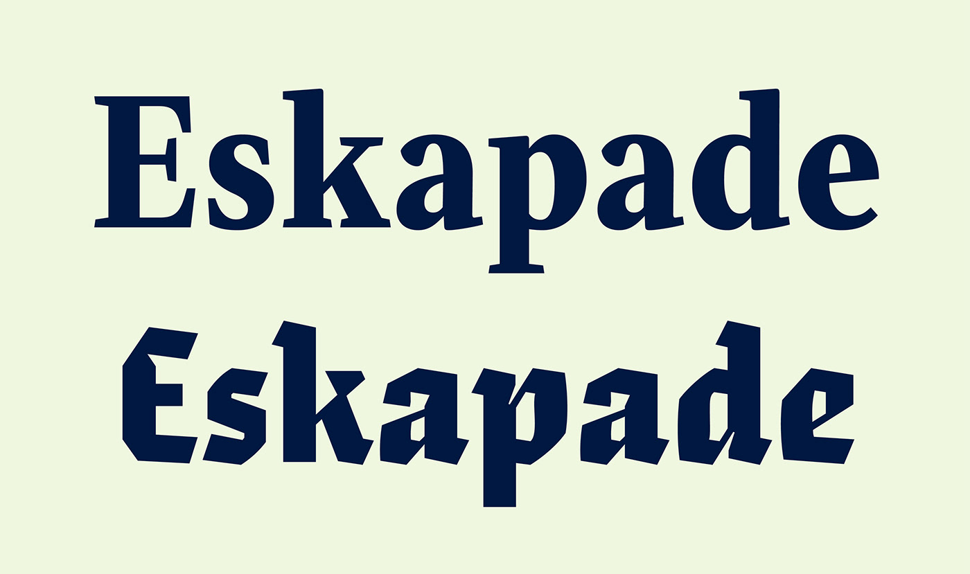
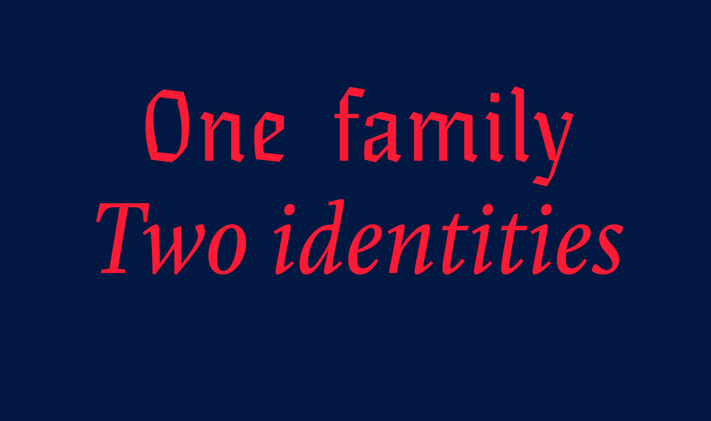
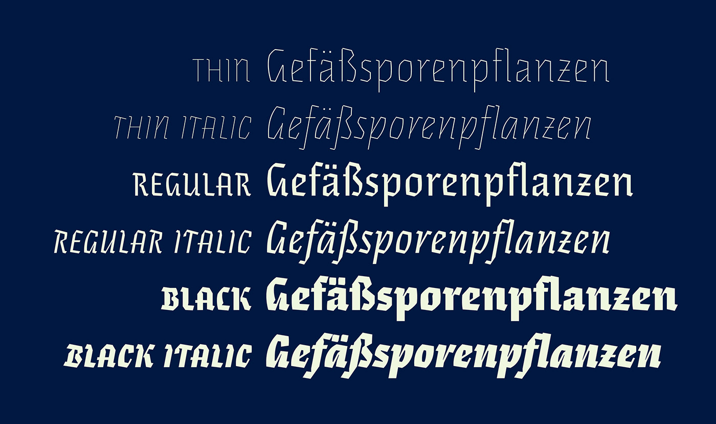
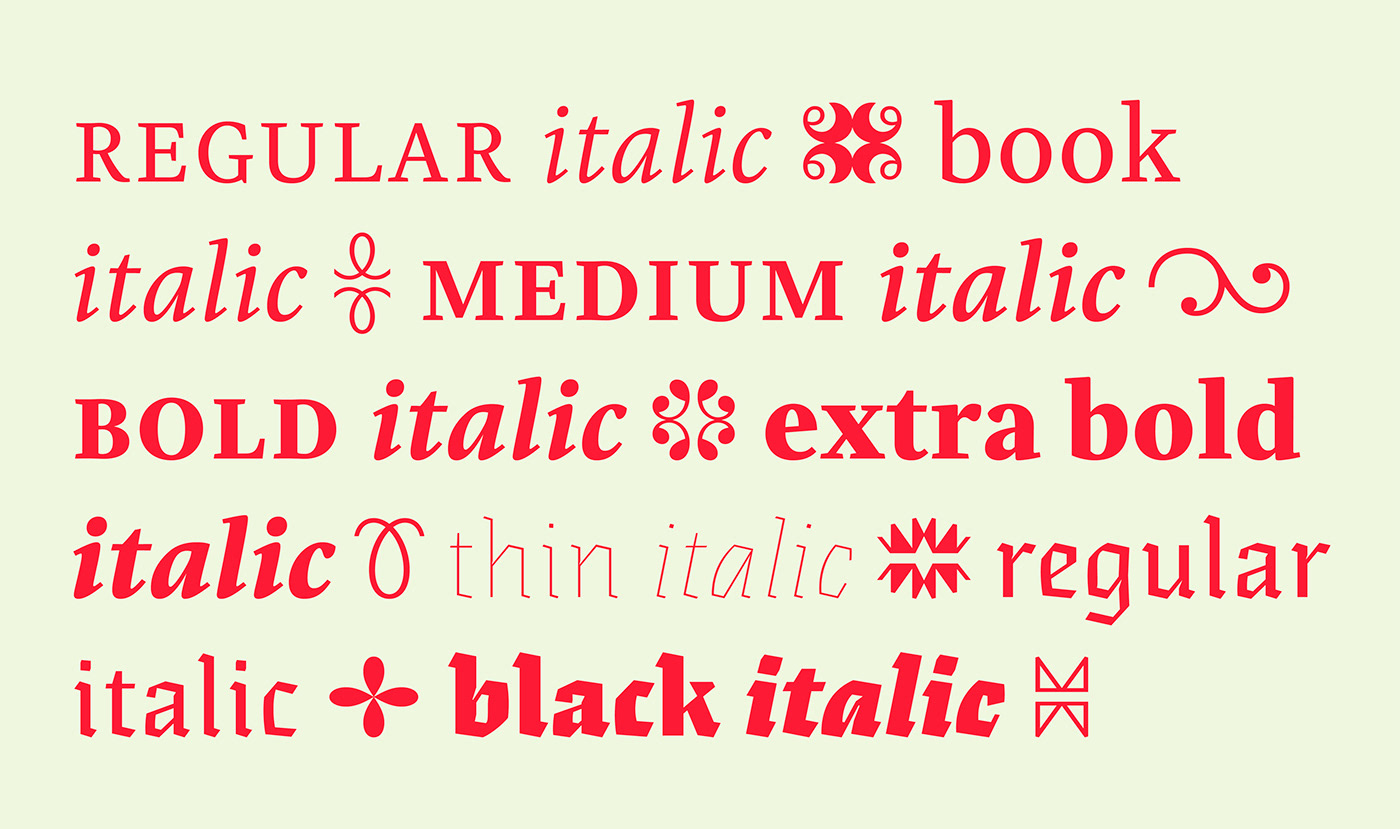
Eskapade & Eskapade Fraktur: creating new common ground between a nimble oldstyle serif font and an experimental Fraktur
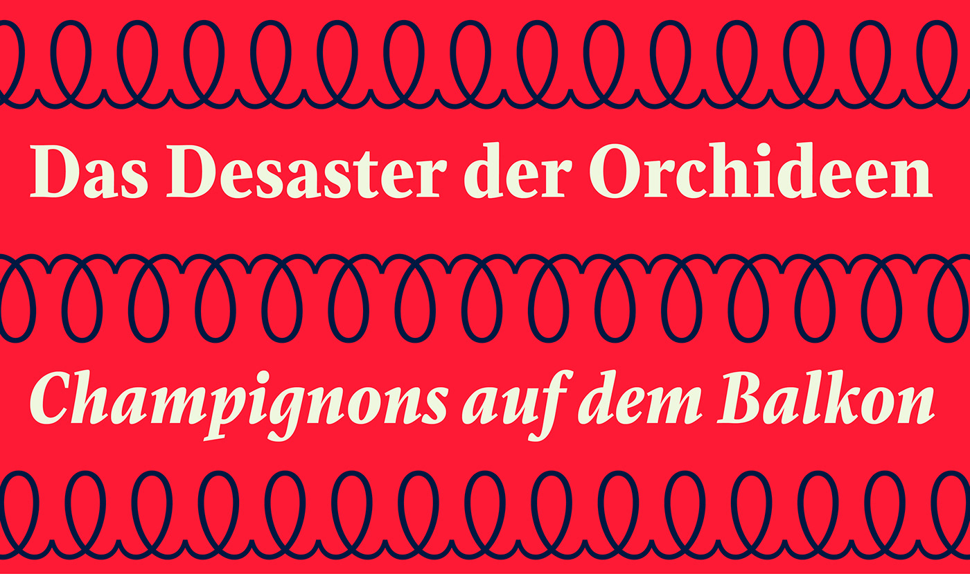
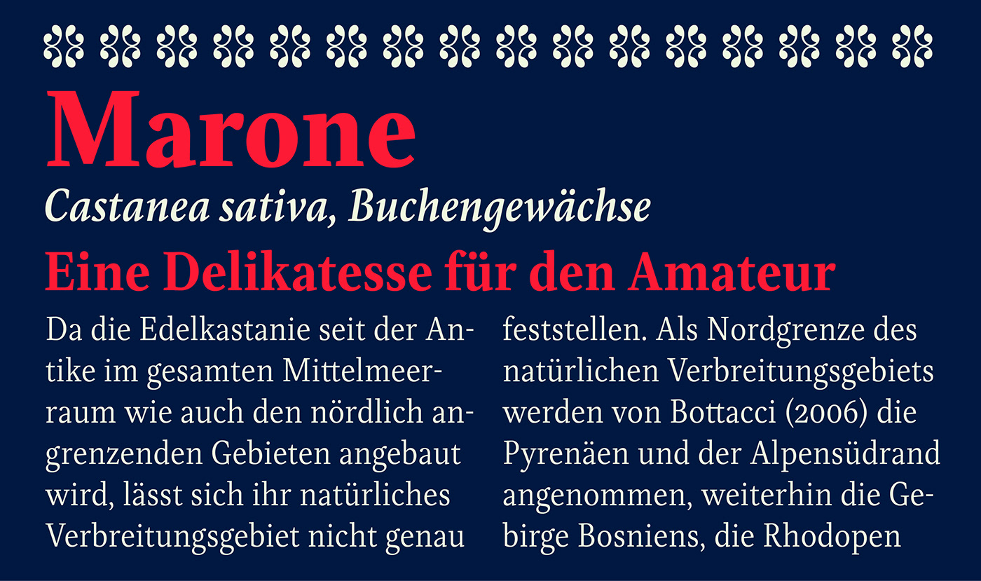
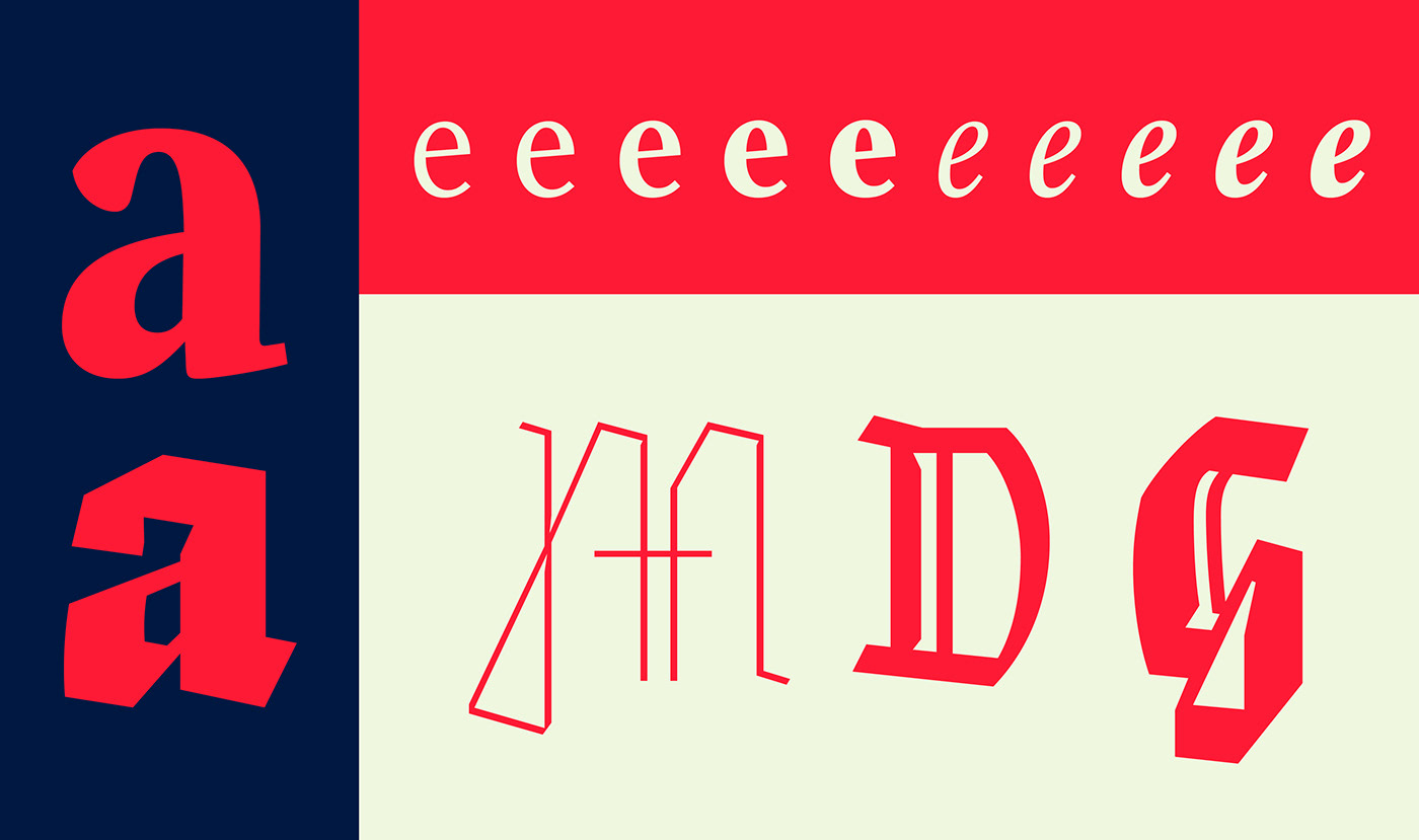
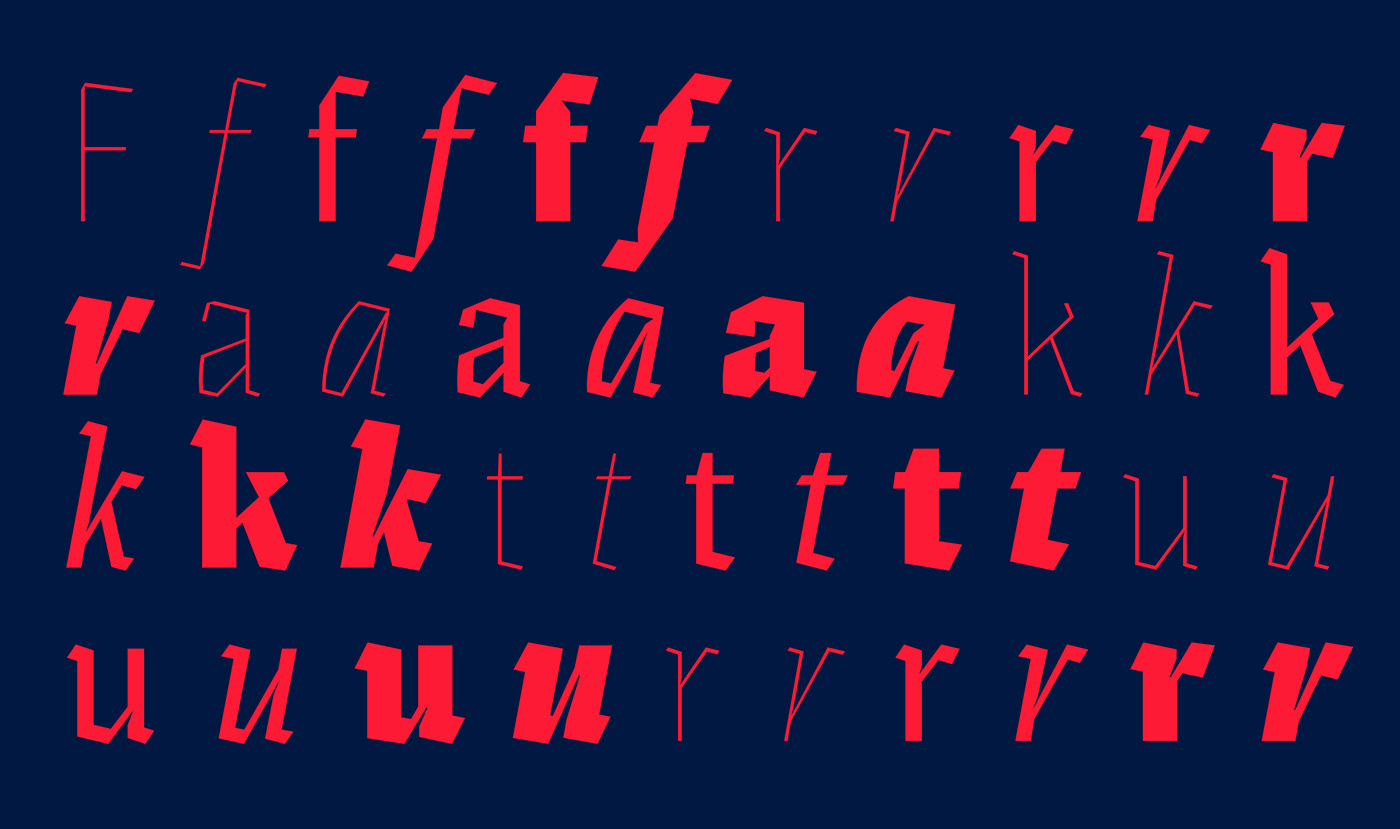
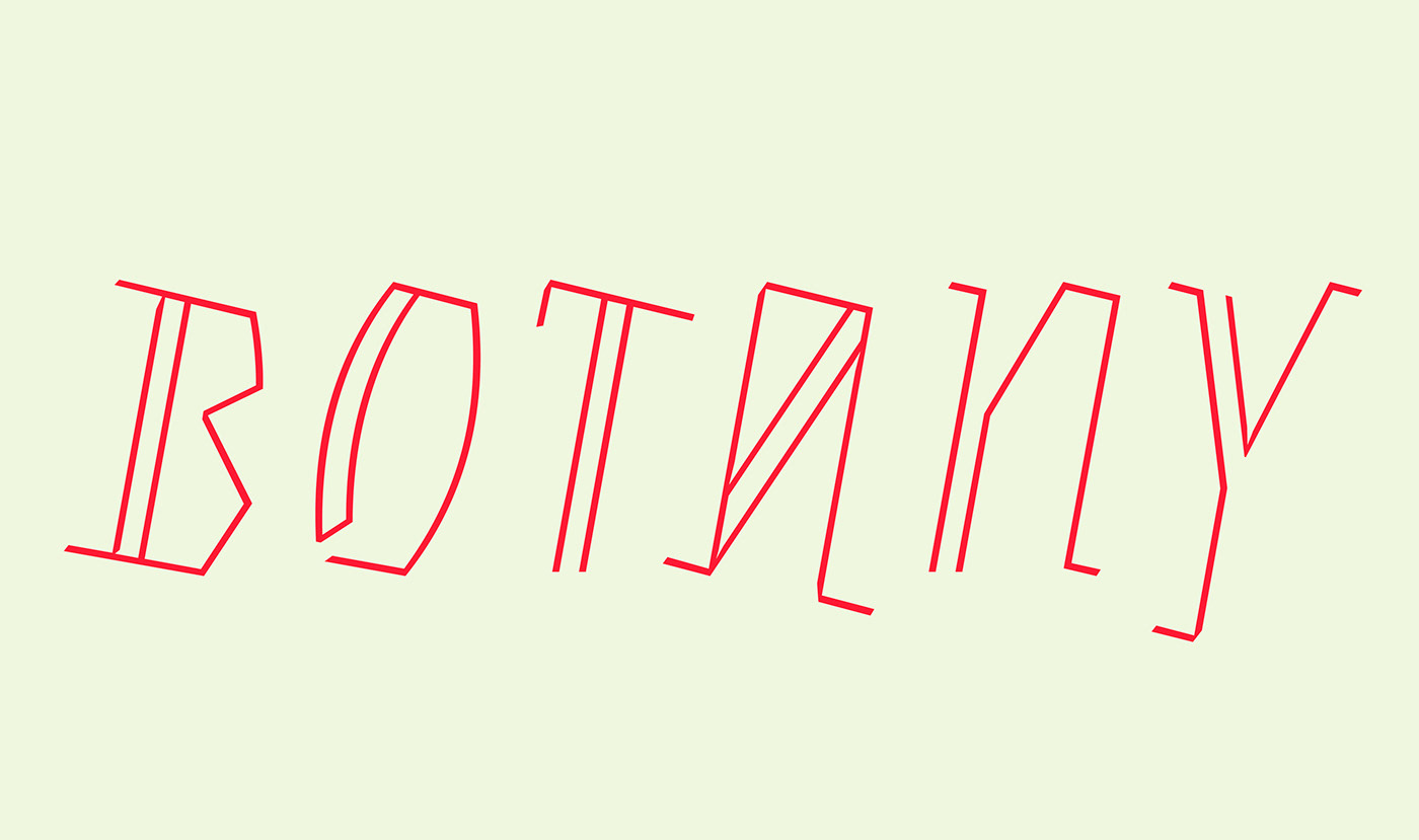
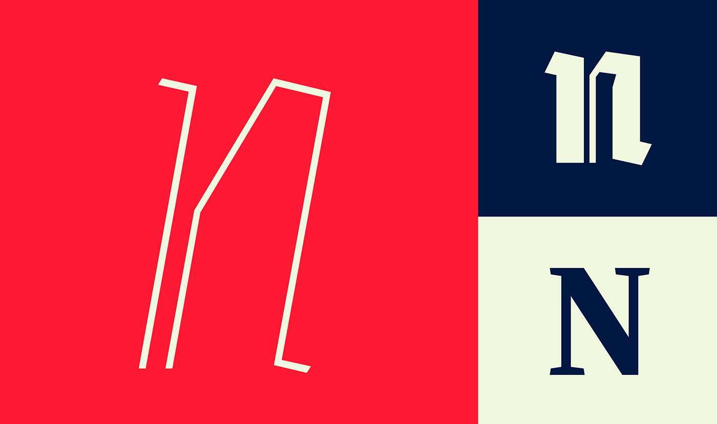
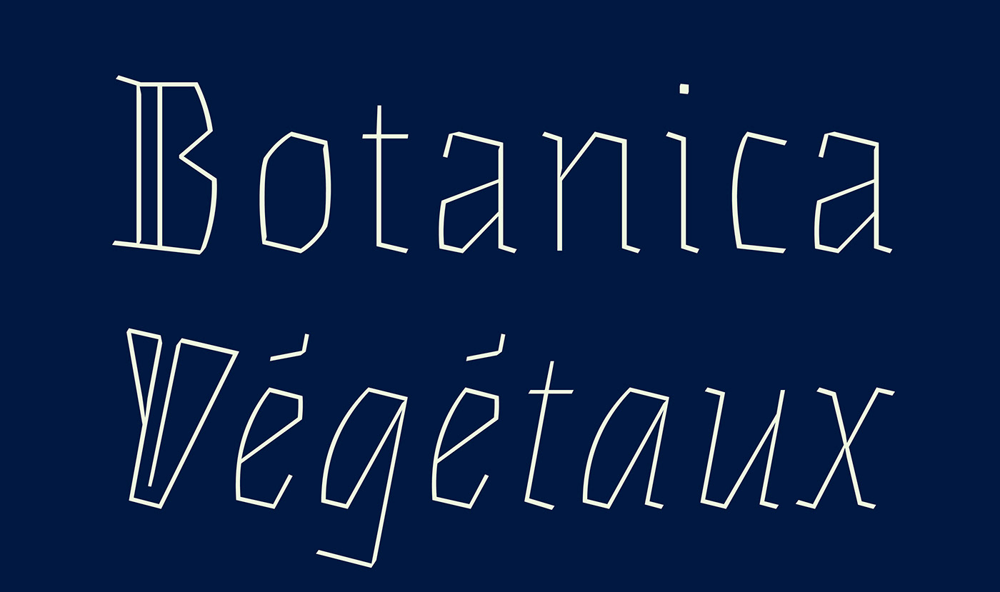
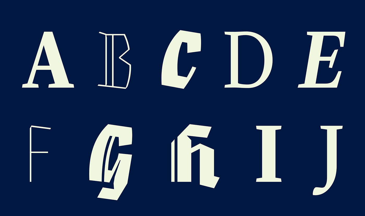
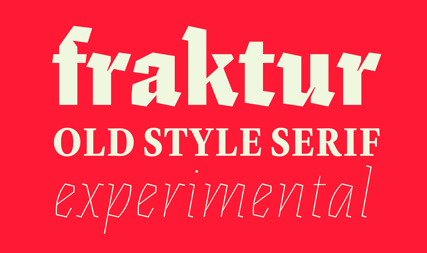
An experimental Fraktur and a nimble oldstyle serif now share common ground in Eskapade. The serif styles have a contemporary ease, light typographic colour, and smooth design — perfect for continuous book and magazine text. Eskapade Fraktur’s visual punch captures the reader’s attention in headlines, visual identities, branding and logotypes, and packaging, especially with the second set of double-stroked decorative capitals that encourage experimental use and creative application.