Redesign Corporate identity -
Co Family Coworking
Logo + advertising design by liliana.es
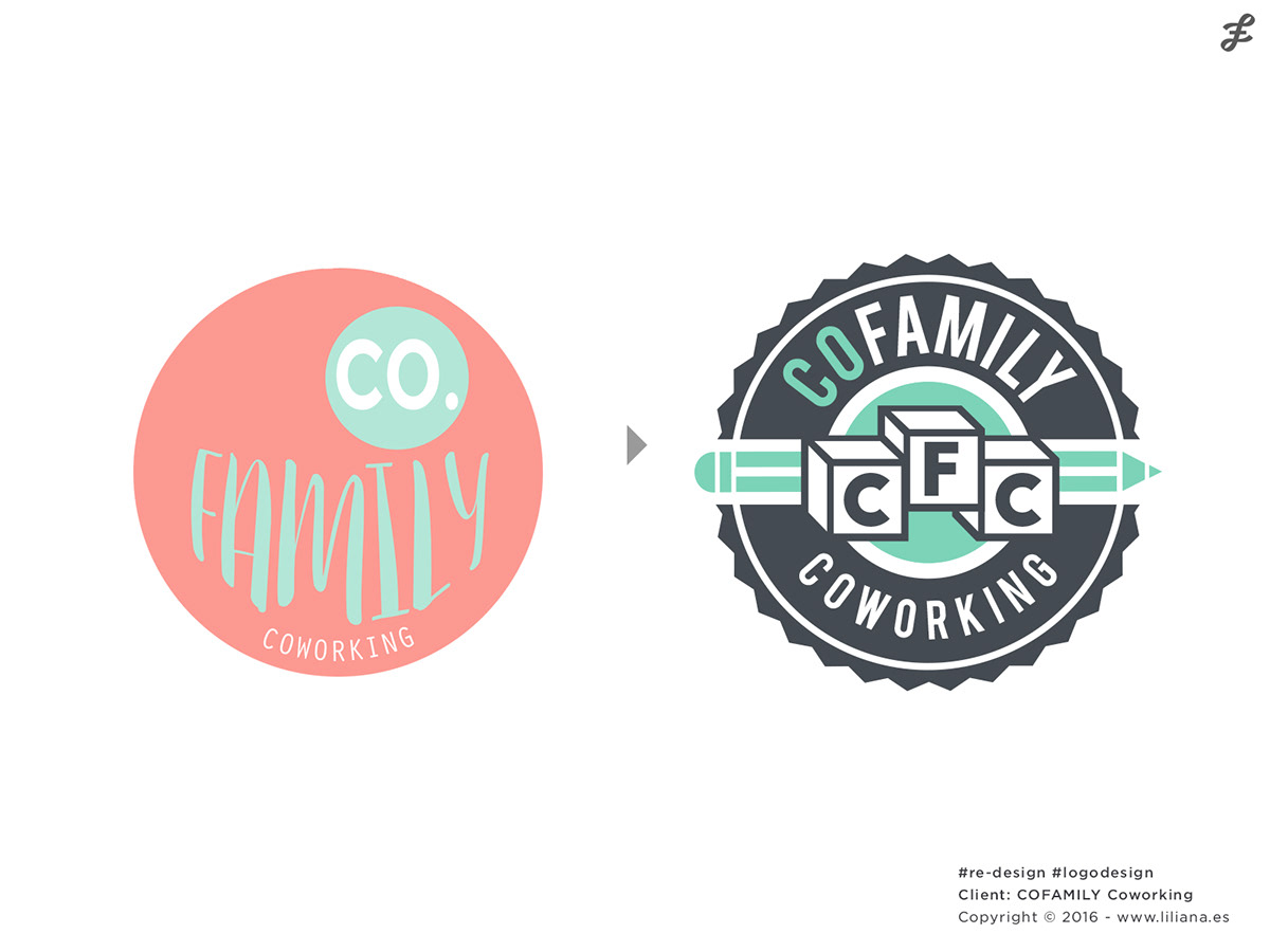
Hey friend! your project is great, although, a logo redesign is needed :)
That's how this corporate identity project started.
My client, a mom entrepreneur who is used to do everything herself, made a graphic element as a logo for her brand new business in Granada, Spain.
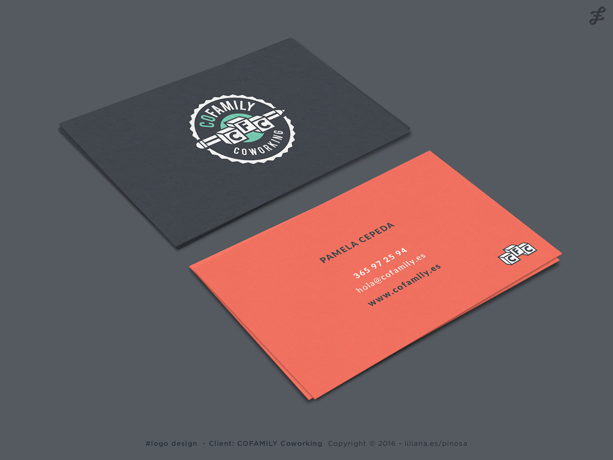
Business Cards
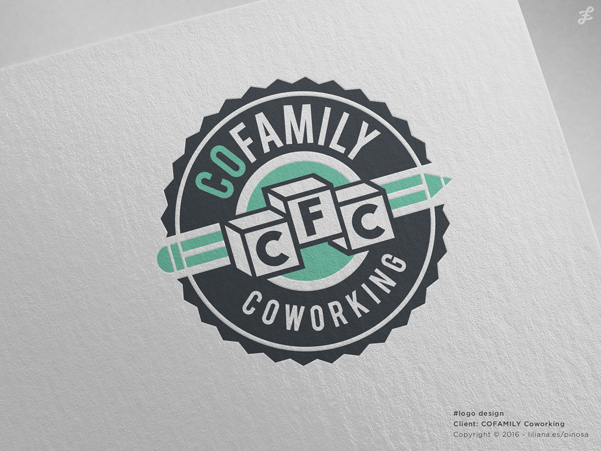
When I have the logo ready I always applied to the simplest graphic element that will show the business personality, this is how it looks:
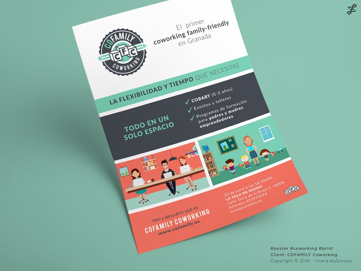
A flyer
I designed a flyer to explain how the Coworking family-friendly works.
An explainer video
Using the same graphic elements and colour palette I also created this explainer video
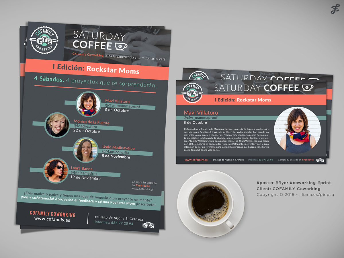
Posters & Flyers
I also designed these elements for a circle of conferences