


COCKTAIL BOOK
PRODUCT PHOTOGRAPHY & GRAPHIC DESIGN
Brief
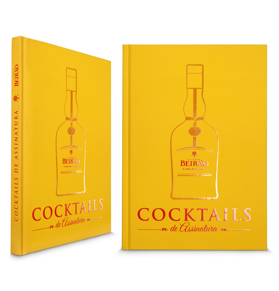
Title: Cocktails de Assinatura - Licor Beirão
Client: Licor Beirão
Scope: Product Photography and Graphic Design
Role: Art director, photographer and graphic designer. This included the design of the cover, layout of the book, photography, final art work and printing supervision.
Target: Professional Bartenders
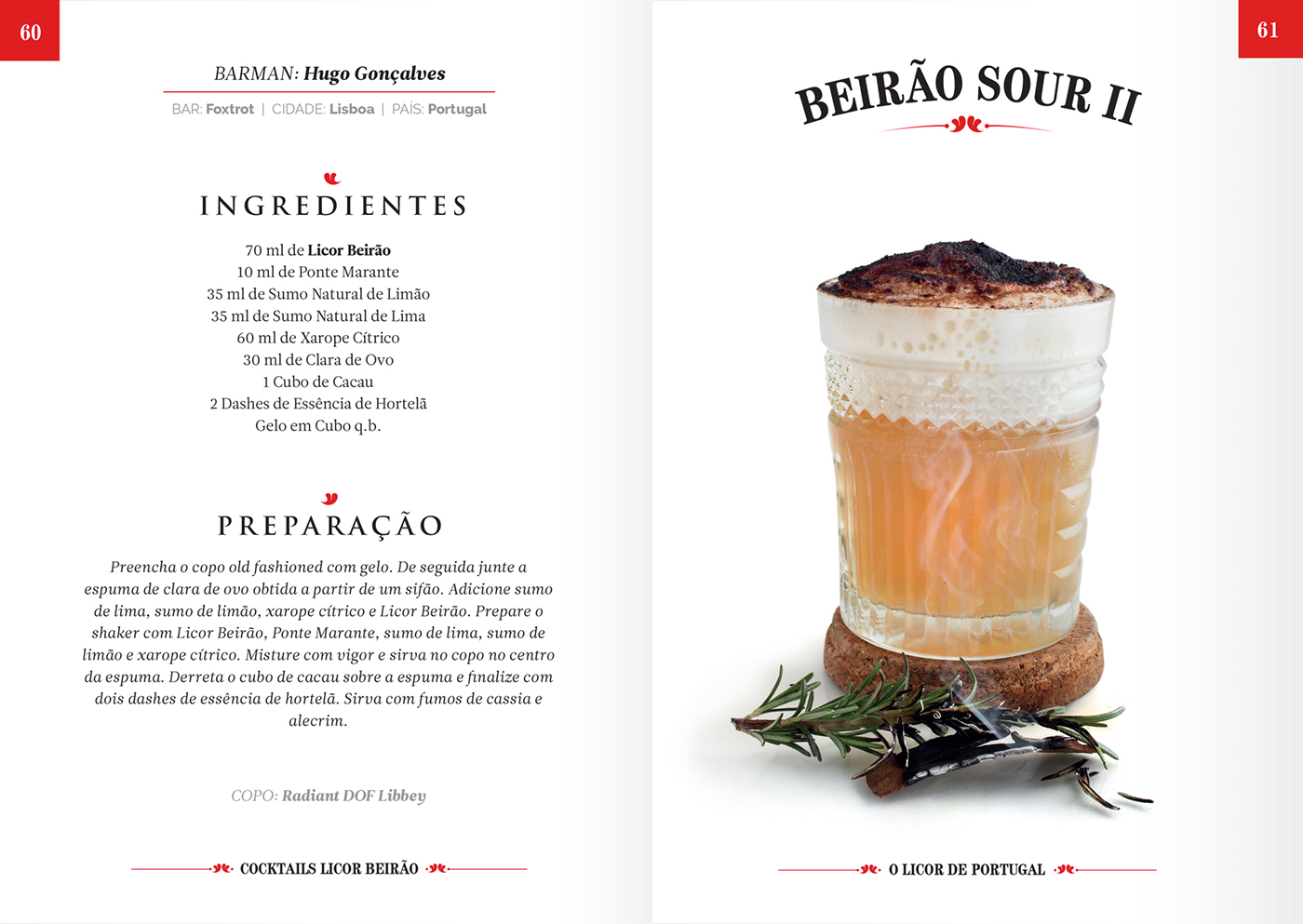
Background: Following a similar book the brand published in the 1950s, the company invited the most prestigious bartenders in the country to participate in this project, challenging them to individually create an original cocktail using Licor Beirão, which would resulted in a book with 44 cocktail recipes.
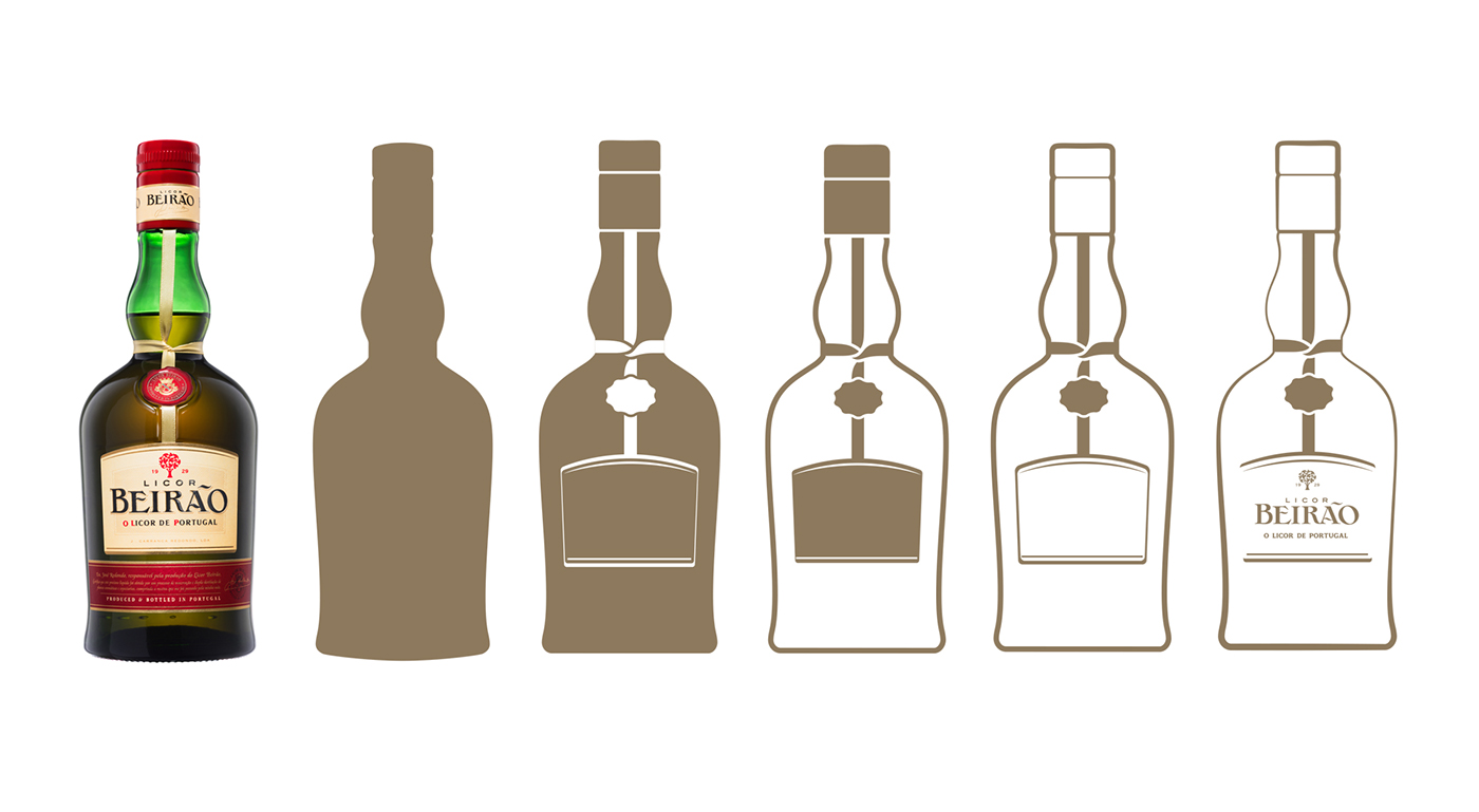
Styling: As mane guidelines I was to give special relevance to the yellow color that permeates the brand's communication. For the cover, it was suggested that I designed an outline stylized image of the bottle as the mane feature. Typography, graphic details and other colors were to follow the brand style guide.

PRODUCT PHOTOGRAPHY
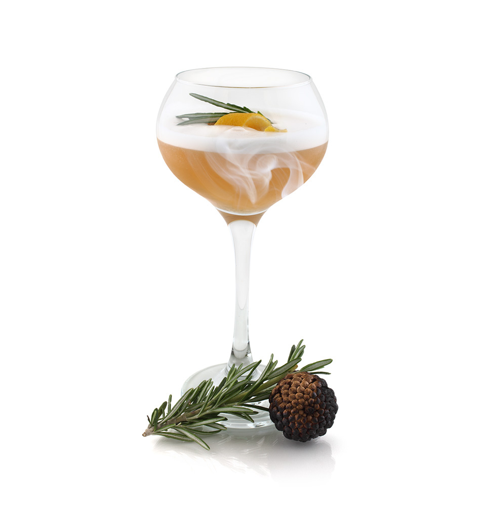
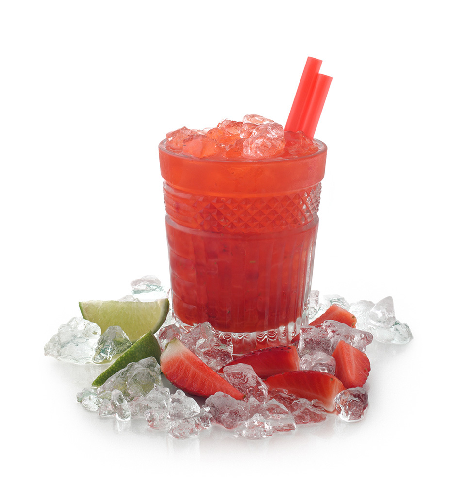
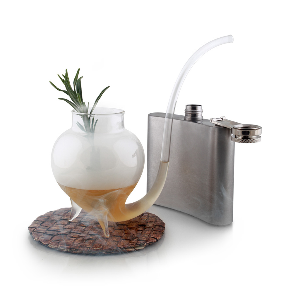
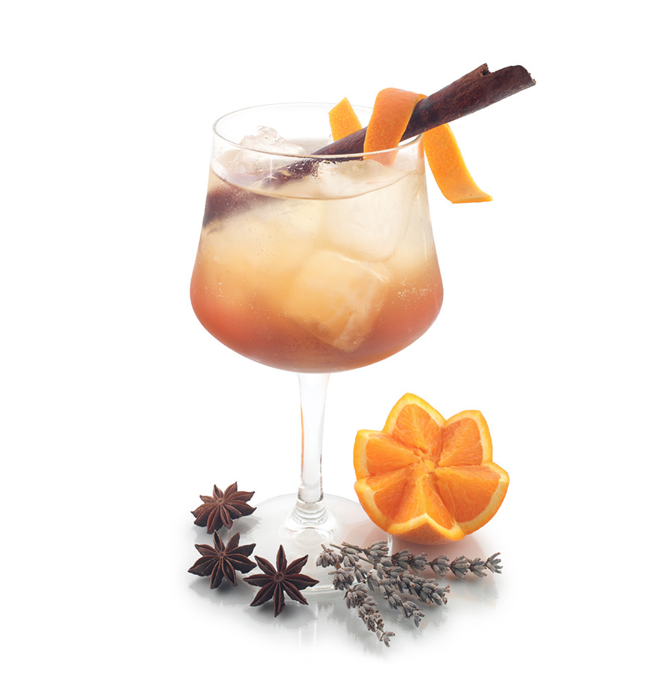
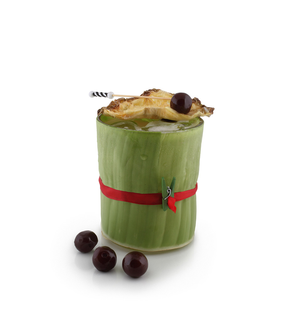
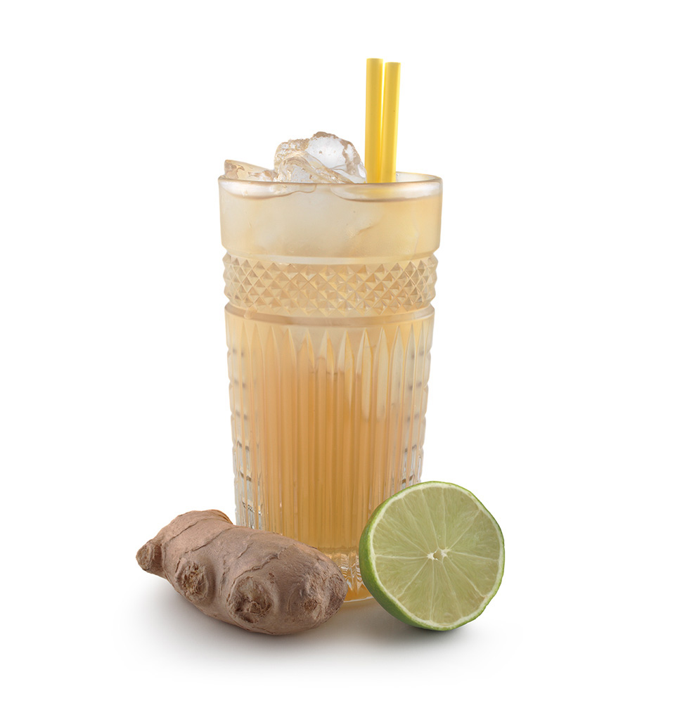
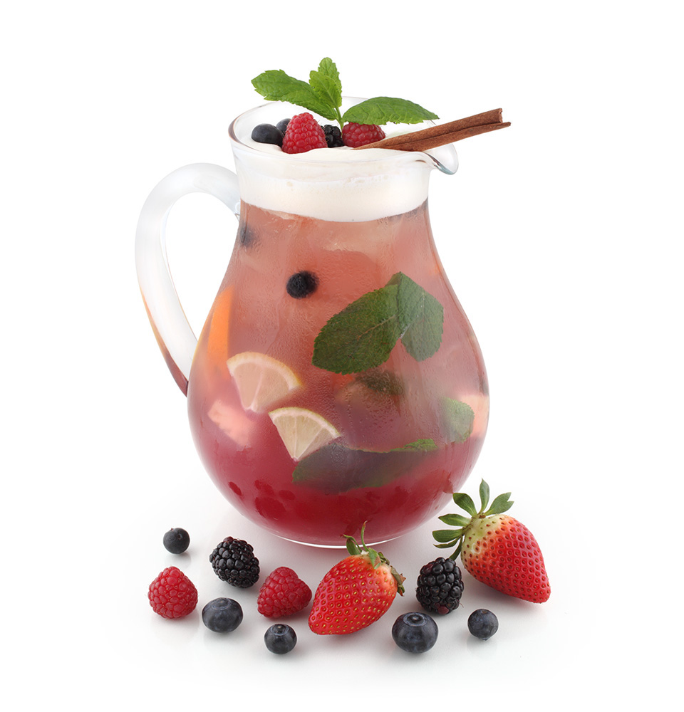
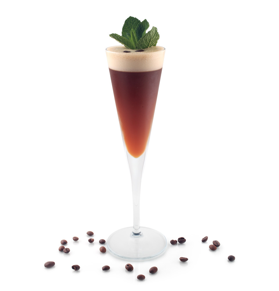
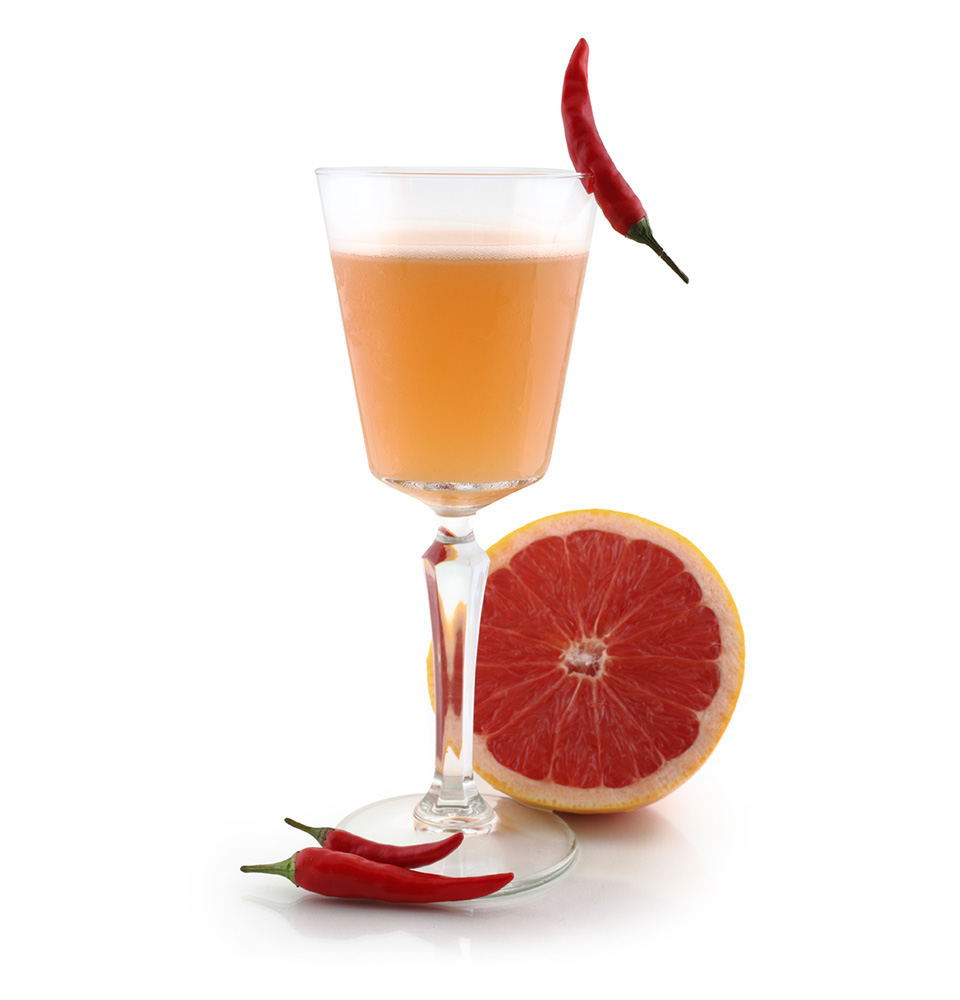
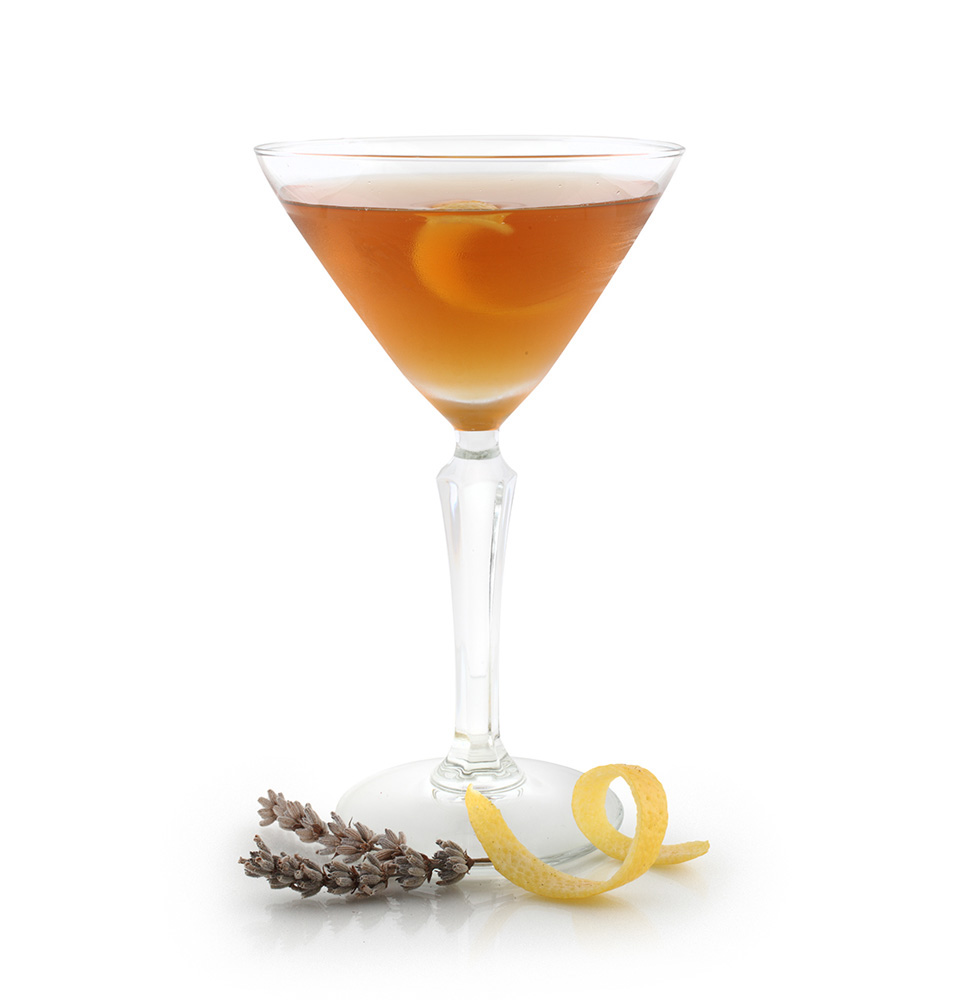
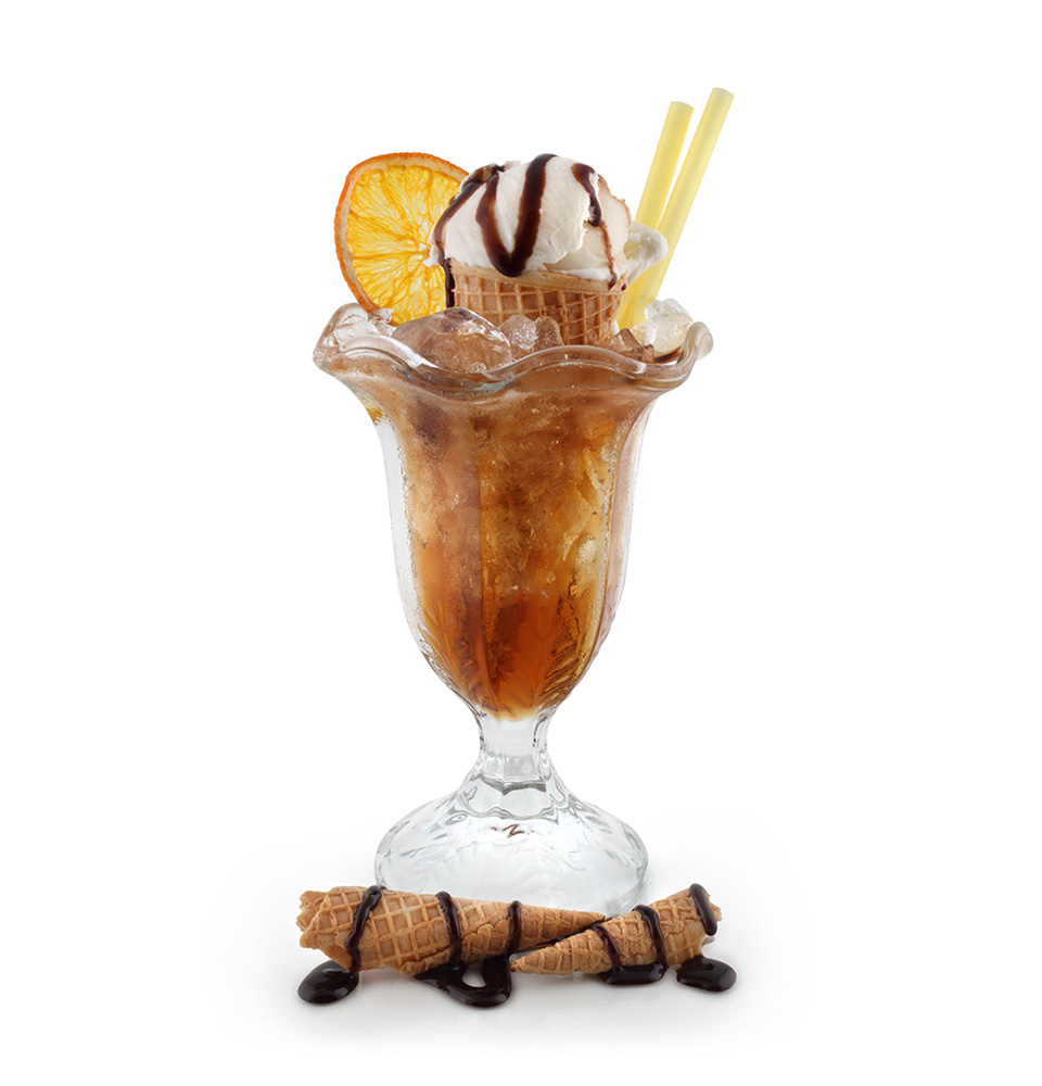
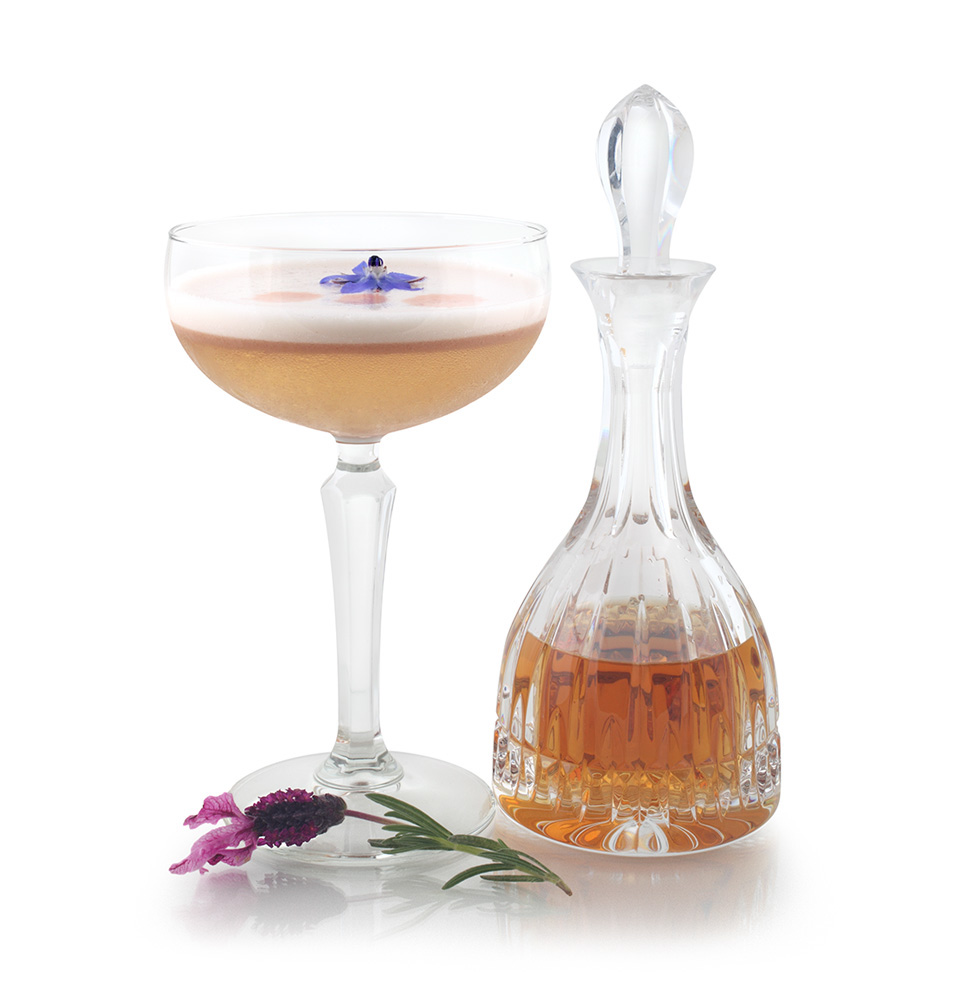
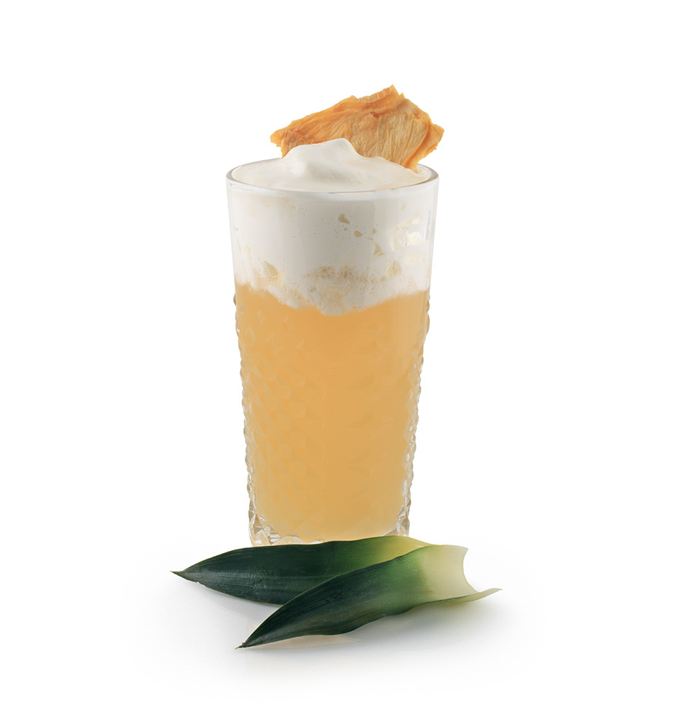
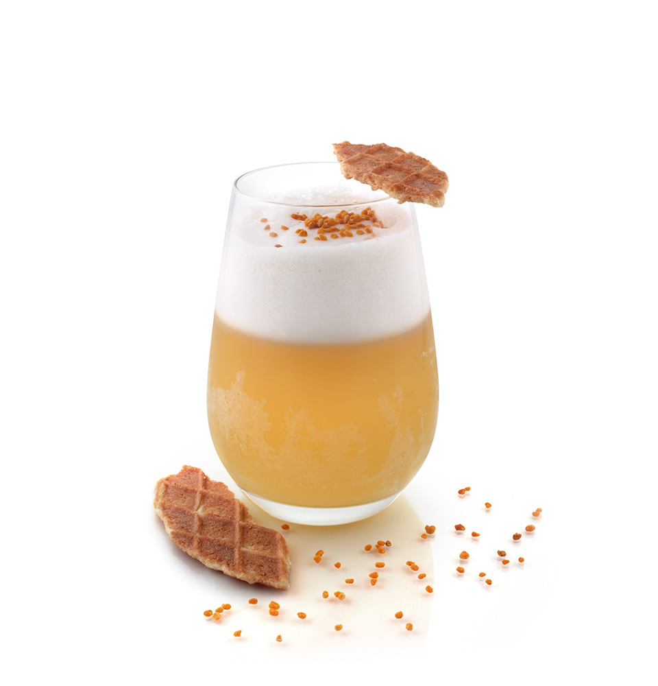
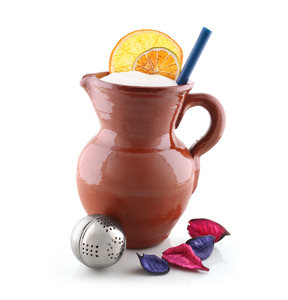
When evaluating the various styling options for this product, my choice was to avoid the common approach of staging drinks and food in a surrounding context. I've decided early on that I didn't want any distractions. I wanted to do in such a way that the cocktails would be the sole focus of the photograph, an aesthetic choice that I thought was more appropriate for a recipe book addressed to professionals, conveying a more technical feel to the images, and overall greater consistency to the book. I wanted to honor the craftsmanship, perfectionism and tireless effort this professionals put into all details of their creations. My goal was to present them as works of art, like pieces of jewelry crafted to perfection with the utmost care and precision. A pure white background was, among the alternatives tested, the one that seem to really make them shine, look more appealing and tasty. Along with the glass, the ingredients help accentuate the different personality of each drink, they make the composition more interesting and help communicating what the cocktail is about.


GRAPHIC DESIGN
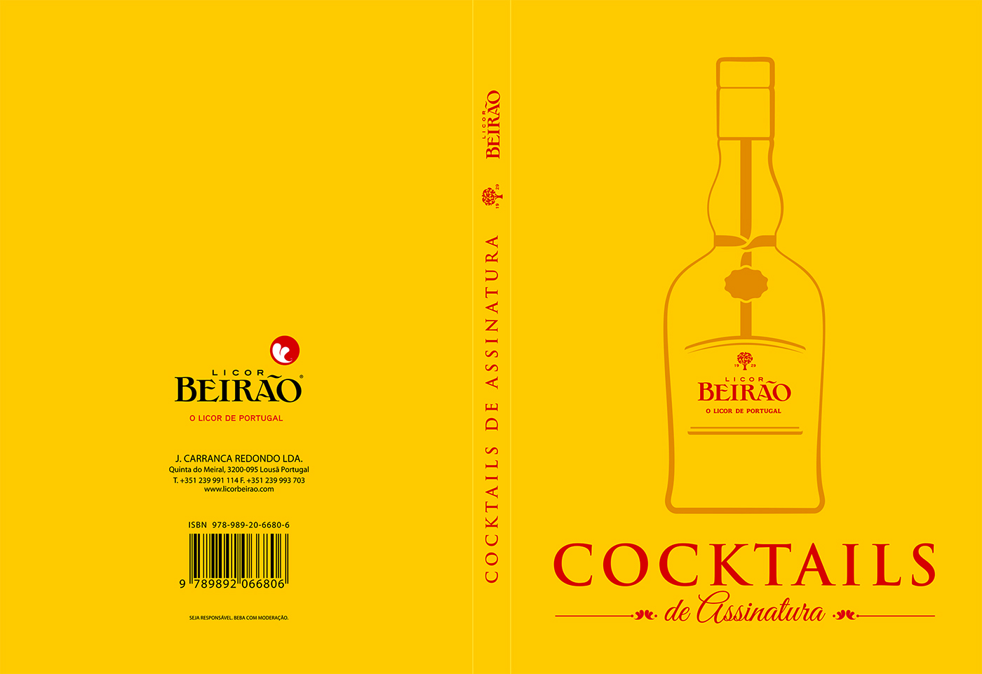
The colour yellow used in the brand communication was adopted as a background for the cover and separation pages between chapters. The colour red which is also part of the brand identity was reserved for graphic elements and display fonts.
The outline design of the bottle highlight its charismatic shape, which is a key identity feature of the product.


OUTDOORS...
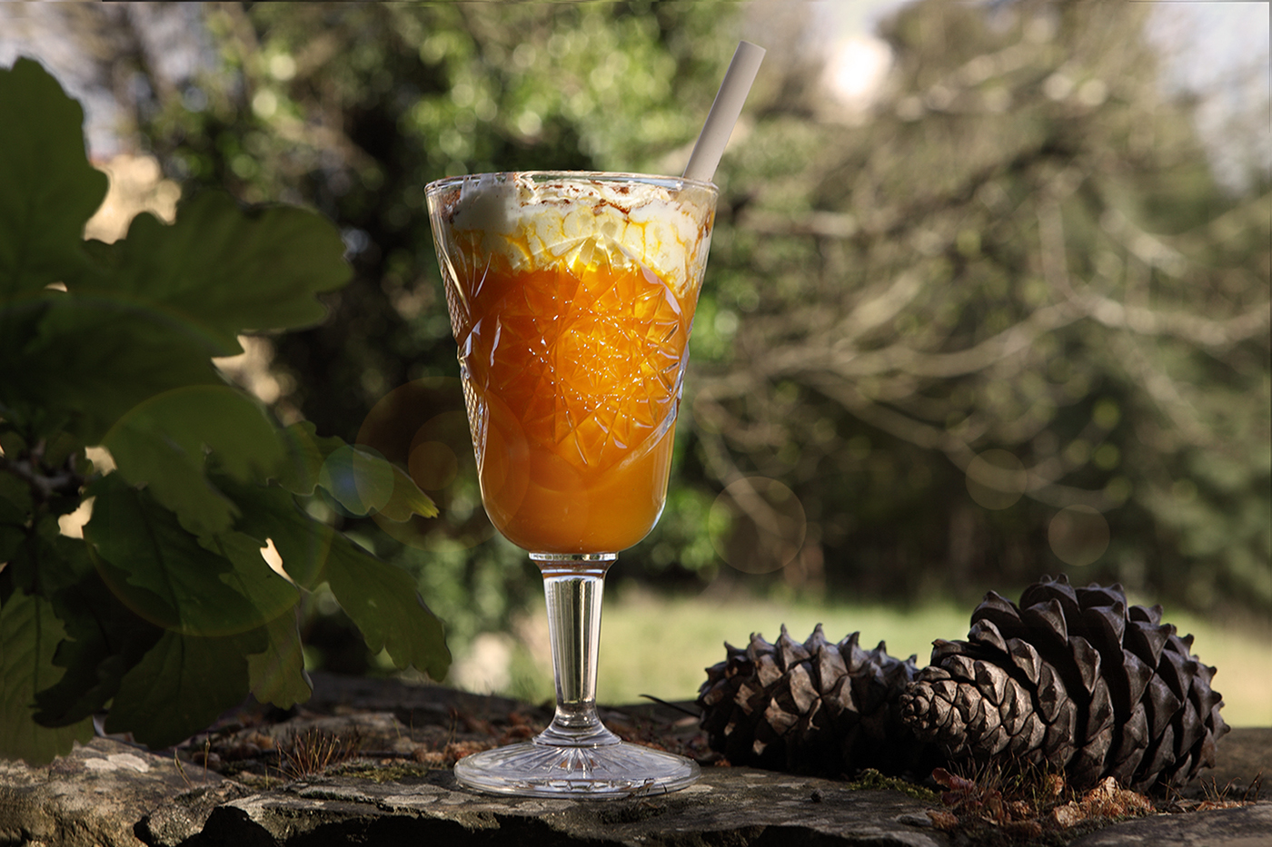
The distillery has a beautiful setting, at the bottom of Lousã mountains, on a large villa that grows lavender and other flowers used as ingredients in the manufacturing process.

BOOK RELEASE
Official book release at Lisbon Bar Show

Thank you!


