
Here are some of the inital ideas for 340B
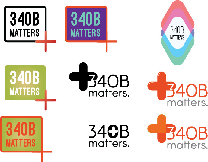
I liked the box idea so I decided to expand upon that

I wanted to see if I could make the box around 340B into a symbol representing safety and care so I tried a shield. I eventually took off the "box" all together.

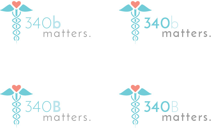
For diversity and other options, I created a similar symbol that is more related to medicine.
The company liked the boxless 340B logo with the heart/cross. I played around with the positioning of the icon and this is the final logo that was created.


