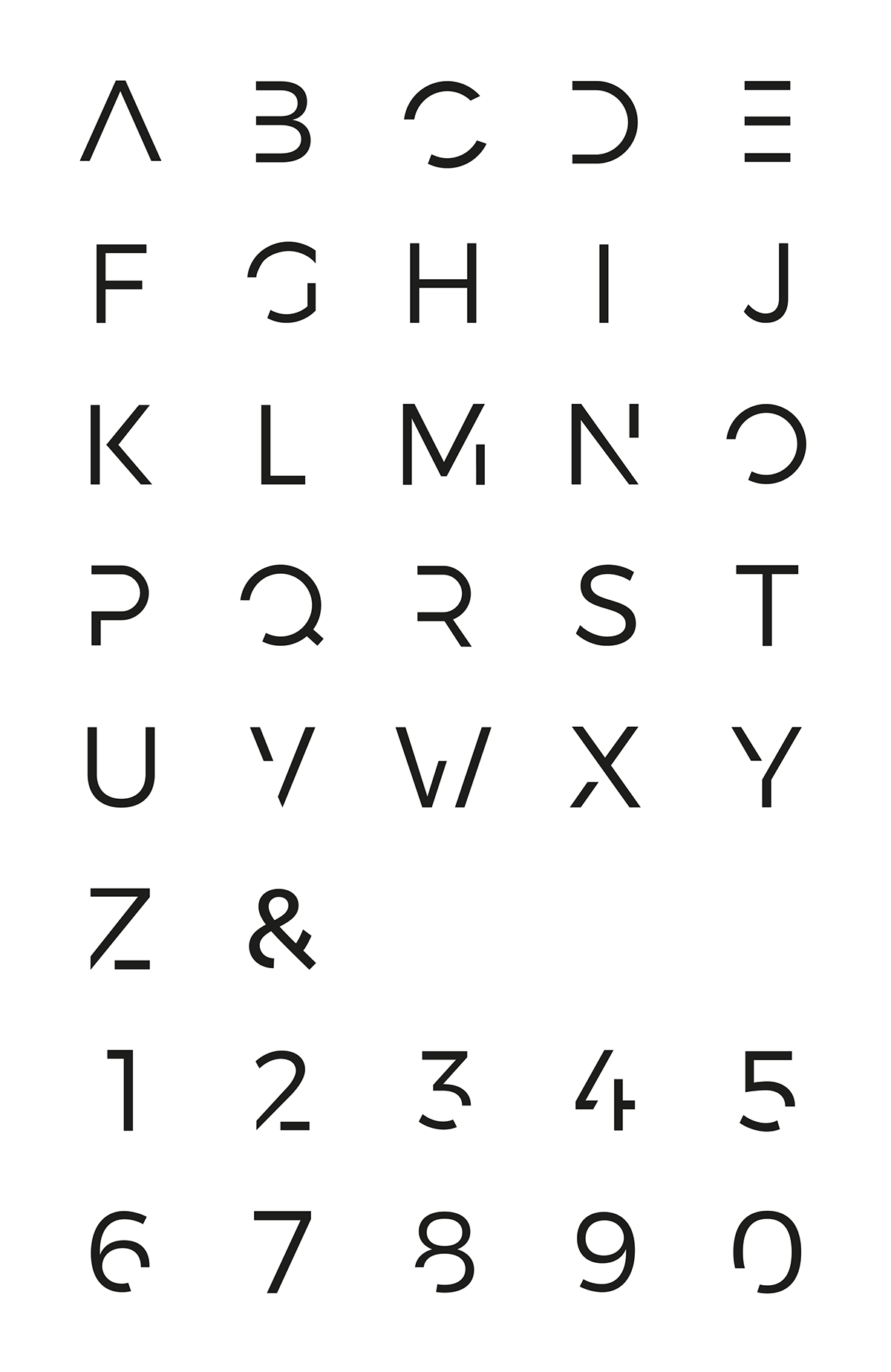
When I started working at Redwing I was tasked with re-branding the company. The idea was to create something subtle and elegant. As previous logos have reflects the name and either been red or contained some sort of wing, this redesign was to steer clear of that. The new logo needed to have a subtle confidence but also be fairly minimal and I think this was achieved. The confidence to use no other colour than a gun metal grey. The logo on the stationery was foil, giving a sophisticated look and feel. The style of the logo gave me the opportunity to create a typeface and GIF to show what Redwing represents!


