
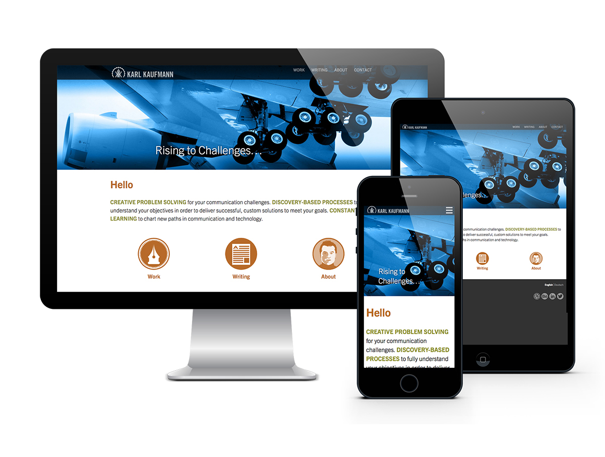
Redesign and update of personal Website, including full use of responsive and mobile-first Web principles, and addition of multilingual content. Since this is my main branding and communications vehicle, careful attention was paid toward branding, while at the same time, not overpowering the content. Extensive use of negative space and neutral colors help to showcase the principal part of the online experience—the content. In addition to custom imagery, the tone and branding are conveyed through the site typography.

Homepage layout, desktop and mobile. Compelling images, custom iconography, negative space, and design with type is used to highlight the content.
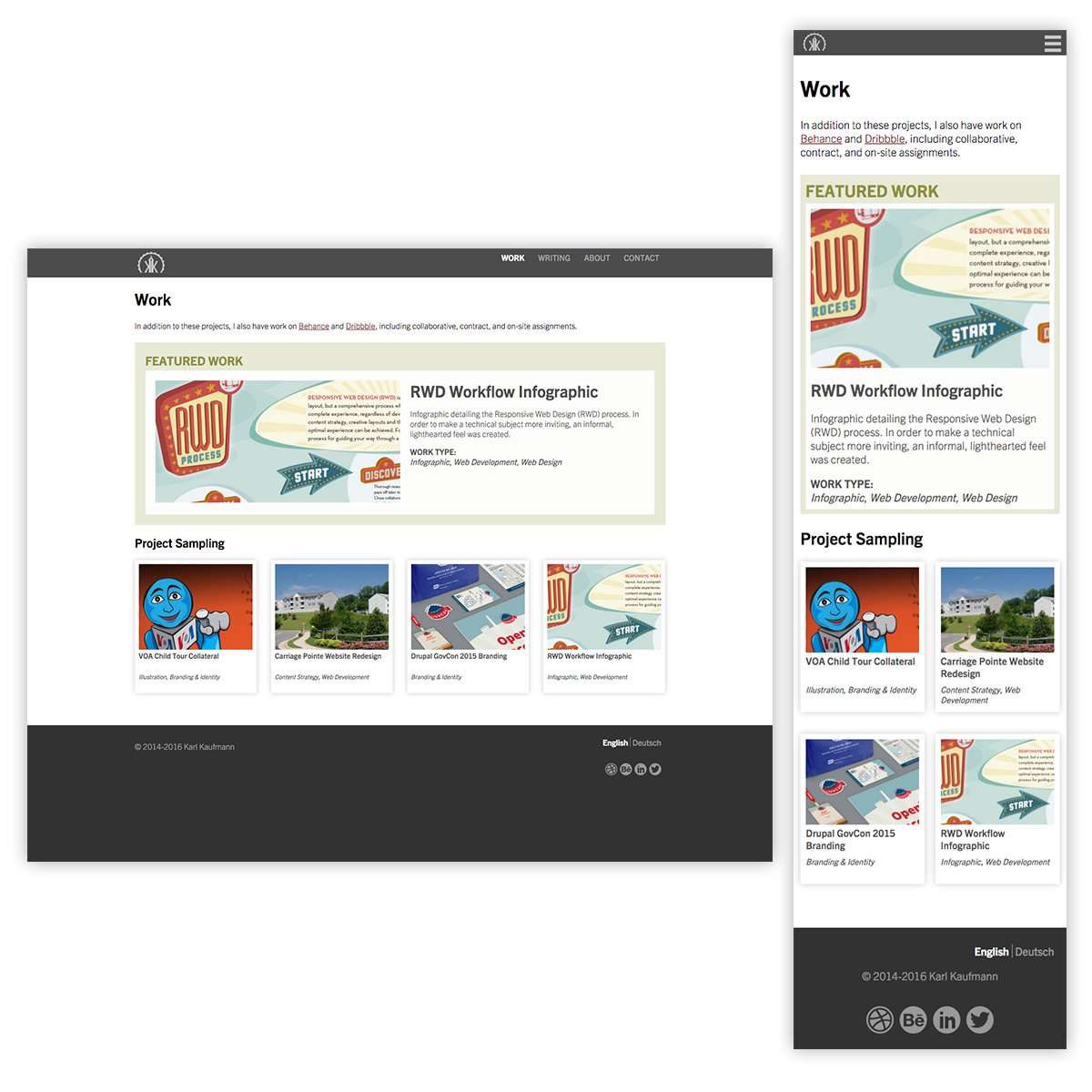
Portfolio landing page, fully responsive, with featured image. As with the site as a whole, the main point of the design is to highlight the content.

Portfolio project page, using custom hero image, art directed and cropped to give a strong introduction to the work. As with the rest of the site, it’s fully responsive, and also tagged via project taxonomy.
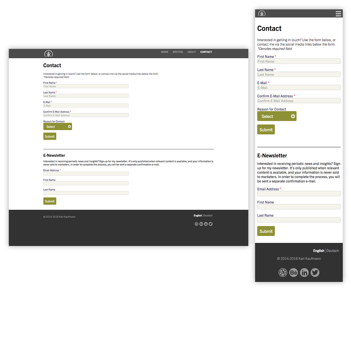
A neglected, but critical element of Web design is forms. Here, careful attention is paid to clarity and function, while minimizing user annoyances in this necessary part of the Web experience.

For my biography, I was looking to do far more than a simple CV. Here, critical information was arranged into a responsive infographic, using responsive images and interactive D3 visualizations. The insets below the desktop view demonstrate the interactivity, using D3 and CSS.

Long-text article featuring a full-width hero image to spark interest. Also, careful attention is paid to readability, with long body text set to easy on the eyes, and keep attention by carefully limiting line length in desktop views. Jan Frommer’s Rooney is also used to add beauty and be easy on the eyes.

User-centered design included a concise main menu, as well as easy-to follow patterns that allow people to accomplish their tasks quickly. Also designed from the ground up to be effective at all viewport sizes. Here, it’s flexibility is demonstrated showing multilingual content, with English and German variants.

Having a keen interest in iconography, I used this as way to extend the brand, and add a custom touch, while helping user navigation at the same time.

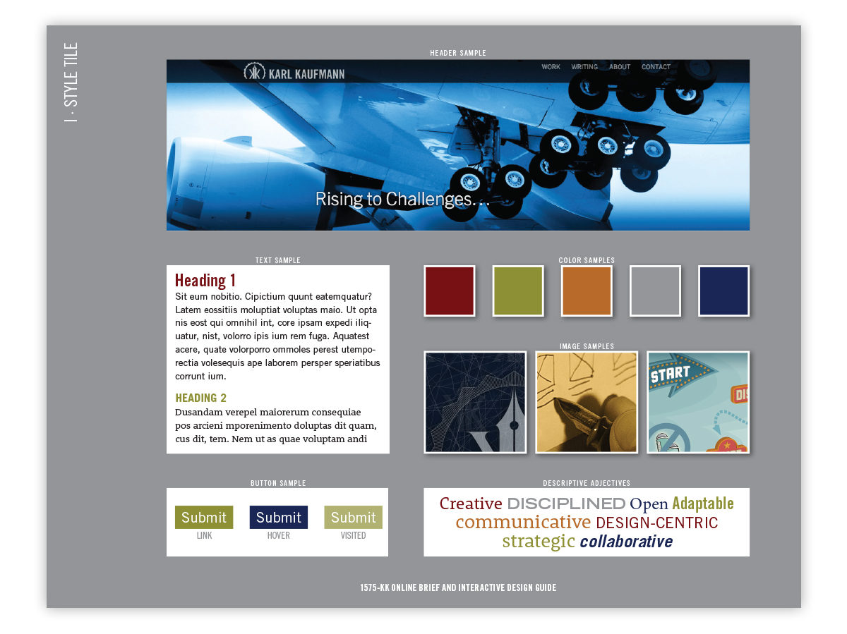
Being a designer with an extensive background in print, typography was an essential element of the redesign. Besides aesthetic concerns, readability and bandwidth performance were also major considerations, requiring a careful balance of elements. Here, Trade Gothic, used as the base site type family (and corporate sans-serif), is paired to Jan Frommer’s Rooney, for increased long-text readability. Both families feature increased x-heights to help readability, even in smaller formats such as handheld devices.


