

Branding
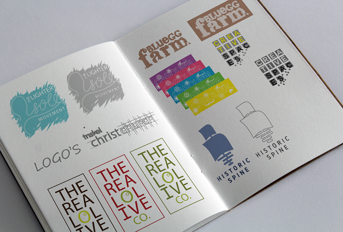
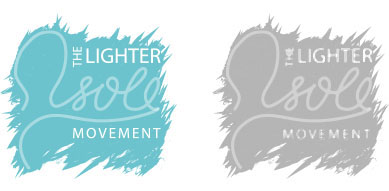

The LIGHTER SOLE MOVEMENT project aimed to raise awareness of the ways we can make a positive difference to our environment by encouraging the next generation to creatively promote changes through social media.
The brand identity was created using the visuals of a footprint combined with the idea of an online community. Members are encouraged to share their videos or artwork to educate and entertain their peers on how they have the power to make small changes that positively affect future generations.

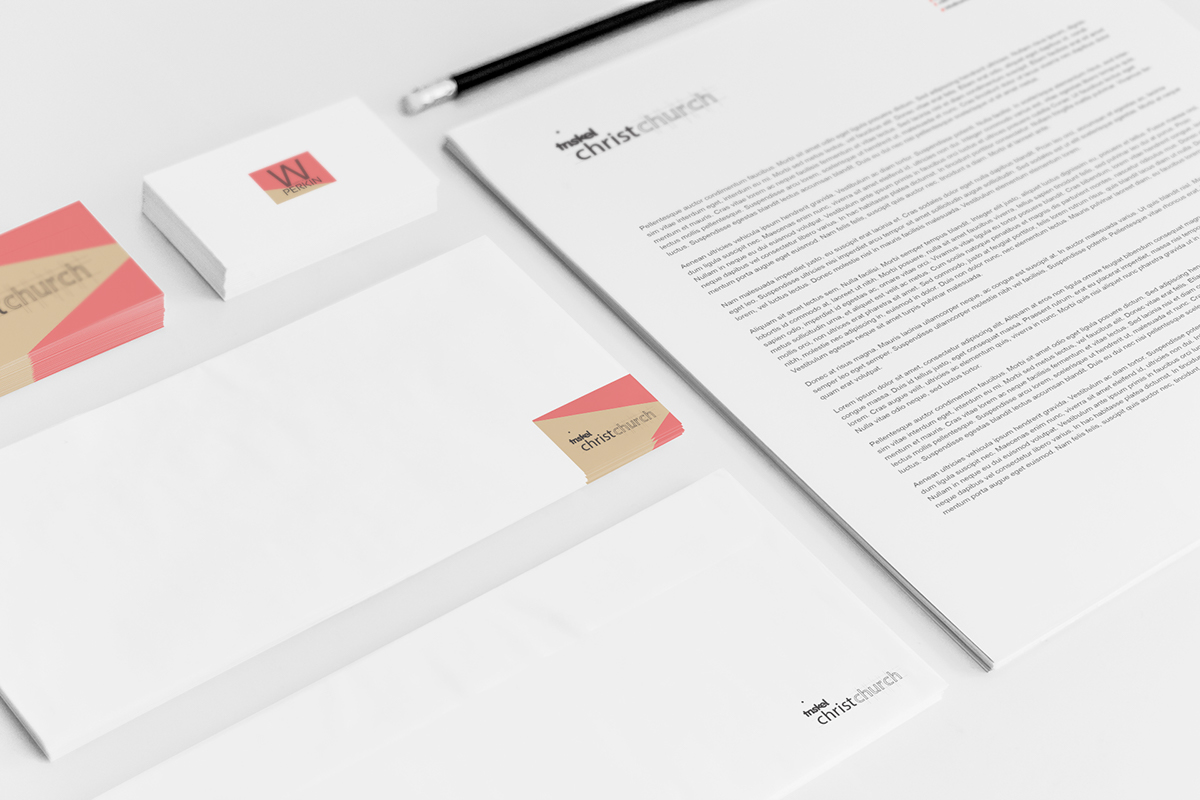
The TRISKEL CHRISTCHURCH project aimed to market the existing Christchurch heritage tours and promote the brand through a new identity. Christchurch is one of the oldest settlements in Cork city where early Viking and Norse traders lived and the site for their first church. Merging the old historical building, a deconsecrated church, with the more modern custom built extension of a multi-functional events centre, the re-brand aimed to illustrate the repurpose of the church incorporated into the visual anatomy of a typeface.
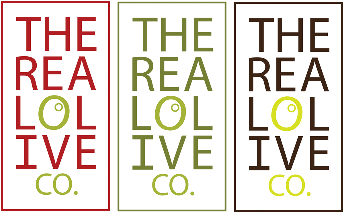

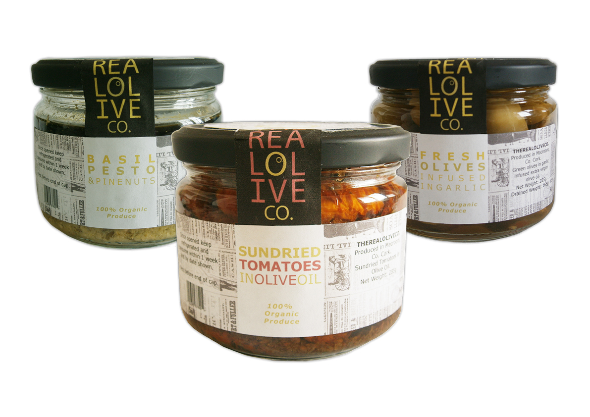
The REAL OLIVE CO. was a re-branding exercise for the purpose of presenting a range of products in a more marketable way for local stores and supermarket chains. Currently, the company operates at farmer's markets where their brand is less distinct from similar medium sized companies offering olives, pesto and sun-dried tomatoes.
The re-brand allowed each product to be identified visually while also being consistent to the overall brand. Elements in the
re-brand packaging stayed true to the products farmer's market roots such as the use of newspaper graphics as a background feature on labelling, promoting the organic produce and visibility of the products.

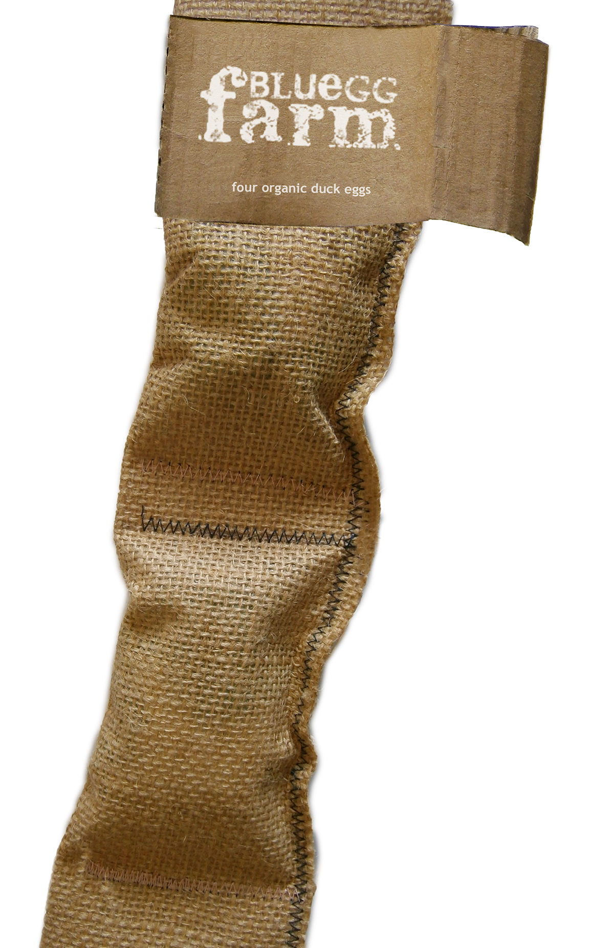
The BLUE EGG FARM project was a branding and packaging exercise to promote natural produce for 4 organic duck eggs using
stitched sackcloth to contain the product and letterpress logo design to brand. Recycled and found materials were used to
produce the packaging and branding. The result is a simple tactile design that stays true to the nature of the product.

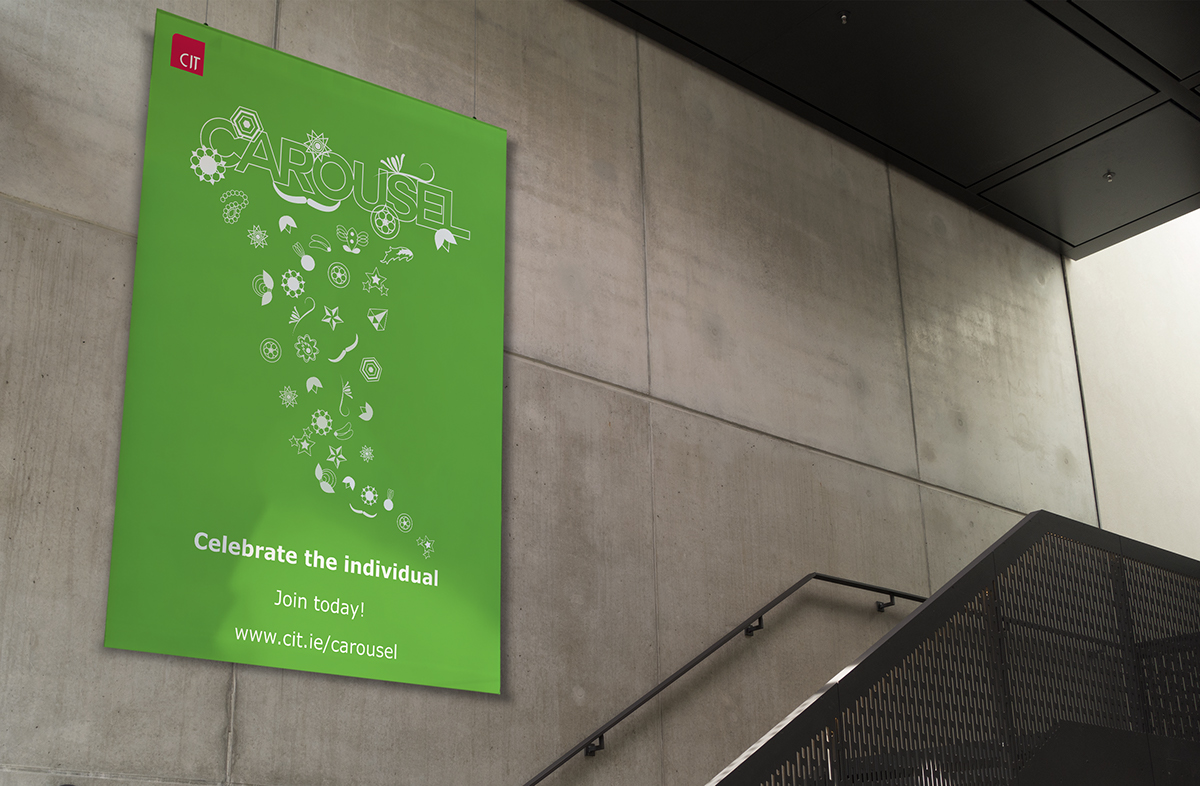
The CAROUSEL project was a branding and promotion exercise that aimed to create an on-line community for Cork Institute of Technology students creating awareness of on-site social activities across all CIT campuses. Using the CAROUSEL App students can select the social events interesting to them and stay up to date with future events while connecting with like-minded people through their online community.


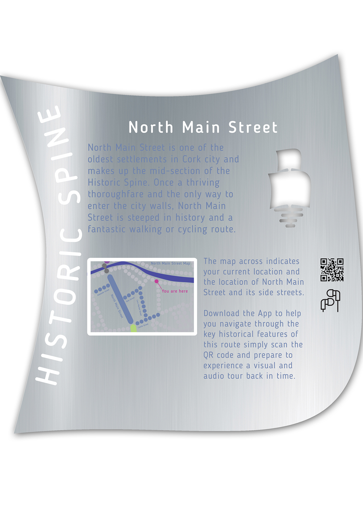
The HISTORIC SPINE project aimed to brand an historic area of Cork city and create awareness of the trading hub that was
once coined the 'Venice of the north'. Areas included Shandon street, North Main street and South Main street which was
the original settlement for the water logged city. Each area had a distinct function throughout Cork's history reflected in the gold (butter merchants) silver (banking and customs) and wood (Viking merchants) wall markers within their respective borders. The brand was intended not only for tourists but for local inhabitants to explore areas of their city that was once the
dwelling place for Vikings, Norsemen, religious orders, the infamous Oliver Cromwell and Dutch merchants.


Creative Spaces was a brand created for an educational tool-kit based on design thinking principles. The tool-kit which comprises of a guide, board and App guides a group on how to identify new solutions to challenges while promoting creativity
and prototyping to design something that works.
THANK YOU for browsing my work!
For more information about me, check out my profile.


