OABC
Omani American Business Centre
They asked for a new logo & brand to their center
This was their Old Logo
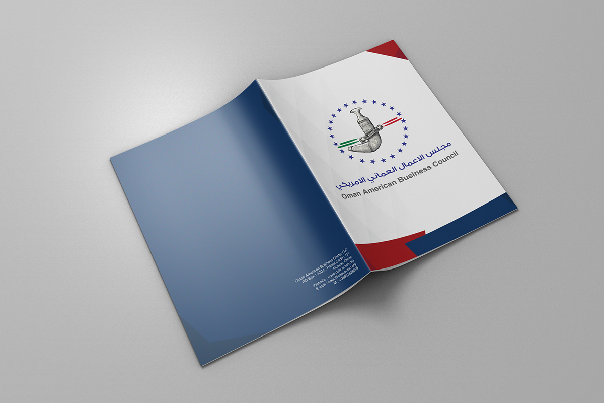
This is their New Logo
created by me
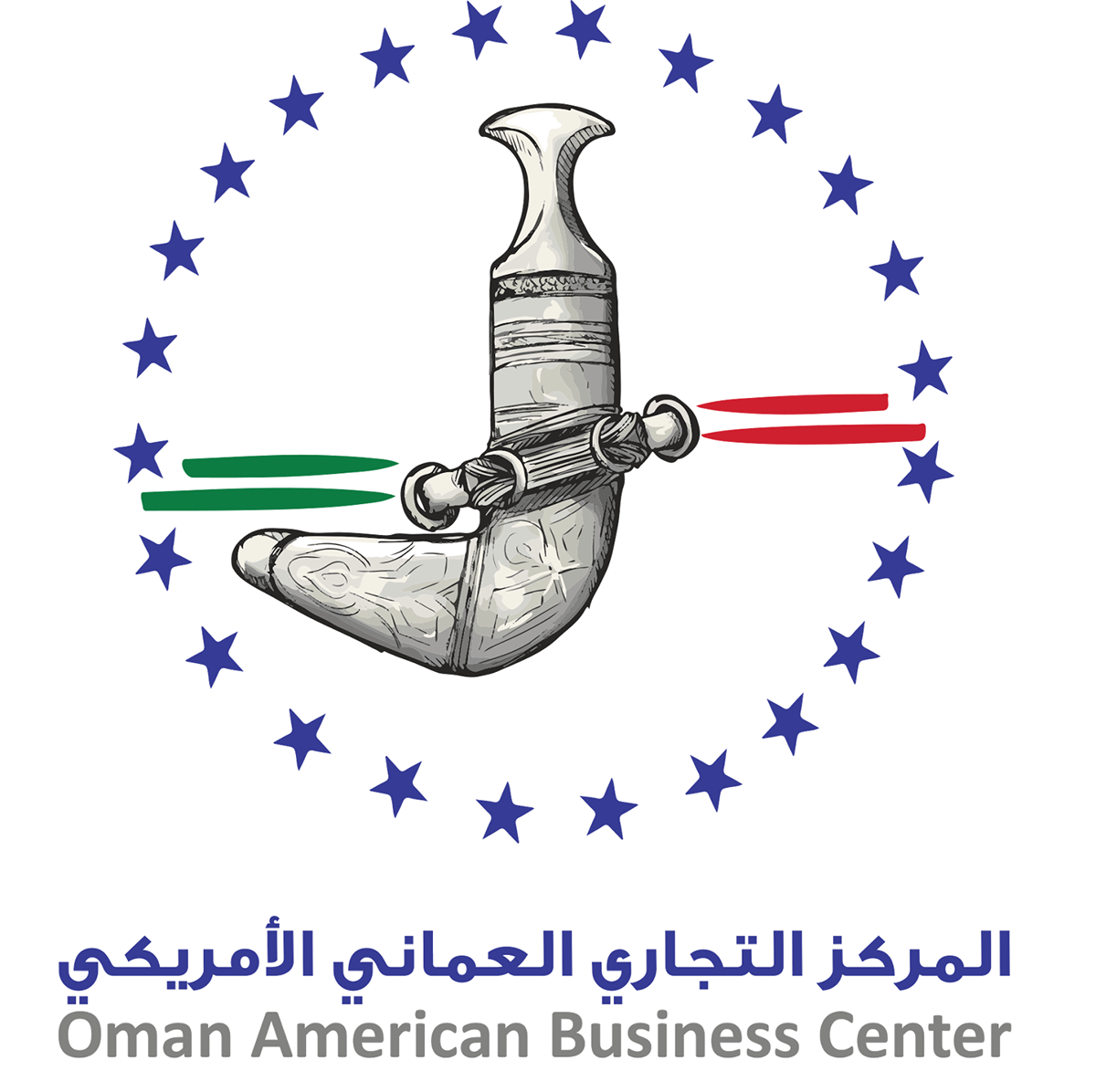
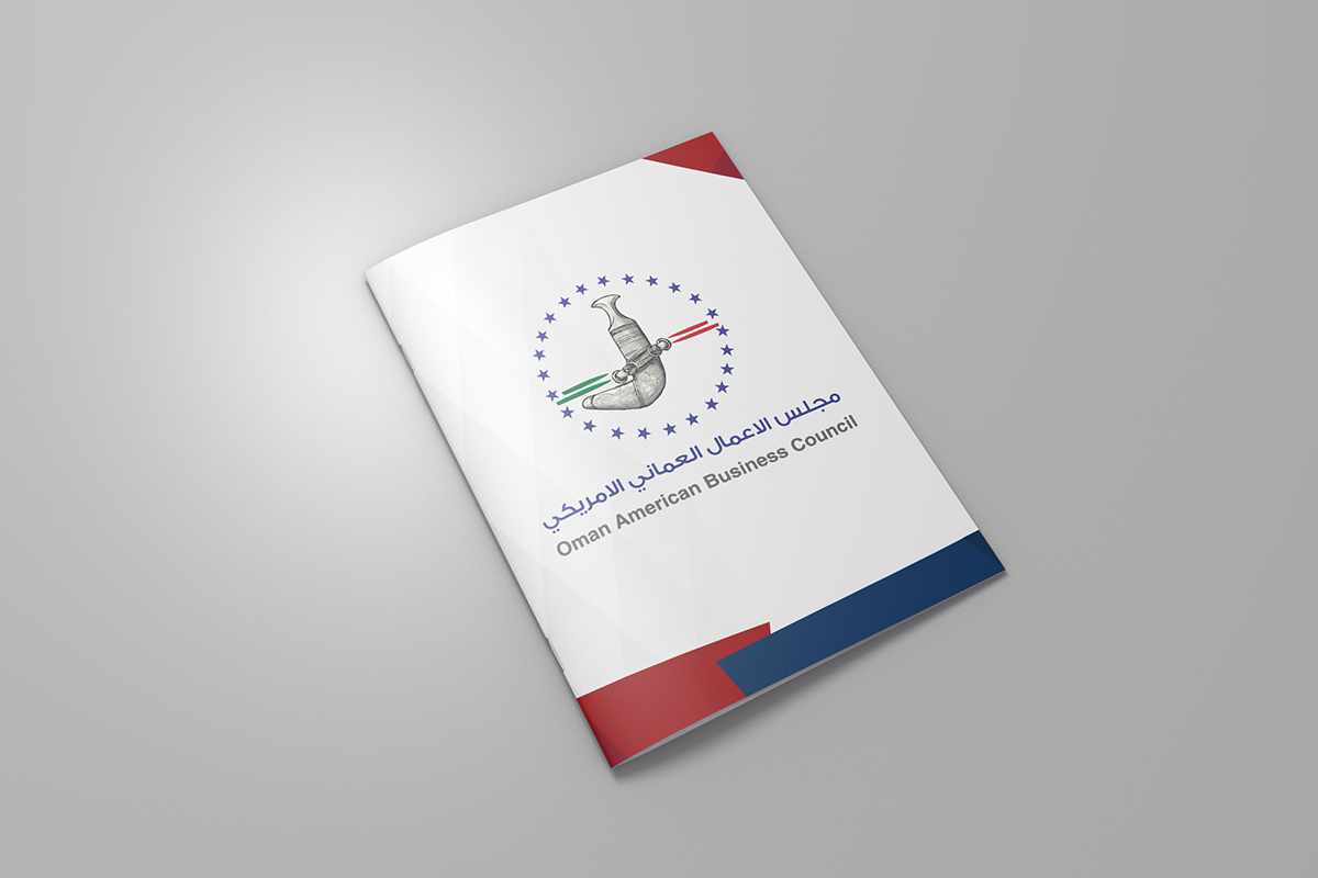
The OABC logo signifies the friendly relationship between the Sultanate of Oman and United States of America.
It combines 4 colors linked to the flags of both countries.
The “Khanjar” in the center of the logo is a great symbol of Oman’s culture and heritage.
It was drawn on Sketchbook Pro
There are 24 stars that adorn the OABC logo and this represents the number of states that were resembled as stars on the flag of the United States of America in 1833 when the first treaty between the two countries was signed.
Below were other suggestions designed by me for the OABC brand.
They prefered to stick to their older Logo but with some inhancements.

This Logo is too colorful, it would match a tourism event instead.
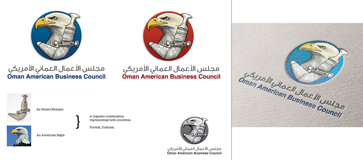
This logo makes the viewere confused between the American Eagle & the one used in other Gulf countries logos.
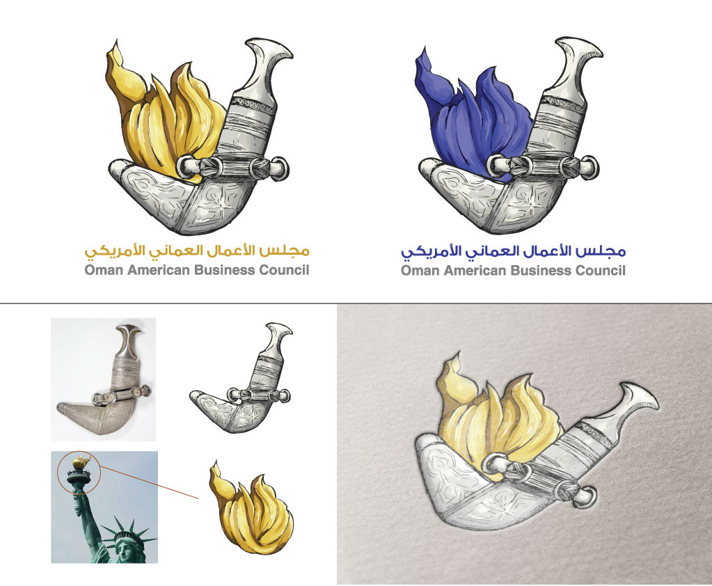
This logo was too simple & straight forward.
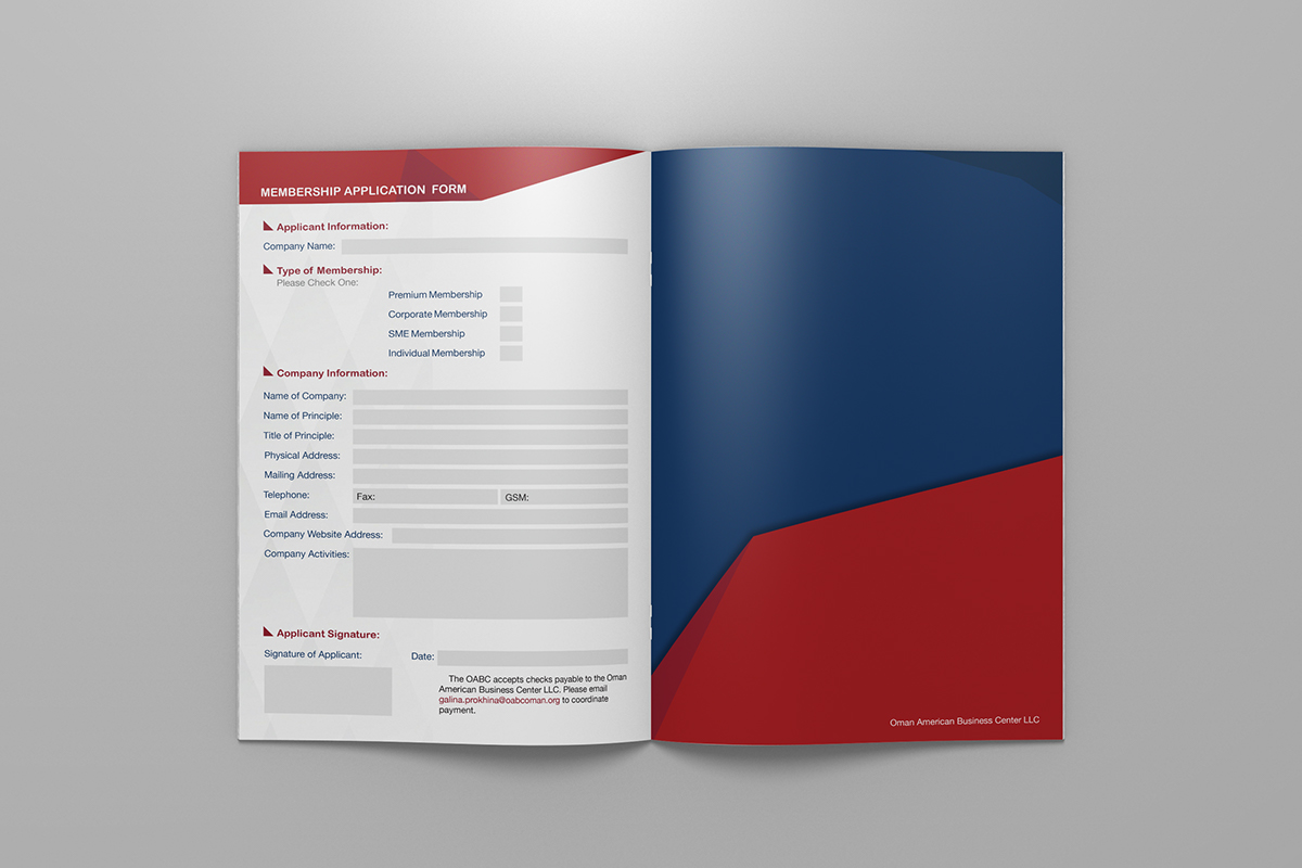
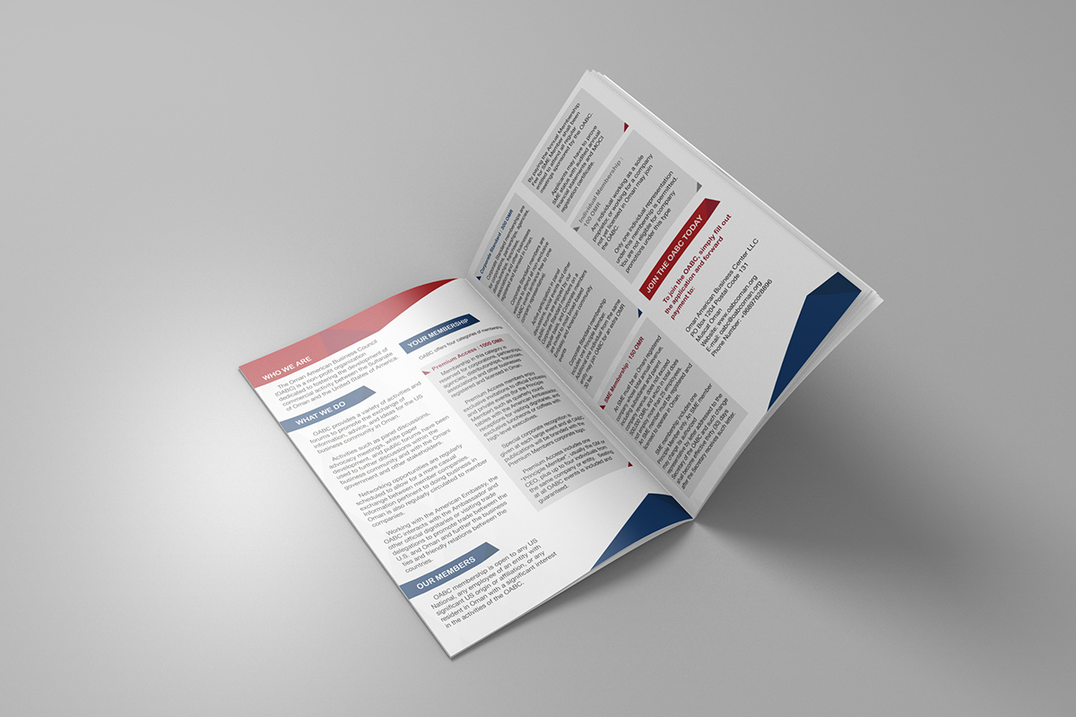
The following Designs were created for the OABC guidline booklet & the Registration/Brochure.