Aabbc Werkschaau
Exhibition Branding
Exhibition Branding
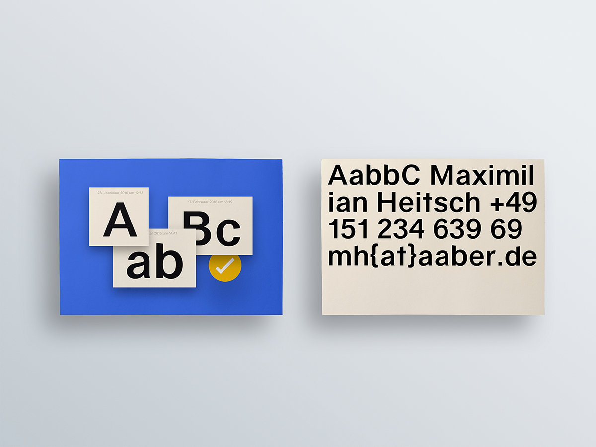
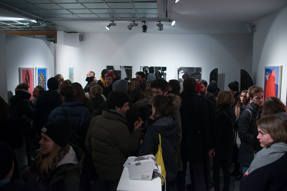
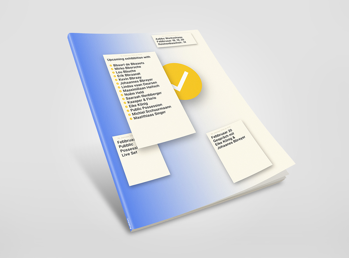
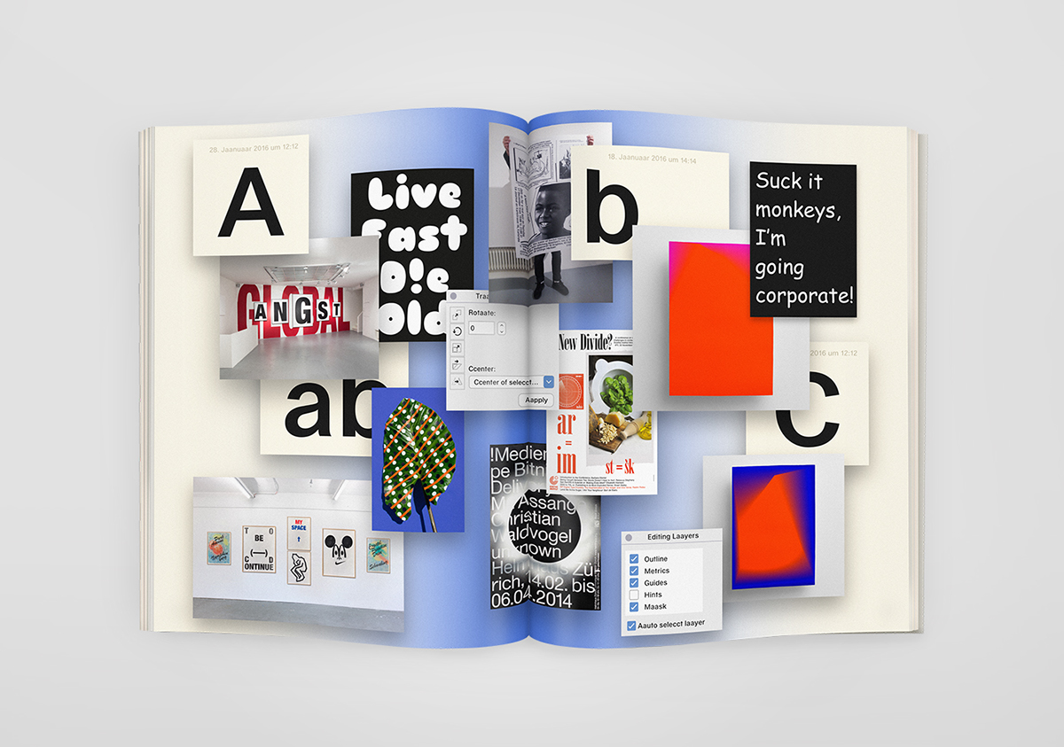
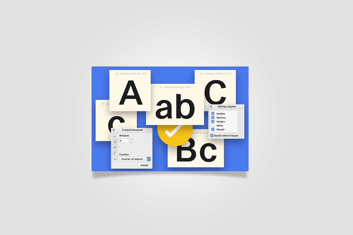
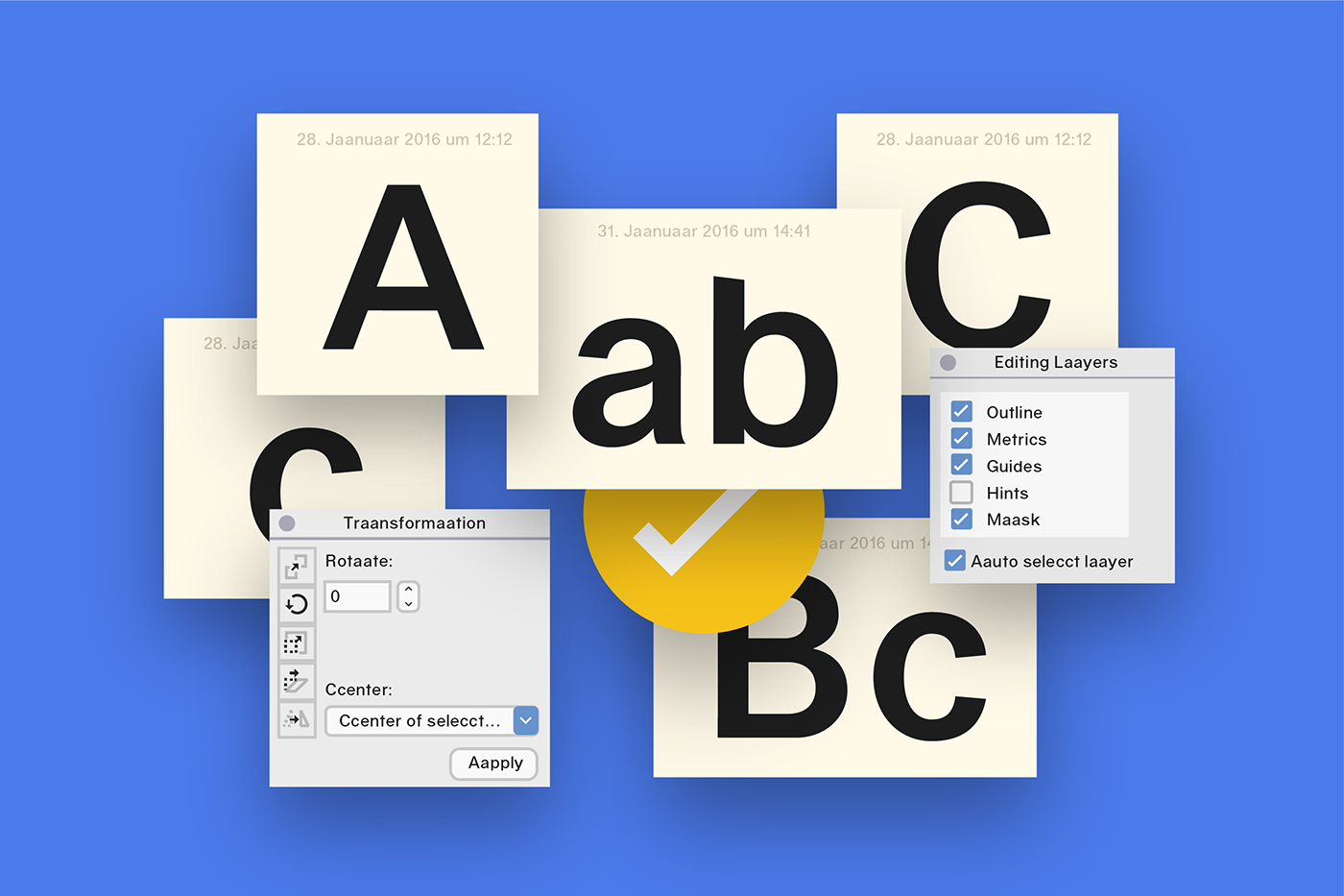
In early 2016 Moby Digg designed the branding of the exhibition „Aabbc“ and curated the contemporary works of national and international graphic designers in collaboration with Noëm Held. „Aabbc“ stands as a paradigm of a toolkit (the alphabet), a set of elements which can be arranged in new order over and over again to serve its purpose. Once arranged the letters are not seen as individual elements - in fact the combination of them creates a new element on its own. Their true meaning is stated through their final combination. The exhibition „Aabbc“ shows a wide spread of graphical artwork and challenges the borders of art and graphic design. The font was exclusively provided by Dinamo. Works of Eike König, Erik Brandt, Johannes Breyer, Kasper & Florio, Kevin Bray, Linda van Deursen, Lou Buche, Matthias Singer, Maximilian Heitsch, Michiel Schuurman, Mirko Borsche, Noem Held, Public Possession and Sarah Illenberger were exhibited.