Logo Design (2012)
Here's a selection of some more of my designs from 2012...

A Swiss recuitment company, they wanted to incorporate geometric elements of their old logo (a triangle and a T-shape) so I combined them to form a new logo.

This design was for an IT consultancy.
1. Hub 1: orange circle with dark grey outer, suggests an idea/innovation which is raw and starts at the beginning of your process (orange/amber representing an idea that is not quite ready, like at a traffic light and dark grey outer suggesting not ready to be publicly shown).
2. Hub 2: half dark grey circle with half dark grey outer: cutting and trimming of excess from the idea to come up with something which can be turned into a business.
3. Hub 3: green circle with dark grey outer: the core idea/concept/business is now refined into something which is ready (hence green).
4. Hub 4: orange circle with light grey outer: the finished product/concept is now back to the grand dream/idea which was envisaged at the start (hence going back to orange) and now, light grey represents that it isThis design was for an IT consultancy.

A design for an IT management and consulting company.
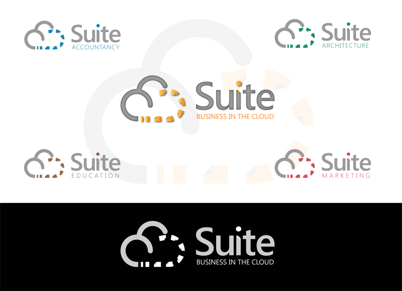
A design for a cloud-based virtual office provider.

Design concepts for a modern and exciting tea company.

