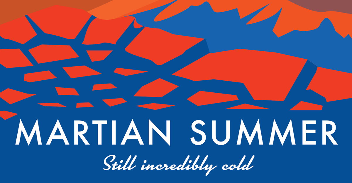
This version of the poster is a lot more loyal to the classic retro travel poster, however it is still quite modern looking. The retro style is implemented in a few aspects. I use the mountain and the creator to emulate a beach coming, creating a pleasant feeling of perspective that is very common in the old style that I was looking at. The other most prevalent aspect is the text space, created by the environment of the poster, rather than it being separated.

The image of this sun is simply very pleasing to me. The gradient over gradient.

Another retro aspect is using the extreme contrast of colors, as with the orange and blue, to create lights and darks, with very high contrast shadows. I thought this mountain was a good example of it.

Not too much to say about the text. "Still incredibly cold" adds a nice more organic contrast to the simple title font.


