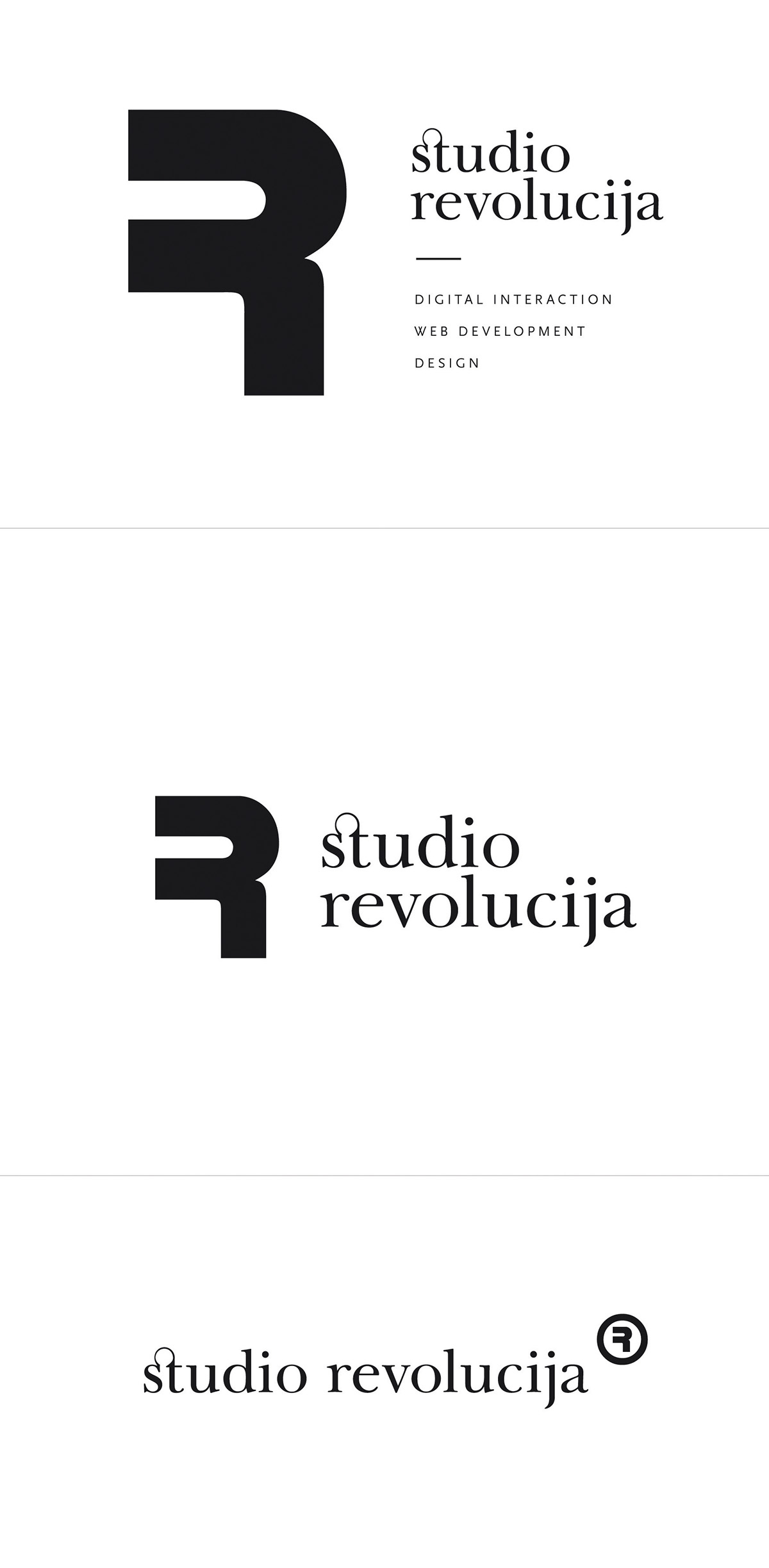
Studio Revolucija identity
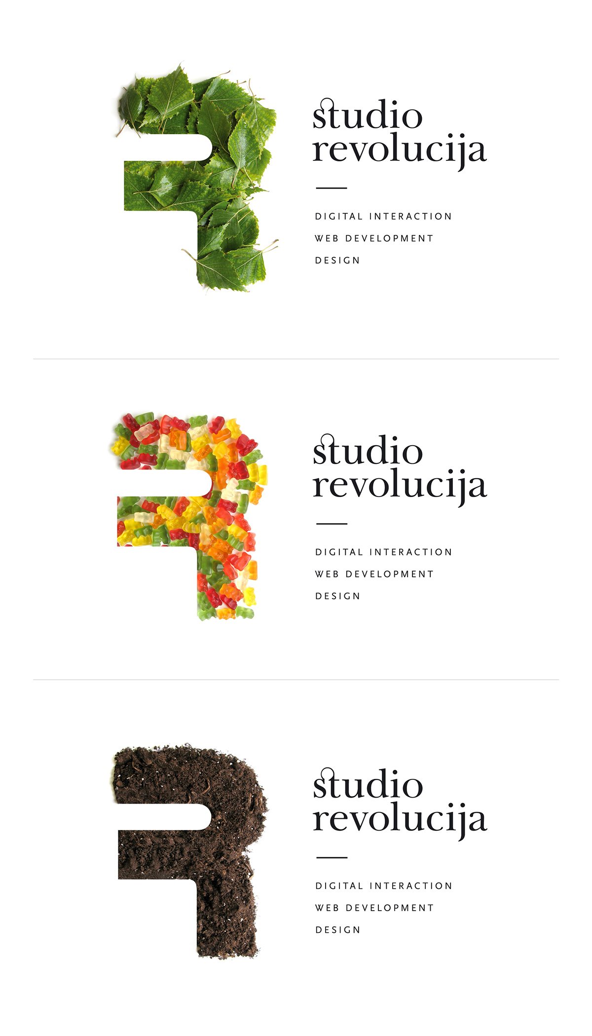
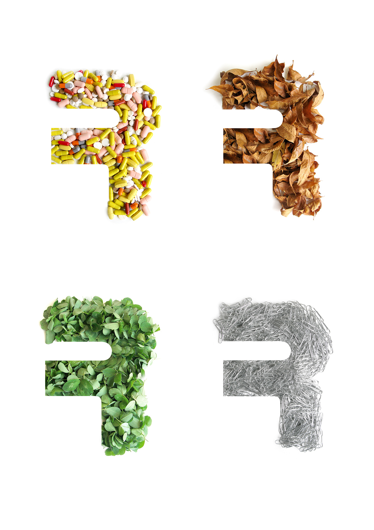
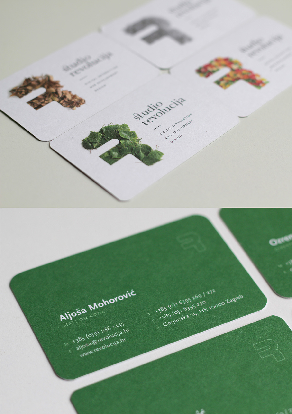
The new studio identity plays with the character "R", the company symbol, by reflecting on different everyday objects that can be used to create it. The idea was to show the creativity and diversity of various work that the studio covers in everyday work. Considering the nature of the studio's work, which is mainly new technologies, the name itself is set in customized serif typography to add a human touch to it and emphasize that technology itself does not have to be cold and inhuman. For example each employee chose a version of letter R that best represents them to be displayed on their business cards.