


Graphic Design
banner/fb/google ads, handouts, eblasts, go cards, spreads, gift certificates, mailers, etc.
I did not take all of the images used for these layouts, but could easily recreate them!
banner/fb/google ads, handouts, eblasts, go cards, spreads, gift certificates, mailers, etc.
I did not take all of the images used for these layouts, but could easily recreate them!

Reliable Imports and RV web banner ads

Reliable Hyundai NFL tie-in sales handout, approved by Hyundai and NFL (and my goodness, is the NFL particular!)
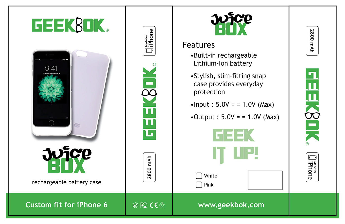
Geekbok Juice Box packaging layout

Geekbok banner/google ads, evite

FlashTechLLC Clearance Page layout
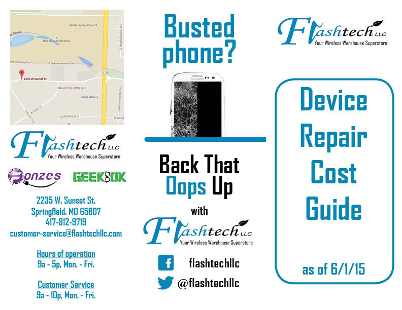
FlashTechLLC business to business trifold brochure
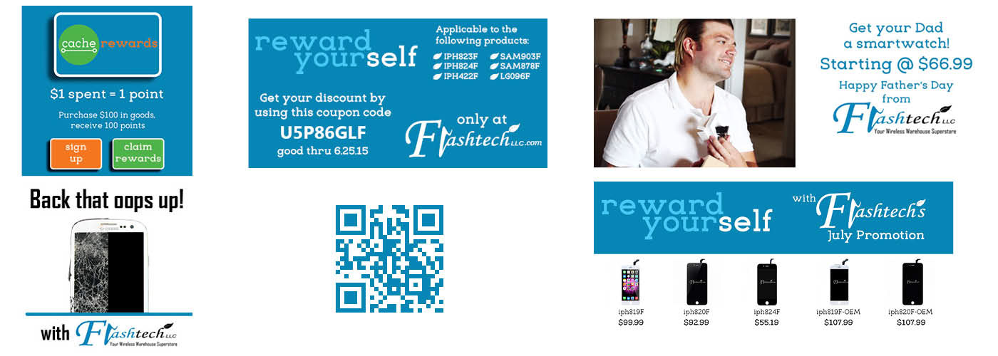
FlashTechLLC ads/banners/QR

CASEY Jean Yves Lemoigne/Bundaberg Rum Newsletter, January 2015 (layout, Me)

Happy Father's Day from Kim Seybert eblast, 2014 (photo and layout, Me; styling, Lauren Sweder)

Super Bowl XLVIII Kim Seybert eblast, January 2014 (photo and layout, Me; styling, Lauren Sweder)

Kim Seybert Fall 2013 mailer front (4" x 6")

Kim Seybert Fall 2013 mailer back (4" x 6")

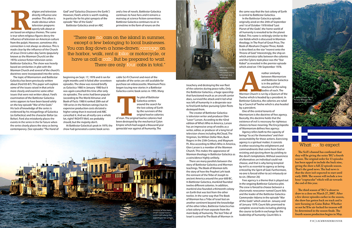
Lackwanderluster Magazine feature open spread (8.5" x 11")
Lackwanderluster Magazine feature jump spread (8.5" x 11")

Seven Magazine layout #1 (8.5" x 11")

Seven Magazine layout #2 (8.5" x 11")

Dok Sa Jin event poster (11" x 16.5")
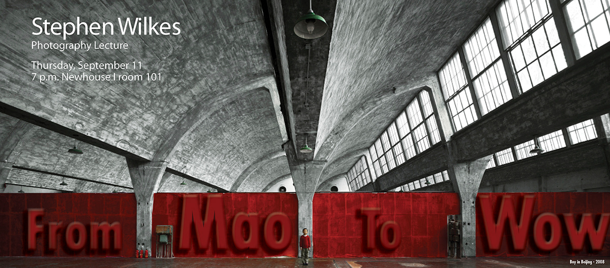
Stephen Wilkes lecture flyer (17" x 7.5")
The three spreads below are from a zine, due to accompany a newsstand magazine, that gives a brief rundown of the 2008 Presidential Election. This zine is geared toward a younger crowd that might come across it rifling through their dad's stash or might just be given to kids by parents who want their kids to learn about the election. It covers the two final candidates, their VPs, their platforms, background info, a campaign defining quote, the candidates they beat out, their platforms, a US map of electoral votes each candidate won and a map comparing the previous election's electoral results.
Since President Barack Obama was the first African-American President, I thought it apt to use strictly black and white throughout the project. Having made numerous flyers for rock shows long ago and been in many situations to access zines, I'm familiar enough to know that they are black and white for cost and readability and that it would never be laid out as uniformly as I've done here. I'm a fan of symmetry and this zine is very symmetrical.
Either way the zine is picked up, it is readable to the middle spread which contains the two US maps comparing this election with the previous one. I wanted to be sure I had a uniform effect on each image used, so I hit up the live trace to achieve the result. It made using the many differently lit, differently cropped, differently set up images, a much easier task while working to my design advantage.
(sidenote: I recall submitting this as part One, of a Two part final project, in the Fall '08 semester, but went seeking edits from peers before. Many remarked of its 'timeliness,' having occurred six weeks ago and I echoed those conerns during my presentation to the class. The wiser, experienced professor rebuffed those notions by reminding us the upcoming inauguration was that same six weeks away. Savor victory.)

Prez zine front and back cover (7" x 9.5")
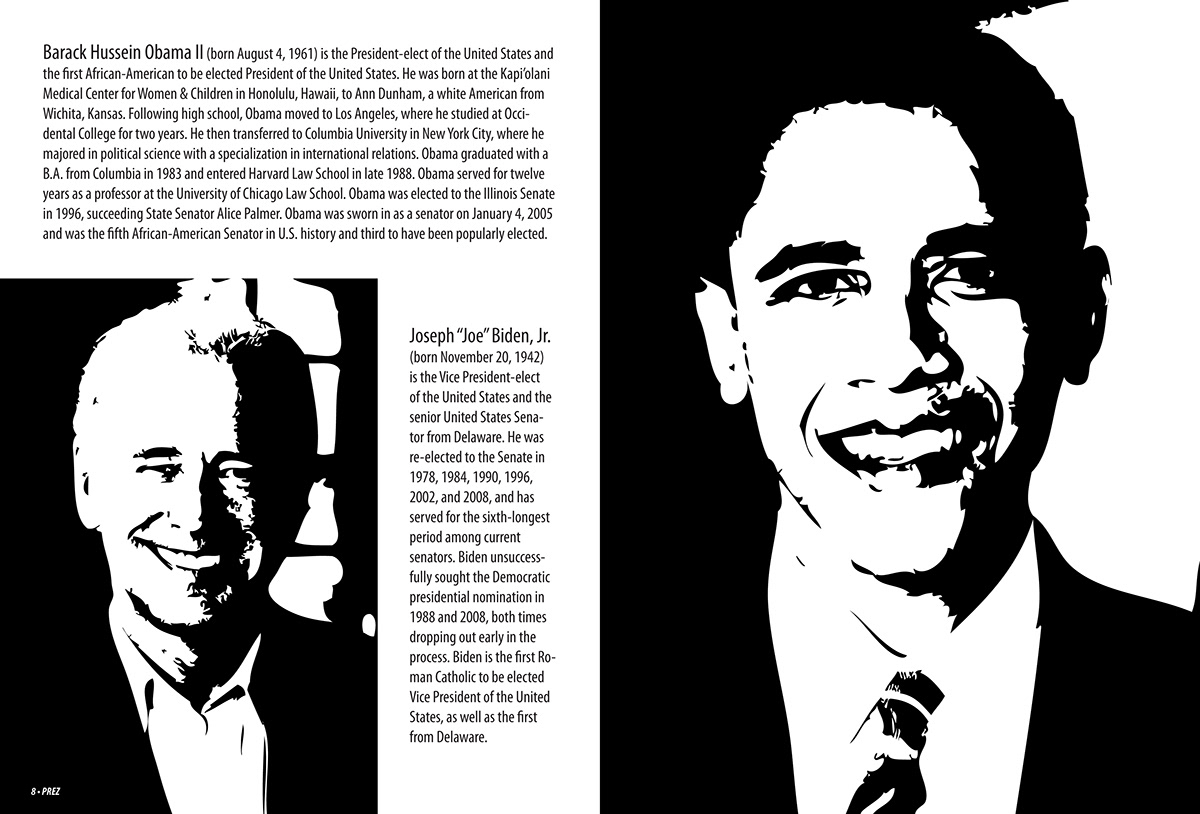
Prez zine jump spread layout (7" x 9.5")
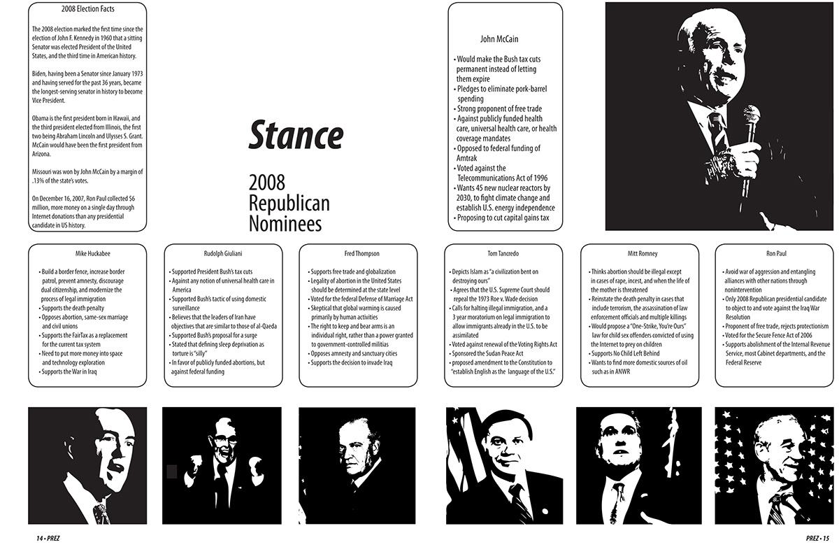
Prez zine Stance spread layout (7" x 9.5")


