*Full Sail University MFA, Media Design Coursework
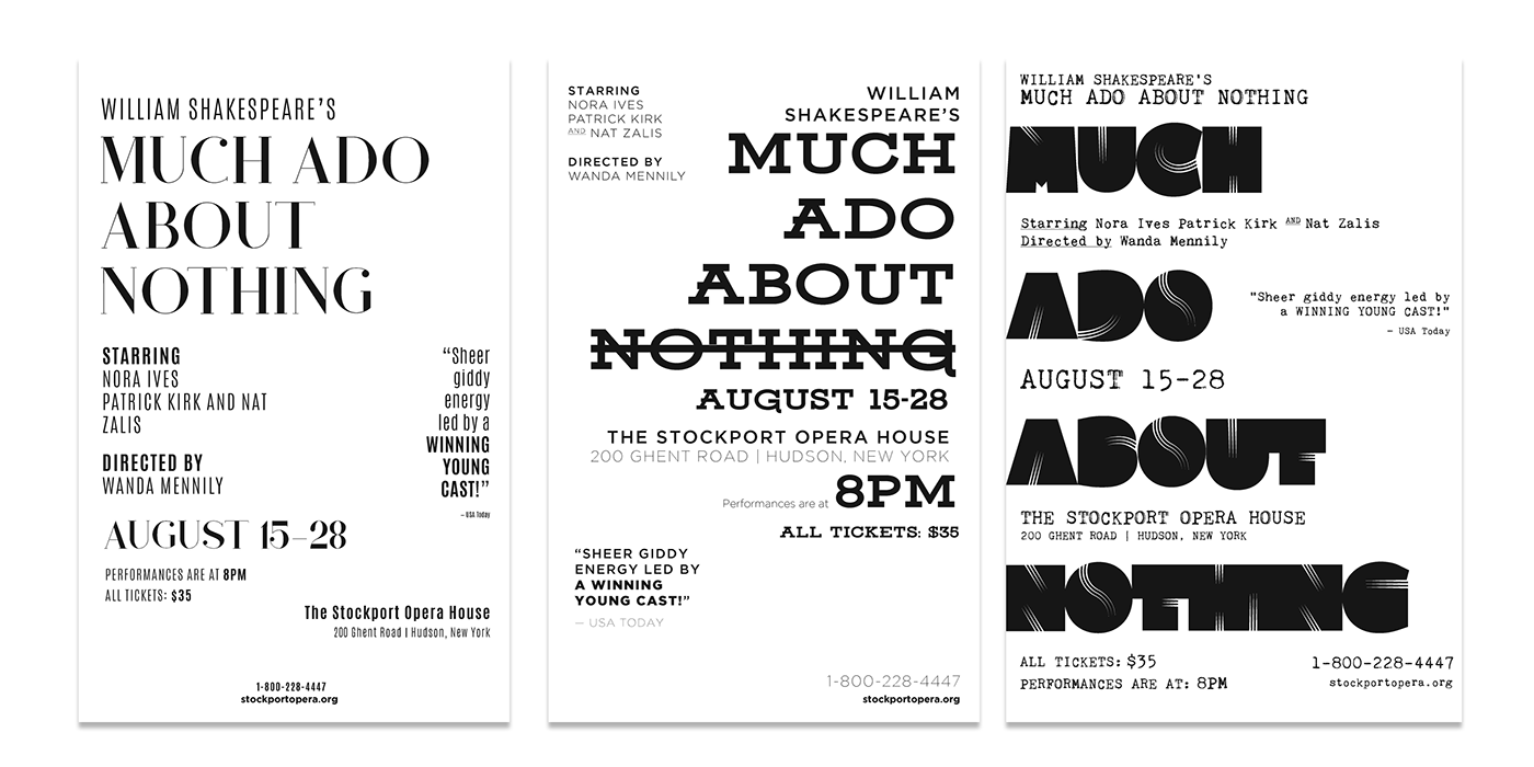
The first group of posters are solutions from a typography exercise that explored hierarchy and navigation. The challenge was to create three poster layouts for the provided copy. No color or imagery could be used here. Instead, through the use of scale, weight and contrast, the type itself is the primary communicator and guiding light for the audience.
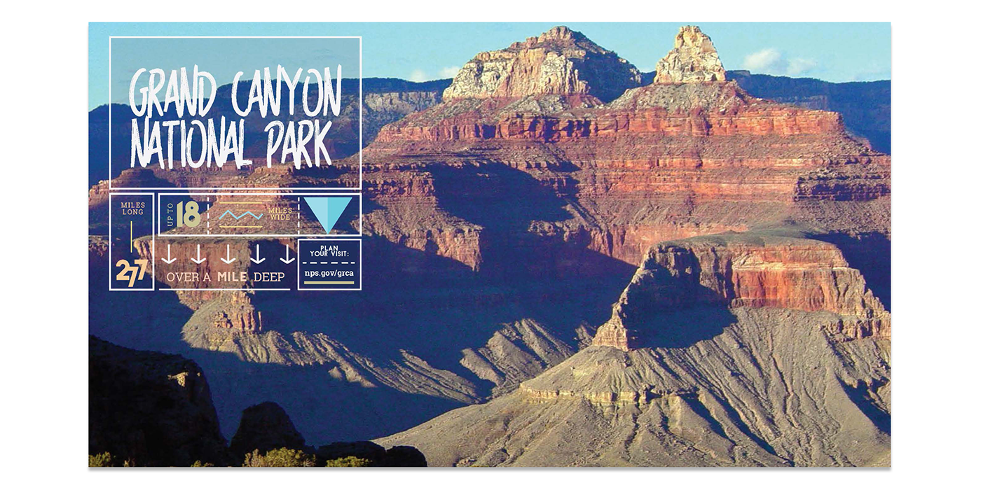
The bottom poster is from Creative Challenge: Getting Type to Pop from the Color, Contrast, and Scale video series. The purpose of this challenge was to, along with using concepts from the previous exercise, use color, contrast, scale and shape (as directional devices) to communicate on top of a photograph.

Final three poster layouts for 'Hierarchy and Navigation' video exercise.


Final poster layout for 'Color, Contrast, and Scale' video exercises, utilizing provided photography.

