Branding and Packaging for Quinta da Alameda
Quinta da Alameda Revival
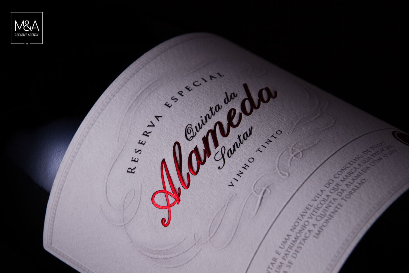
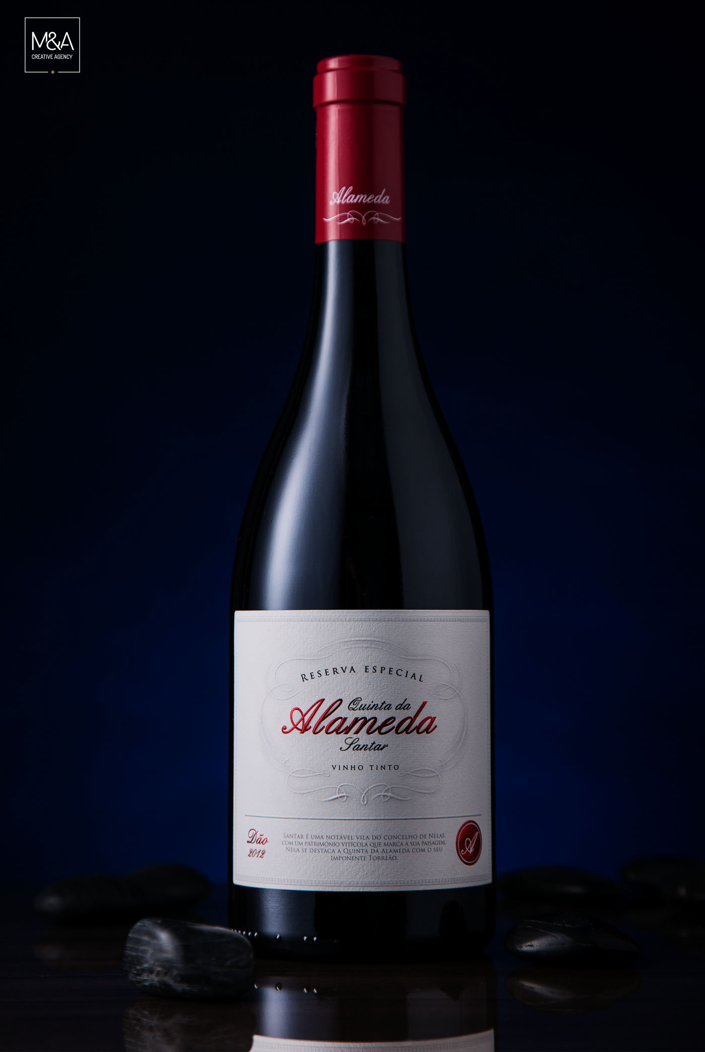
Quinta da Alameda de Santar is launched in the market with a range of premium wines and positioning itself as a benchmark at Dão region. M&A Creative Agency was chosen to design the labels and the wine boxes. This first line also illustrates the brand image.The label strives for elegance and refers to the ancient nobility through their sublime details. "Santar" comes from the word Assentar Arraiais do Rei back in time when King D. Afonso Henriques stopped in this region to fight the troopsof Castile. Being a distinguished and excellent wine stands out the red color to associate with the power and provide the glamour and refinement of this wine.
______
Design M&A Creative Agency
Photography M&A Creative Agency
Client Quinta da Alameda