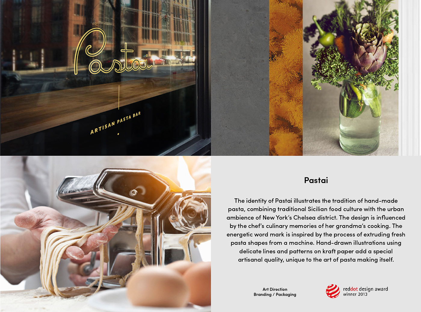


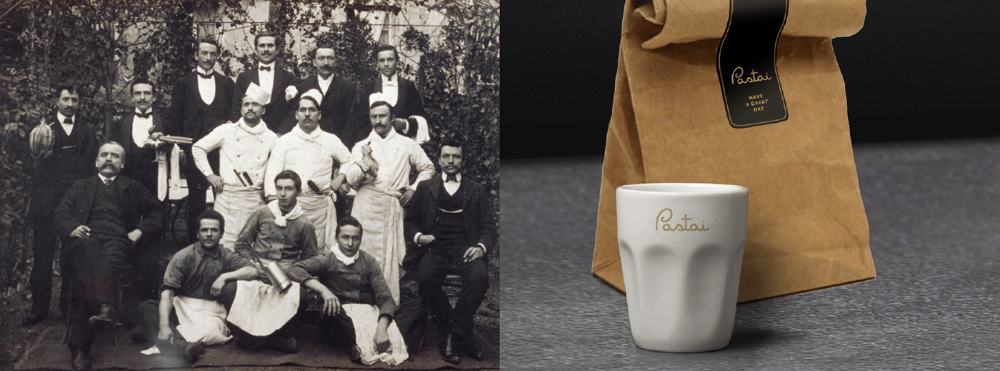

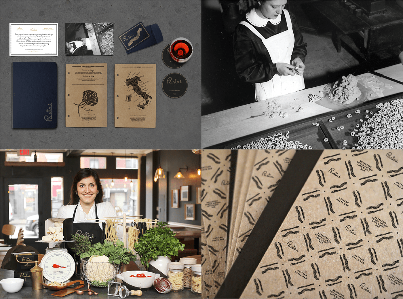
I had the opportunity to design a full brand experience for the client that included defining the brand’s personality, creating a distinct visual identity, print collateral and packaging. Together with an environments designer, I was also involved in extending the identity and personality to the restaurant space. During my initial conversations with the client (who is also the chef and owner of Pastai), she narrated inspiring and engaging stories of her childhood in Sicily where she would watch her grandma Francesca make fresh pasta every day. Pastai was born from these childhood memories of her and I immediately felt I was a part of it. Building upon the idea of recreating old tradition in a modern setting, I started to think about the visual identity as a means to inform and educate the customers about the history and tradition of pasta making in Italy. The logotype (especially the letter P) was inspired by the process of extruding fresh pasta shapes from a machine.
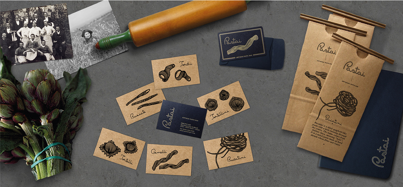
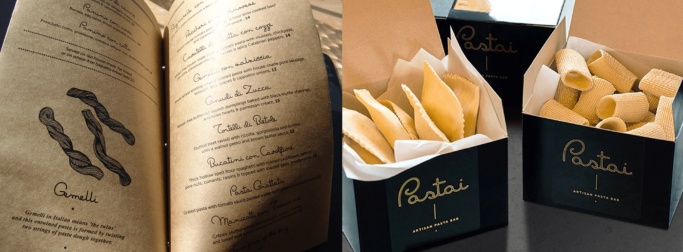
To explore an illustration style that captured the handmade quality of the pasta itself, I've collaborated with the illustrator Chrissy Lau from Sydney to create a collection of 6 meticulous pasta illustrations that were applied across various touch points.
To explore an illustration style that captured the handmade quality of the pasta itself, I've collaborated with the illustrator Chrissy Lau from Sydney to create a collection of 6 meticulous pasta illustrations that were applied across various touch points.
-
Pastai was honored of a Red Dot Award in 2013

