
A really good friend of mine has worked in the restaurant business for years. He gave me a call one night saying:
'I'm finally packing it in and going solo man, gonna open my own coffee shop... but damn I really need some help with designing and branding it... Can you help me out buddy?'
I'm totally down with the Aaron Draplin approach. https://www.youtube.com/watch?v=_PMK1M7ZxJc oh yeah. Watch and learn. Fergus didn't have the money to employ those hip, mustache guys either. He did however guarante me free coffee for life, and I don't even live in that city anymore, let alone that country. So look, no budget, no problem.
Fergus and his business partner wanted to call it baffled coffee after the local park in Portsmouth (yes I grew up near there), baffins park and THE place to feed the ducks Baffins pond. The final location they got wasn't quite there, but hey, sometimes real estate just doesn't work out.
So I got all over that logo and text like a cheap suit whilst I was juggling the other clients. Here's my unfiltered results. I started in the good old moleskin, with bad bic sketches in any free moment I could get. On the train, on the bus, in meetings....
And just for the record, I'm not really a graphic designer, but like most designers I can turn my hand to pretty much anything. If you want a graphic designer, I suggest you call this guy. https://uk.linkedin.com/in/payneharry He kills.

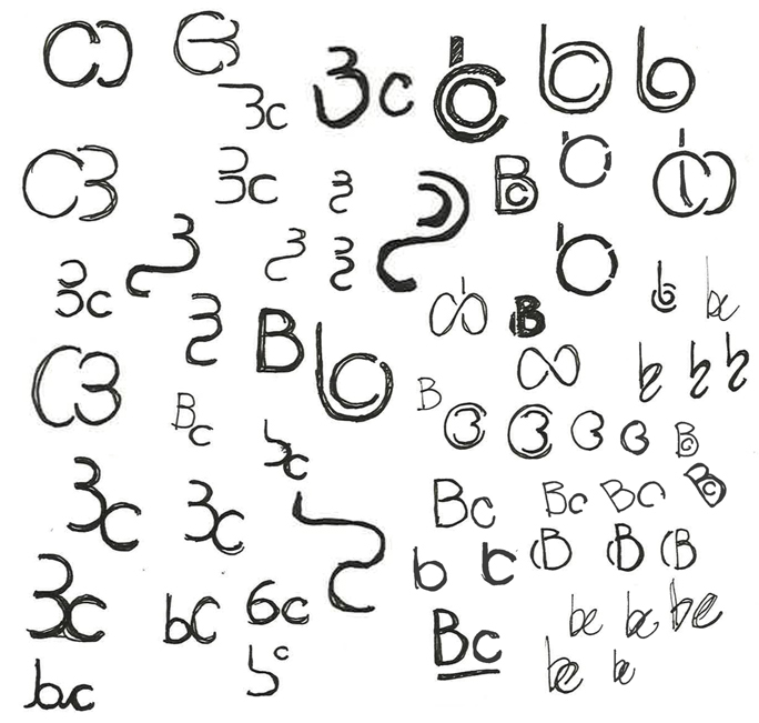

So. There was some gold there and some... well... yeah. So I picked my favourites and went forwards.
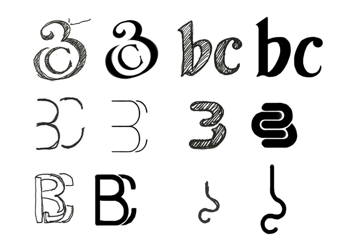
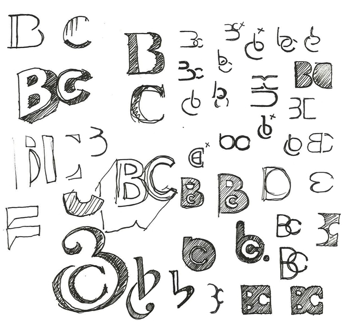
And between us we chose the following 3.
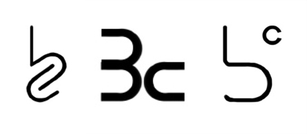
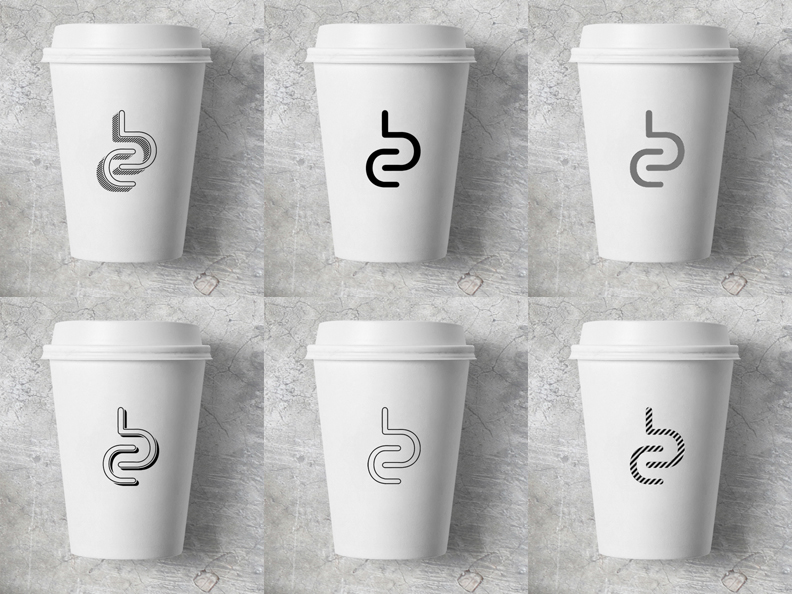
So I went to town on those three for a while.


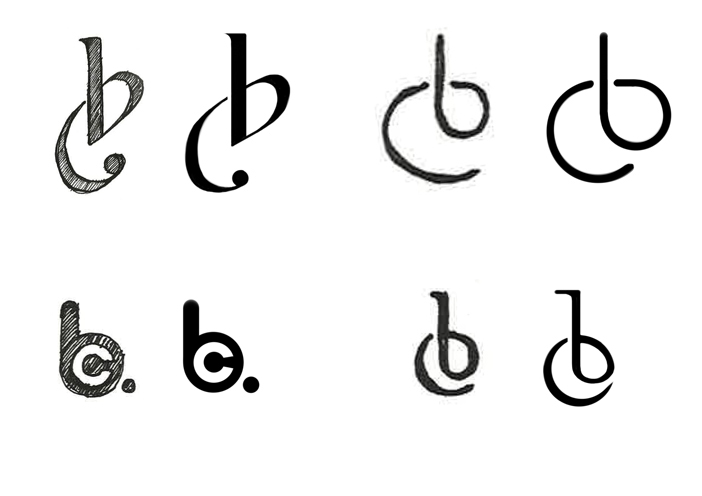
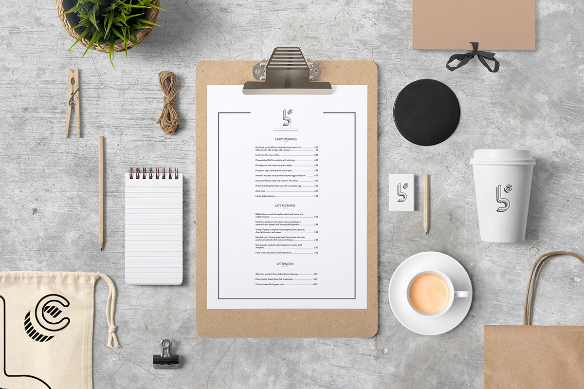
So I worked it a bit and one felt a bit like it was 3c not Bc. I liked the heat generated by the c on one concept as it fitted well with heat and coffee and warmth etc. But the one we chose resonated most with Fergus. He liked the connected feel between baffled and coffee as well as it feeling kinda meat hook ish. The coffee shop is going to be very industrial - as that's the look and feel of that city honestly. I felt like there was a nice feel of coffee steam as well curling through the logo.
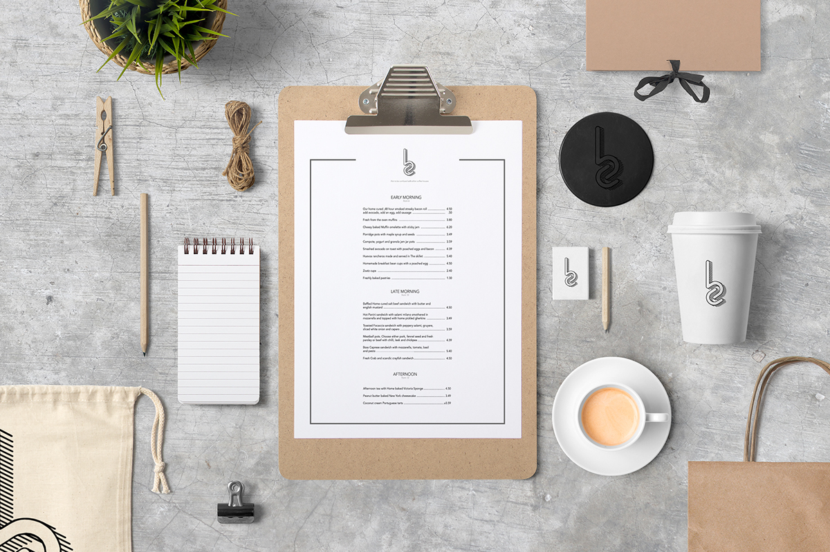
So then I downloaded the excellent free mockup pack from mockupzone.com to get a feel of how they would look. Here's how it looked.

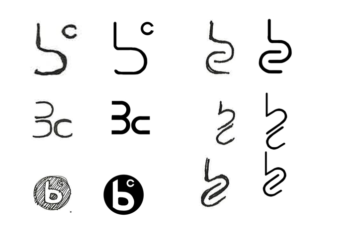
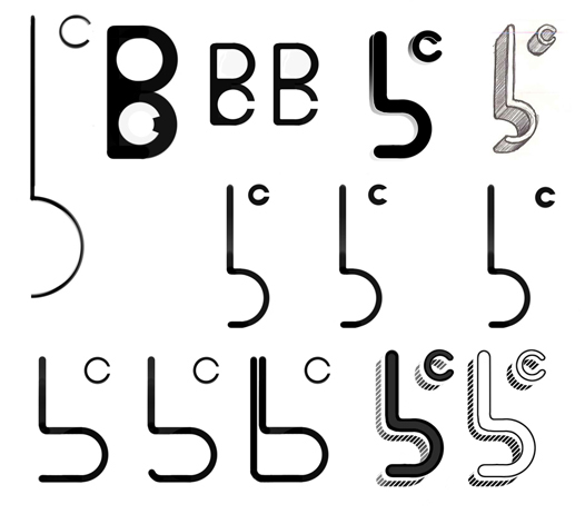
The angled hooked letter worked well on the logo, but I'd been tracking how they worked on a font and was pretty concerned that it would look a bit stupid when combined in text. We could have separated the logo and text but I think it worked well to use those letters as the brand identity. So I ditched the angles and tried horizontal. It looked a lot more refined.

I wanted to try the single storey 'a' as it fit the 'd' and 'c' better... But we tried it on a few people and the feedback was that it was hard to read. So I popped the double storey 'a' back in and it became a lot clearer and more legible.
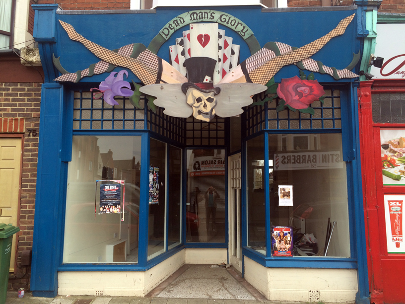
I'm not kidding, this is how it looked when Fergus rented it.
This is roughly how it's going to look. Thank god for photoshop.


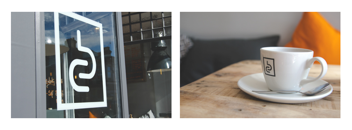

And so after lots of backwards and forwards, we have a finished branded coffee shop with unbelievable food and drinks, a wonderful cosy yet industrial feeling interior, and most importantly a fresh daily rolled sausage roll. If you're ever in Portsmouth UK near Fawcett road, drop in and enjoy!
Here's a review http://strongisland.co/2016/06/29/baffled-coffee-fawcett-road/
Check out the facebook page and instagram account.
https://www.facebook.com/baffledcoffee/
#baffledcoffee
Thanks for the images from Charlotte Griffiths
www.charlottegriffithsphotography.com


