Maximo stationery design
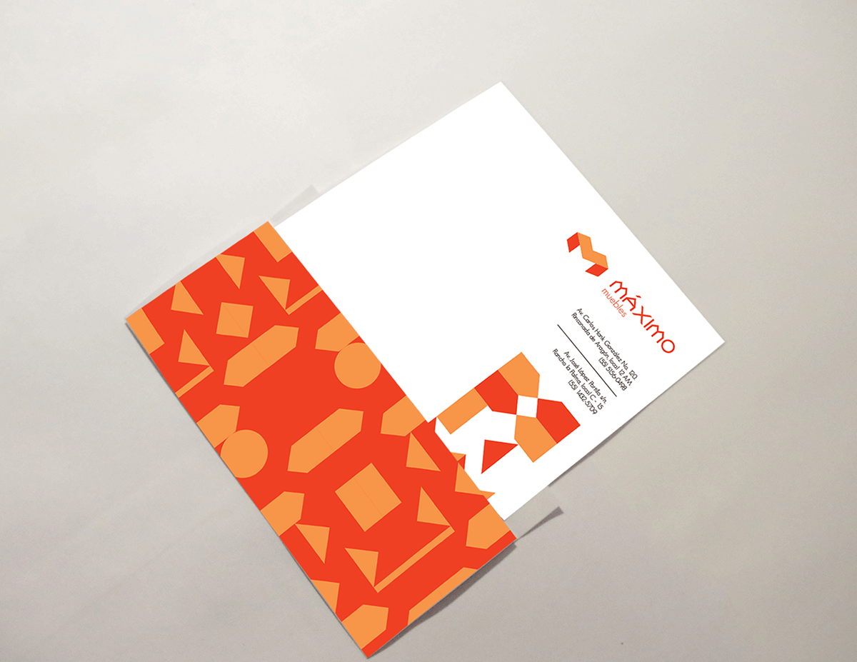
La mueblería Máximo se caracteriza por la simplicidad de sus formas geométricas, combinados con acabados y materiales de excelente calidad. El rediseño de esta marca se origina a partir de módulos rectilíneos que constituyen la base del diseño de la línea de muebles. La M del imagotipo fue modificada hasta convertirla en un signo abstracto que además de conservar los rasgos originales del caracter tipográfico, adquiere la apariencia isométrica de un taburete, mueble que fue tomado como modelo para la reinterpretación de dicha letra.
Los elementos secundarios de la identidad de la marca se originan del mismo sistema modular del cual se desprende el signo M y además permiten configurar texturas de patrones aleatorios.
Maximo furniture company is characterized by the simplicity of its geometric shapes, combined with luxury finishes and excellent materials. The brand redesign is based from rectilinear modules that constitute the design basis of the furniture. The logotype´s M letter was modified until getting it transformed into an abstract sign that as well as remains its original typographic characteristics, get a stool´s isometric shape, which was taken as a model so that M letter were reinterpreted.
The secondary brand identity elements are originated from the same modular system from which letter M was created and additionally they let make random pattern textures.