


The approach to developing this logo has been to convey efficiency in a visual manner. This logotype has simple circular forms, and also a unique element within the 'e'. The 'e' is designed to mimic a smile - which signifies good health, that it is good for the environment and also a happy customer. This logo also excels in french, as the 'e' takes on the role of an icon beside the word 'pur'.
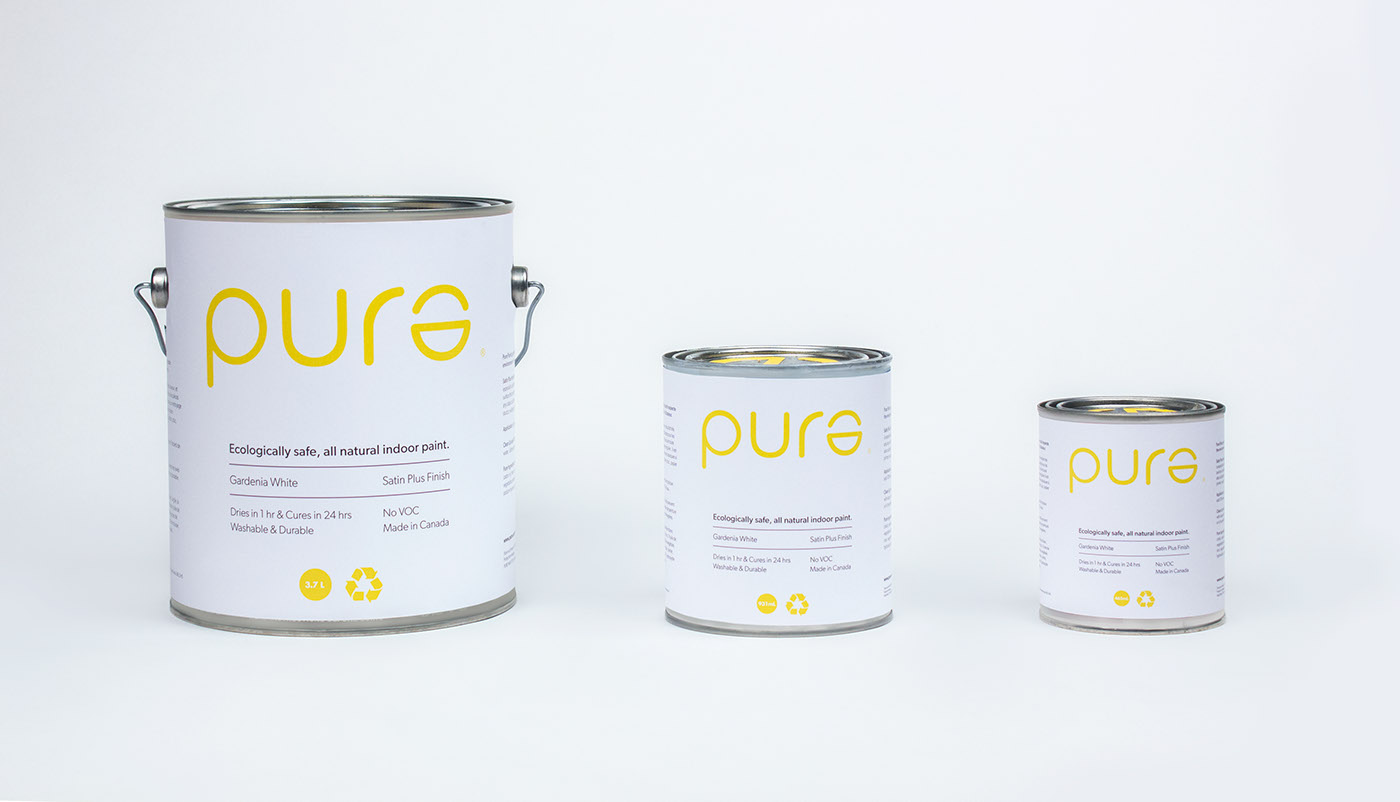


The customer wants transparency and efficiency in the product. To create this ease of use, the copy on the can is concise, paired with a simple to understand layout. The emphasis is kept on the recycling symbol, which clearly states Pure is eco-friendly.


The colour choice for Pure Paint was made strategically, as to set the tone for the brand without green-washing. A bright, happy yellow was chosen which introduces a more playful and modern look.
This is also shown through the playful patterns and secondary brand elements such as paint chips and other accessories.
This is also shown through the playful patterns and secondary brand elements such as paint chips and other accessories.


The logo is also used within advertising to express the emotion of the user.


