

Reflection
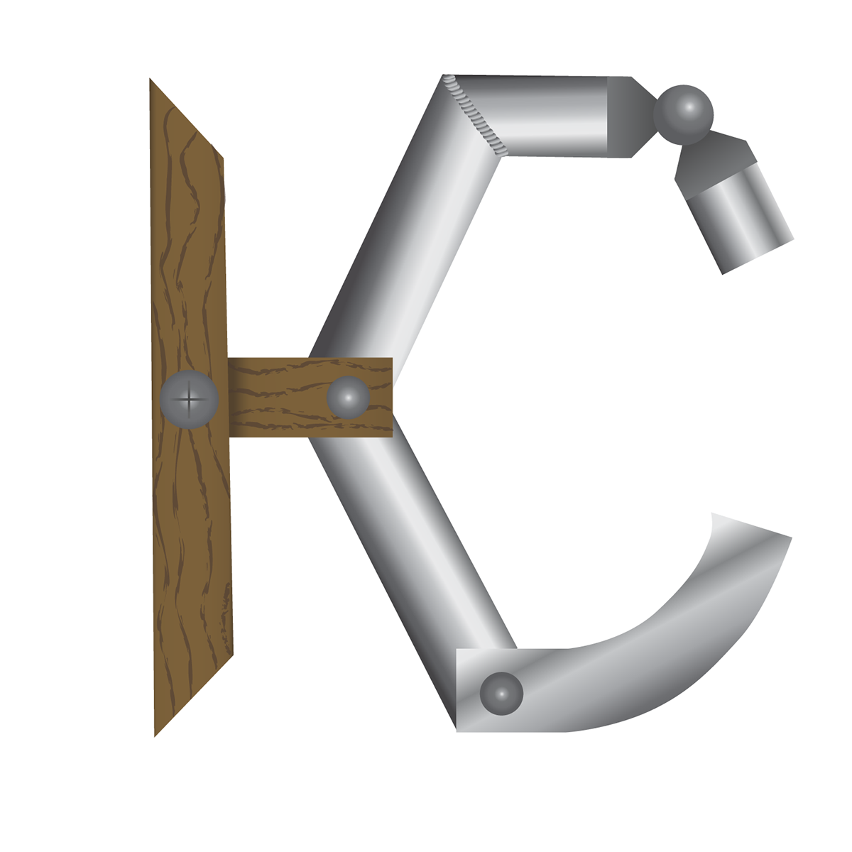
Looking back on this project, I thought it went well. I feel that the logo really represents me. The "wooden" H contrasts with the "metal" C. These represents the two sides of me; my softer, flexible side that contrasts with the cold, rigid side of my personality. I think that the execution of my ideas and sketches was excelent, as the parts look like wood and metal. I feel that I did a good job of incorporating my initials into an abstract logo that represents me.

