Beme app Re-Design
Hello, I present you my Beme App Re-Design made by myself with Photoshop for the visual part and After Effect for the motion part.
Why I made this project? Because I like the Beme app but not really the design interface.
Why I made this project? Because I like the Beme app but not really the design interface.
So I wanted to re design the full app.
On the project, you can see some motion design to illustrate how the app going to be, the home/Profile/React part, and the app icon on Google play.
On the project, you can see some motion design to illustrate how the app going to be, the home/Profile/React part, and the app icon on Google play.

BEME APP ICON
The Beme App icon. I wanted to make it with the Material Design and Android style with the Beme color of course.

BEME LOAD SCREEN
On this screen, I wanted to make it class, simple and without many effect because its suppose to load the home page and the app.
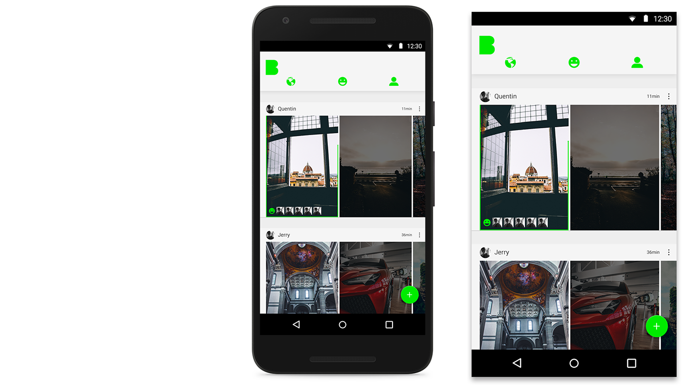
BEME HOME
On the Beme home, you can see the top bar with the Beme logo on the left ( if you click on it you'll be directed on the top of the home) and the different icons ( EXPLORE, REACT, PROFIL). On the middle its two piece of paper with the information and videos.

BEME CLICK VIDEO.
When you're going to click on a video, its going to be bigger with a react images on the bottom and the green time bar on the screen.
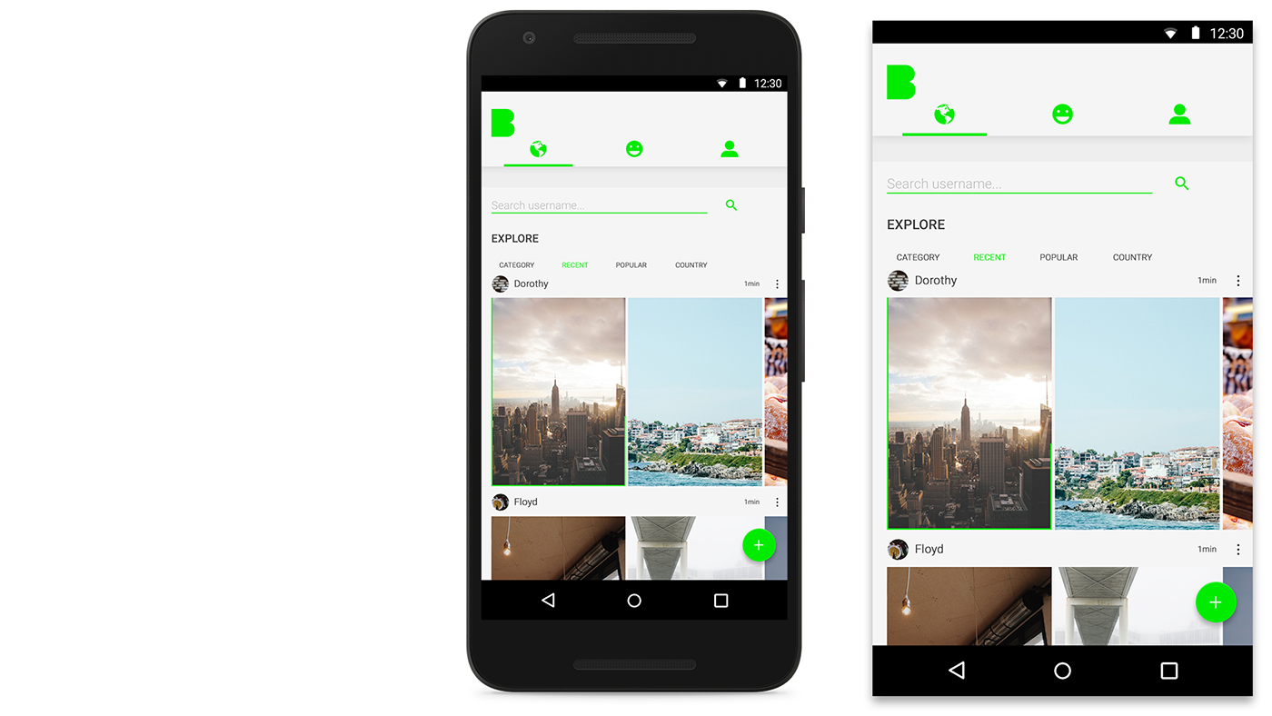
BEME EXPLORE
Explore, on this screen, top bar, the search user if you want to search your friend on Beme and the " Category, Recent, Popular, Country " To explore more Beme user with the same country or passion to you.

BEME REACT
On this page, you have your notification ( react ) to your Beme video(s). you can check the old reaction from yesteday or last day if you want, or only today.
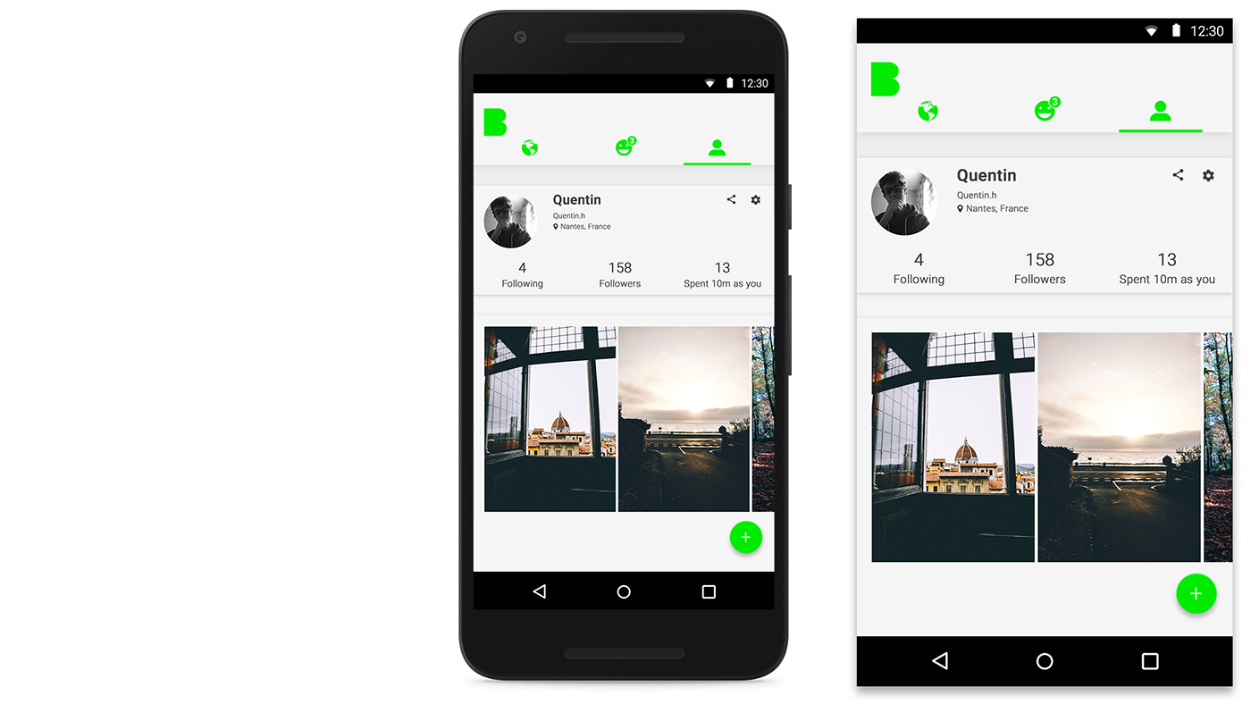
BEME PROFIL
The Beme profil screen, with one piece of paper with the proefil information ( followers, following, spent...). And one more piece of paper for the Beme video

BEME BUTTON
When you click on the green button, you have one principal button to rotate you camera and a second button to film.