A Sound Identity.
For this brief we were asked to create a visual identity for a music festival that showcases artists and a specific genre of music. The visual identity needed to translate across a single page promotional site created on Adobe Muse.
For this brief we were asked to create a visual identity for a music festival that showcases artists and a specific genre of music. The visual identity needed to translate across a single page promotional site created on Adobe Muse.
I chose to rebrand a UK Grime music festival named '#GimmeGrime' as when intially thinking of grime everyone always gets the feeling of a dark grundgy vibe; I wanted to bring across a new side of grime. I didn't want to stick with a classic dark and gloomy colour scheme as I wanted to create a modern, up and coming new feel with it. By taking other festival websites into account, this allowed me see what I personally wanted to achieve; I didn't want my website to be cluttered, I want it to intruige viewers instantly and have a creative feel throughout. I want the viewers of my festival website to feel the emotion and vibe by simply looking at the website; the colour scheme playing a key part in this.
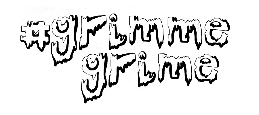
Below I have placed a typeface design which was my starting point for my website. When thinking about my website format and how the audience will interact, even though I feel this typeface design automatically interests the viewer, I wanted something that could really pop out the page and link closely with my grime genre. Connecting with your audience on an emotional level leaves a long-lasting impact. When something sparks an emotional response, the viewer is more likely to share, comment on and remember it; which is what I want to gain. While researching through other websites and especially festival websites I noticed that GIFS were a common thing to use, the visual content is becoming more and more popular and is seen on most websites nowadays. Humans respond to what they see, more so than any other form of stimulation. By trying to connect emotionally with users, they’ll start to associate those feelings with my brand.
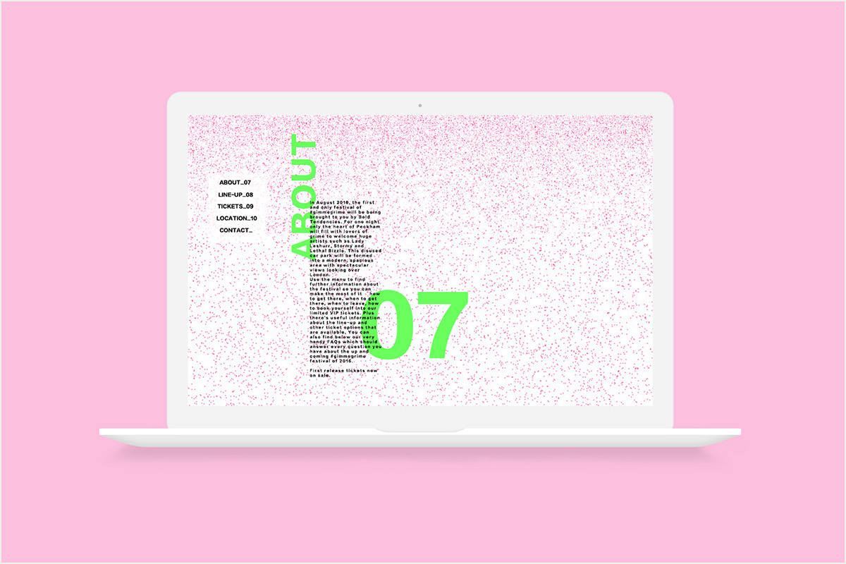
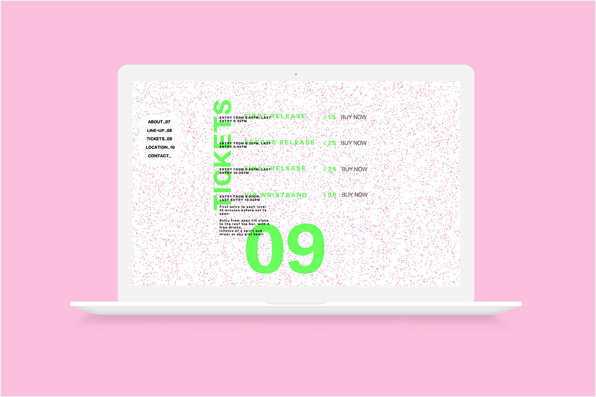
Hierarchy is a key thing to consider in a website format and especially with our brief. I feel that a hierarchy concept that would work well with my website is using the idea of my location, as it is a multistorey car park, using each level as the stages for a selection of acts would be an effective way to portray specific parts of information. Laying out the main section of my website with this hierarchy will allow viewers to take in some of the most important information in a less complicated format. When placing this on Muse I needed to consider the most important to the least important information and make sure this is reflected in the way I make it interactive.
Throughout this project I have learnt that Muse can be extremely glitchy and anchor points can be affected by simply moving text boxes. I was having a lot of issues with getting my Muse document to stay in-line when moving around the page as I intially designed it to jump across my Muse page to get to options such as ‘LOCATION’ and ‘TICKETS’ and I was wasting a lot of time trying to perfect this. After struggling to find an interesting way to layout all of my text as well as failing to understand Muse, I decided to go back to basics and focus on my concept instead of the design.
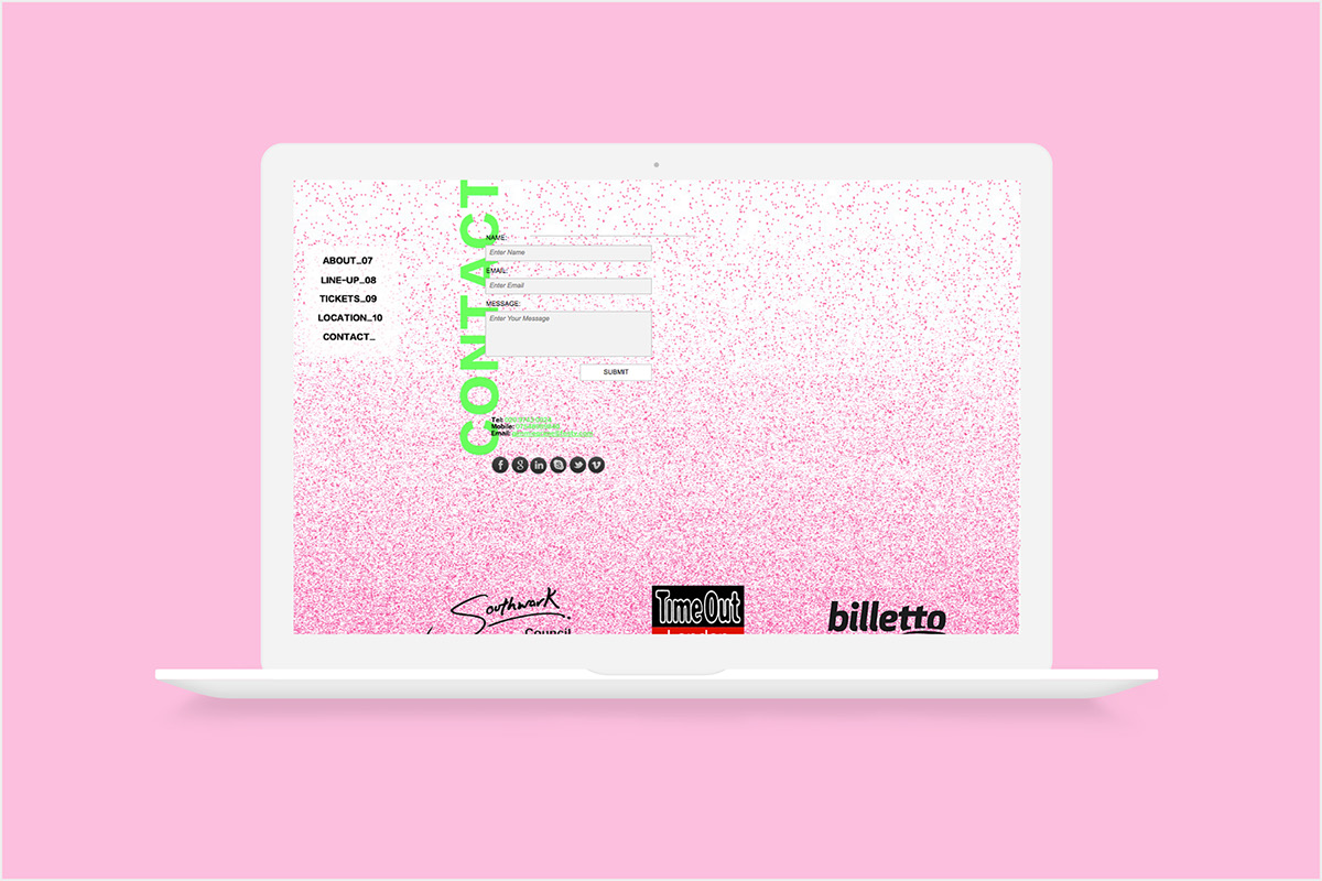
When playing about on Photoshop I created a happy accident and created an interesting cluster of speckles. I instantly felt this could work well as a background piece running throughout my website as it minimal so it won’t take over the text laying over it. As my chosen genre is grime, I felt this could work really well with my website design. I personally feel that grime itself is a very clustered, face-paced, negative feeling genre and in an interesting way this accident has worked to my advantage due to its crowded and confined look. Below is another experiment where I made the previous design with a gradient effect, I felt this would fit well on my website at the start and end to give a flowing feel and to allow the user to recognise the start and finish.
After choosing my font for my website (Lantinghei SC Heavy), I concluded that I wasn’t as keen on the intial typeface I had created for my title; they didn’t work well together and every experimentation I tried didn’t help this. I attempted to add in a lightbox with the title for when the user would intially open up the webpage however, even though this didn’t sit on my actual website, I still wasn’t keen as it didn’t sit well with the background and new font. I decided to lose this typeface (after holding onto it for far too long) and carry on using just the plain typeface throughout my website. I feel that loosing this title did not make my website any less engaging which was a main concearn I had.
After choosing my font for my website (Lantinghei SC Heavy), I concluded that I wasn’t as keen on the intial typeface I had created for my title; they didn’t work well together and every experimentation I tried didn’t help this. I attempted to add in a lightbox with the title for when the user would intially open up the webpage however, even though this didn’t sit on my actual website, I still wasn’t keen as it didn’t sit well with the background and new font. I decided to lose this typeface (after holding onto it for far too long) and carry on using just the plain typeface throughout my website. I feel that loosing this title did not make my website any less engaging which was a main concearn I had.