A Greek chef immersed himself in the art of making sushi in Tokyo, before opening his restaurant in the historic center of Athens.
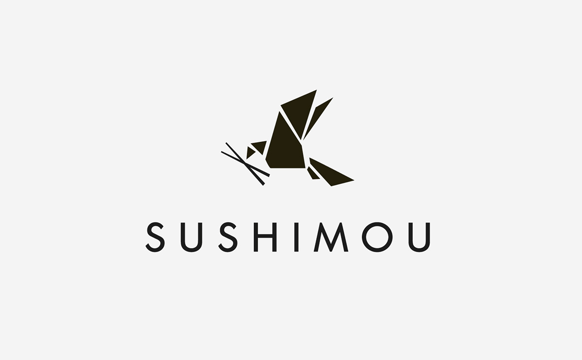
Sushimou’s brand identity is influenced by the same characteristics that inspired all its dishes: nature, balance, simplicity and harmony. In the restaurant’s logo, an origami crane holds chopsticks with its beak, as an artistic metaphor of bringing the Japanese culture to the Athenian dining scene.

The design concept includes several references to Origamiおりがみ, the Japanese art of folding paper into decorative shapes and figures, and Haruki Murakami むらかみ はるき, a popular contemporary Japanese writer known for his magical realism.

The centerpiece of the interior installation depicts Sushimou’s signature crane reeling in fresh fish while other little fish swim around freely on the restaurant walls. Aesthetics, once again, become as essential to the dining experience as the food itself.


Traditional Japanese watercolor techniques were used for the back side of the menu. The custom made painting features a red circle to represent Japan’s flag.

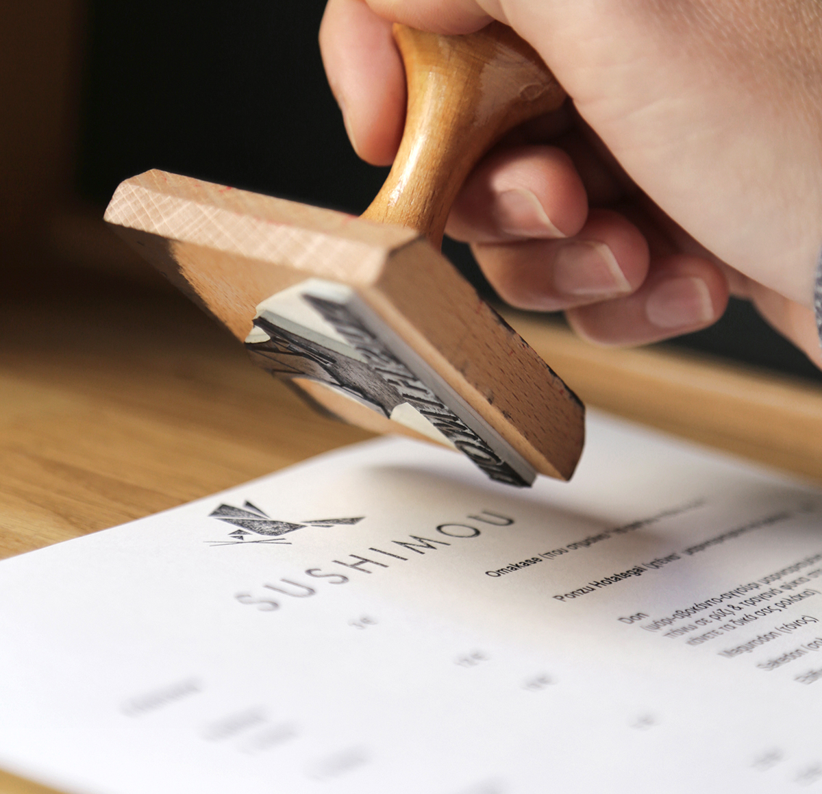
The A4 size menu was designed to be printed and asymmetrically folded in-house, as the food selection changes every day depending on what the chef finds available at the fish market.


Photography: Ioanna Roufopoulou


