


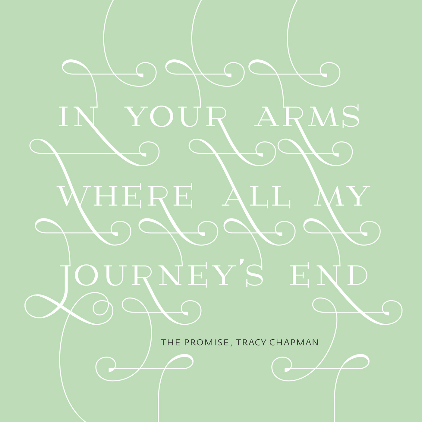
Custom lettering for my sisters wedding invitation

custom lettering for the birth announcement of Wende Elize Dieuwke Scheper

Custom lettering i did for the birth announcement of my niece Emilia Alineke

Band logo for the stoner rock band Ditch

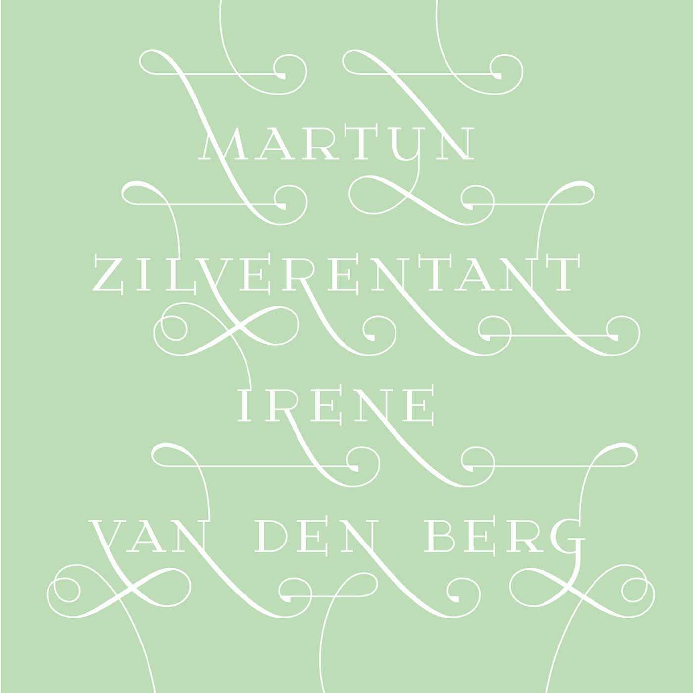
Custom lettering for the birth notification of my nephew Rafael Arthur

My contribution to vouwblad 10 (http://vouwblad.com) the theme was 'ode to the monospace type'. Typeface Anna-mono i created to support the corporate identity of Anna Vastgoed & Cultuur (real estate and culture) http://www.behance.net/gallery/Anna-Mono/658064
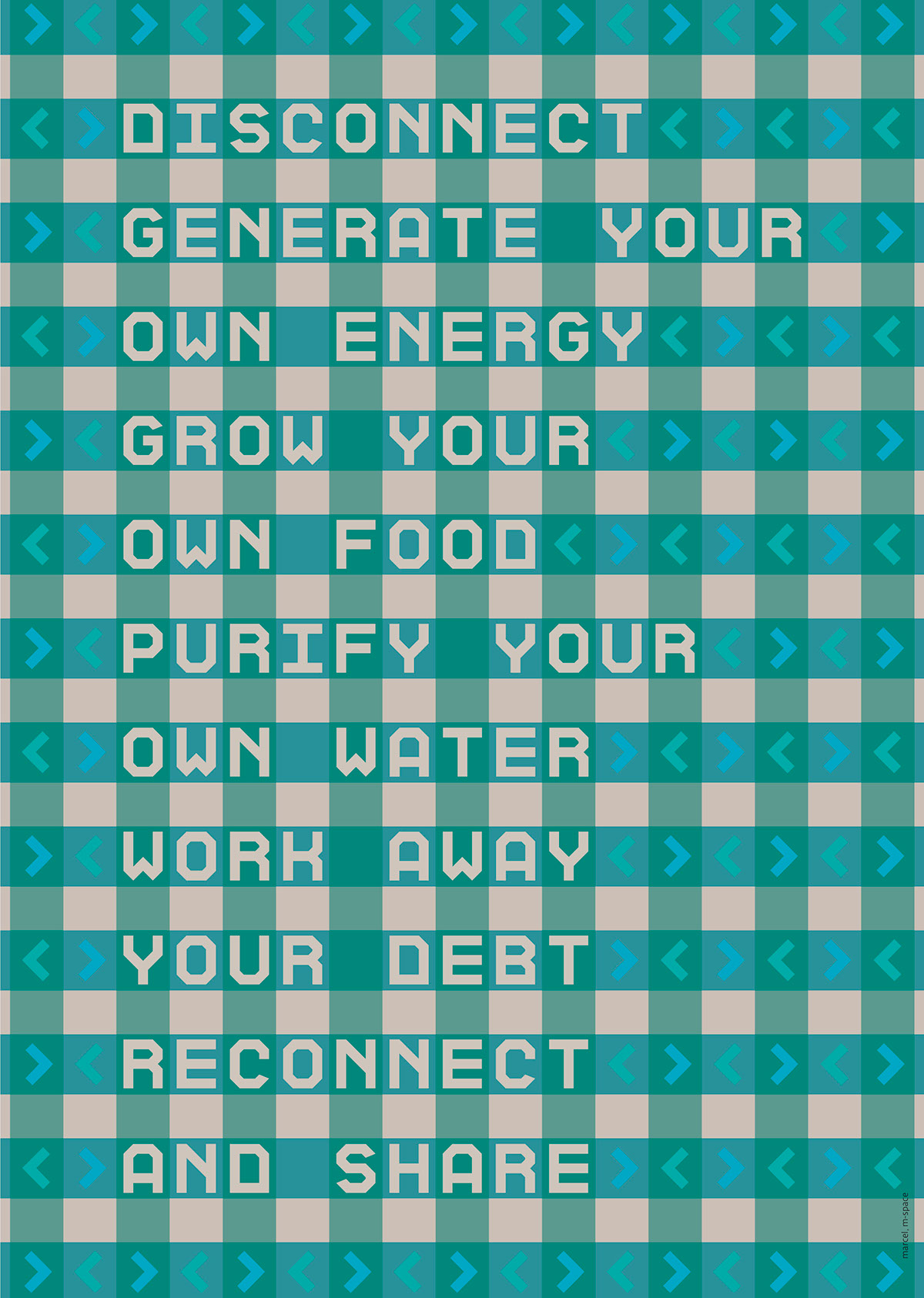
My contribution to vouwblad 10 (http://vouwblad.com) the theme was 'ode to the monospace type'. Typeface Anna-mono i created to support the corporate identity of Anna Vastgoed & Cultuur (real estate and culture) http://www.behance.net/gallery/Anna-Mono/658064<

Bookcover proposal for a book about vampires (Servants of the Night by Chris Canning)

I'm experimenting with gothic lettering, maybe to be used for a book cover. i looked at several forms of gothic scripts and tried to make one which is still readable by todays standard without losing the characteristics and keep it tight at the same time.


I am asked by Making Waves to design a 'hallmark' kind of card, arround the theme 'warmte' (translation: warmth) to be sold for a good cause.
This is the first idea i made a decent sketch for. The text in the heart are instructions in dutch about how to fix a central heating system, just to make it not too 'in your face' sweet.
not sure yet if i will submit it

Design i did for my dad's businesscard

made this in 2008 for "Haags Kapitaal" a initiative of "Schoon en schijn", The idea was to make an 'The hague' alphabeth by letting graphic designer from the The Hague area design a poster with each one letter.It was displayed in the postergallery in the tram station here in The Hague.
My character was the "i". Because the posters are displayed on a luminous box, i took a anti-aliased palatino i and turned the gray pixels in line patterns with about the same 'gray-tone' and had it lasercut by maquette atelier so the light could shine through.
Thanks for
watching!
marcel van den berg
grafisch ontwerp
http://joostmarcellis.nl


