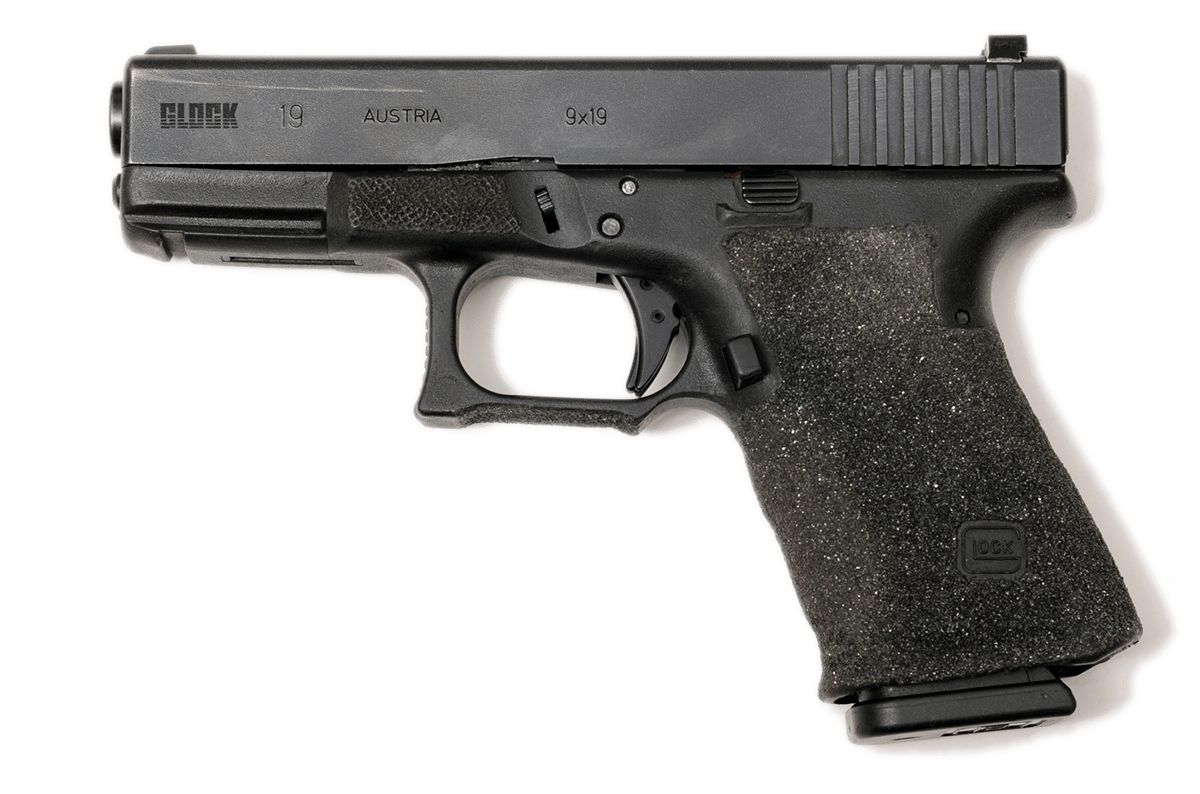
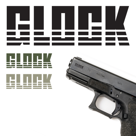
Glock Logo Re-design
This project is just a personal interest in re-designing the logo for Glock, the gun manufacturer. I feel that the current logo is outdated and doesn't fit the style of the handguns themselves. Glock's guns are reliable, functional, and simple. That is what I am trying to convey here with this logo. This design is simple, visually looks sturdy, and the three straight lines represent the reliability built into the Glock pistol.