


As a requirement for my Typography 03 class, I created big creative conference related with Go Game / 바둑 / 围棋 and Typography. The concept of my personal branding was to find typographical elements through Go Game and explain to my audience.
1 / Vision Statement

2 / Logo + Fonts + Color Patette
The best identity is the symbol that can provide the most meanings with the minimum set of elements. So I pondered what could be the elements that can connect the game of 'Go' and 'Typography. After thinking in various ways, I could figure out the relationship between through the following three elements: dots, lines and surfaces.

3 / Letterhead, Envelop, Notebook, Pencil, Eraser


4 / Name Badge

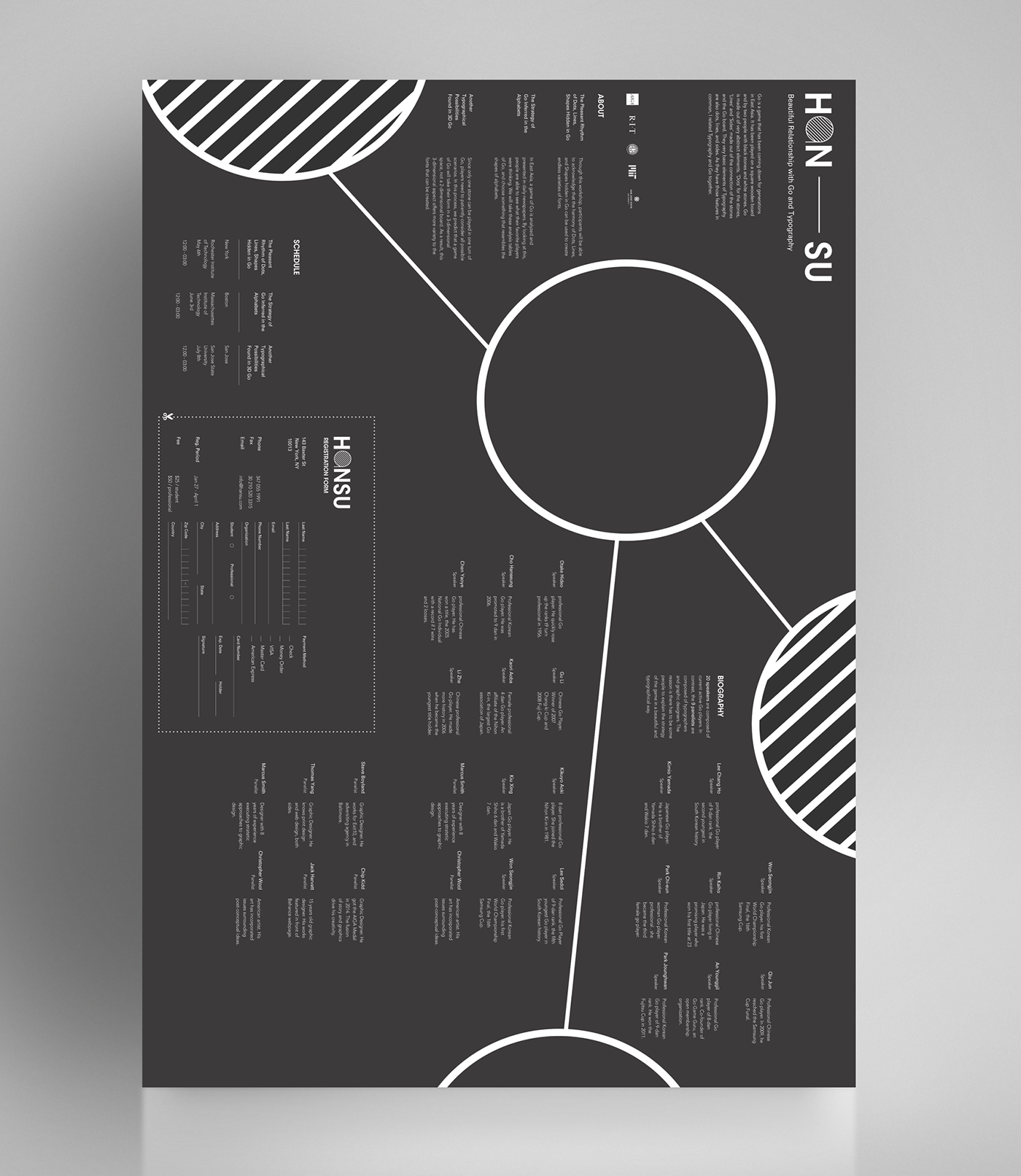
5 / Poster - black&white version
In front side, I tried to put a brief information of HANSU conference, a biography of each speakers and panelists and schedules. In contrast, I put impressive or decorative vector images on the backside to emphasize the beauty of the appearance of 'Go game / 바둑 / 围棋'.


6 / Intro Motion Graphic
I made 15 sec motion graphic work to express the beautiful connection of lines, dots, and areas which came from dots and lines. I tried to explain the same elements between typography and Go board.
Thank You for Seeing my Work


