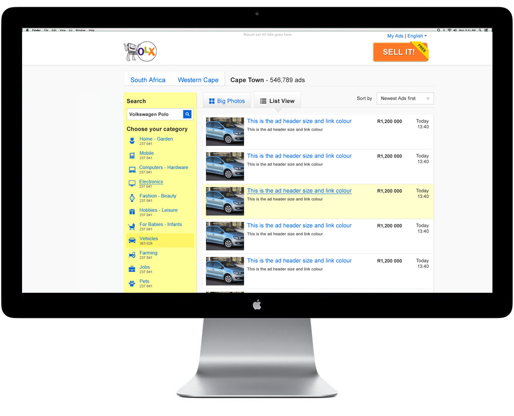
Ad listing page
On the Ad Listing page the idea was to have all the features that a buyer would use to find an item altogether. Previously the search bar, the category selection and the filters were disjointed. This showed us that buyers would either only search or only filter and very rarely would they do a search and then filter the results.
We kept the yellow from the home page for the right sidebar as we'd seen in testing that users became accustomed to the yellow being their guide as to what their next step was. In this case, after location has been selected, the next step would be to choose a category or do a search.
In our testing we learnt that 25 was the ideal number of ads for one page as it gave the user a good amount of ads to keep them enagaged and not so few that contantly going to the next page would be frustrating.
We also learnt that having ad descriptions in the ad preview would lead to reduced engagement and as such we only added very simple information which would be enough to entice the user to click through if they were interested.
Sketches
We tested so many different aspects of this page and these are just a few of the sketches that I've added for illustration purposes. Some of the things we tested were:
We tested so many different aspects of this page and these are just a few of the sketches that I've added for illustration purposes. Some of the things we tested were:
- Location of categories and filters
- Location of search bar
- Content within each ad snippet (4 variations)
- Pagination vs Infinite scrolling
- Replying straight from listing page

Wireframes
The wireframes and prototypes for testing this page were especially tough at times as we were always running tests on this page and keeping track of which versions had won an A/B test and which versions were changing meant the prototypes kept changing. Thank heavens that Axure has masters and repeaters. Those made making this page especially easy with the amount of changes we had.

The Final Design


