» READ ONLINE «
The Sound of Many Sleeping Bees is the final product of five years of undergraduate study cooked into the form of a BFA thesis project. It focuses in on the Why and the How of individual experiences with smartphones and what can be done to improve them. It covers a brief history of smartphones, delves into interaction theory, and outlines several means of addressing specific issues. The website and illustrations were developed specially for the project in effort to create a beautiful user experience while discussing the intricacies of user experience.


Original Concept
How can design be used to address the hidden negative mental impacts of mobile technology for young people who have grown up in a world of perpetually available distraction? This constant stream of distraction discourages solitude and introspection, which leads to a variety of negative impacts on health and development. They make it incredibly enticing to waste time and avoid mental responsibility because of the instantaneous, yet empty, gratification they provide. They promote a culture of reactive response instead of critical thought because of the fast paced hive-mind culture that has evolved with social networking. They distract from consciously choosing who and what a person surround themselves with by encouraging automatic responses to boredom like open ing Facebook and mindlessly scrolling the feed, which occupies brainpower without expanding it. Overall, they demote introspection and self-improvement by creating the habit of filling any and all empty time with mindless activity. One possible solution to this problem is to simply create awareness of the problem and the benefits of solitude. This could be done with an awareness campaign or including technology abuse as a section in public school health classes. Another route is to attack the problem directly by developing some sort of product that streamlines the notification process and promotes healthier mobile technology habits.
Refining the Problem
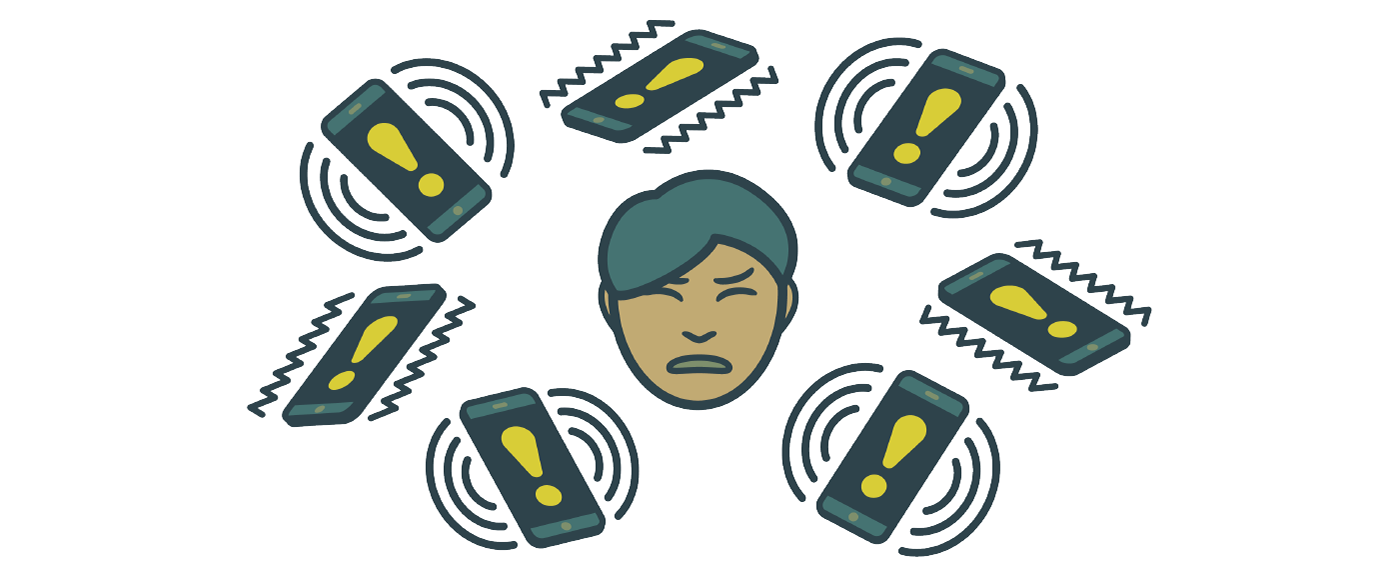
After continued research, it seems that the most basic problem here comes from cellphone notifications. Because they are emotionally rewarding [backed by research] they train us to want them and wait for them and even check for them when they haven’t shown up yet [verified by survey]. They are emotionally rewarding ("somebody is paying attention to me"), spontaneous & unpredictable (encourages a “waiting” mentality), and carry social weight (users feel the need to reply quickly so the other person doesn’t have to wait.)
Exploration
Through constant research, exploring of existing material, and conversation, I went on to explore the ideas surrounding my problem, from theoretical to practical and the rational to the bizarre. I found new angles and aspects that I wasn't aware of at the beginning of the project, and my concept expanded from simply finding one or two solutions, to creating a framework that allowed me to gain a deeper understanding of the systems at work.
I started by thinking about notifications themselves as the sole way that your smartphone communicates with you when you don’t have it open. I brainstormed a list of as many creative notifications I could think of (some of them require custom cases or add-ons), what sense they interact with, and what kind of feeling the invoke. Unfortunately, most of them were “fear” but that’s beside the point.

Solution 1: Notifoo
I began delving into realistic improvements to the current notification interface. At this stage in the project, I believed that a single, highly fleshed out design of one such solution would be my final product, and this initial creation was Notifoo.
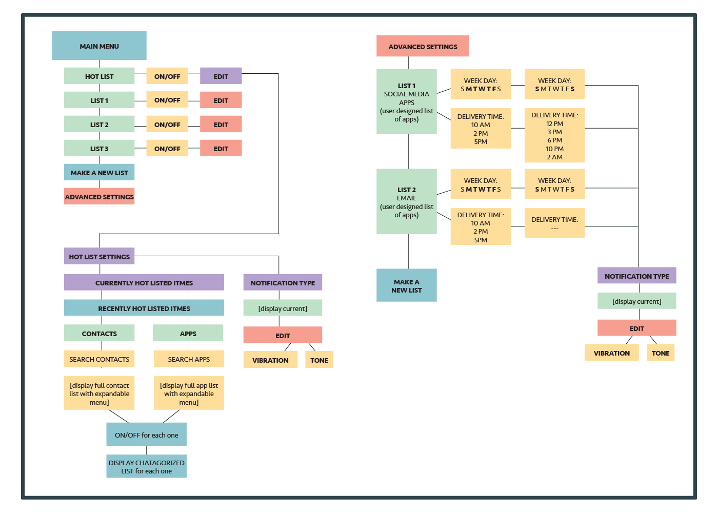
Notifoo aims to address the spontaneity of the notification, the most pronounced of its flaws. Very important notifications certainly need to happen in real time, but a huge amount of social media and game notifications have no time sensitivity. With Notifoo, users are able to categorize these notifications into a more customizable delivery system that removes much of the guesswork of receiving a notification on the user's end. In this system, notifications from specifically selected apps and contacts would be delivered in real time, while all others would be stored in related lists that are scheduled to deliver chunks of notifications at convenient and expected times. No more will we find ourselves distracted by something we don’t care about in the midst of an important meeting or class or date. The notification system becomes flexible and customizable enough to t the user’s life, not force the user to bend to their phone.
Notifoo has two main sections. The main part of interface consists of completely customizable Lists. Users are able to create difierent lists of apps and contacts organized by category (e.i. social media, games, work, etc). For each list, the user is able to set custom delivery times for every day of the week. Notifoo collects and stores all notifications from apps and contacts on these lists and delivers them in bulk at the allotted times. With this system, a user is able to schedule all notifications from social media, for example, to be held until their lunch break during the work week, and then have them delivered in real time on the weekends.
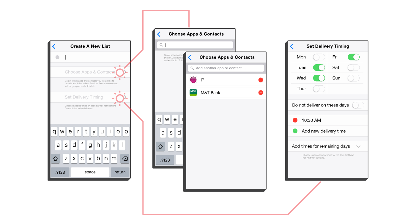
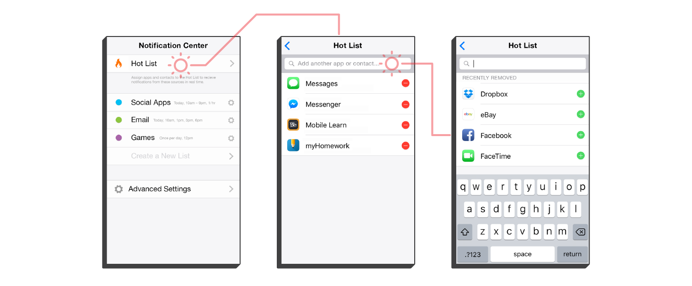
Notifoo’s second component is the Hot List, which houses vital apps and contacts whose notifications need to be delivered in real time. is might include calendar apps, reminder apps, and contacts for family members or coworkers. It is extremely easy to add and remove things from the Hot List in only a few taps, so users can adjust their settings as their needs change during the day. Upon installation, the Hot List is the default location for all notifications until organized into Lists, so that nothing accidentally gets lost. Explore the prototype here.
The Beginnings of a Theory
After going as far with Notifoo as I could, I spent a great deal of time reading related articles and studies and thinking about how I could further expand the project. After a very poignant conversation, I began considering the very nature of an interaction in order to more deeply understand the forces at work in a dysfunctional human/smartphone relationship, as well as a functional one. The following realizations reshaped the entire project.
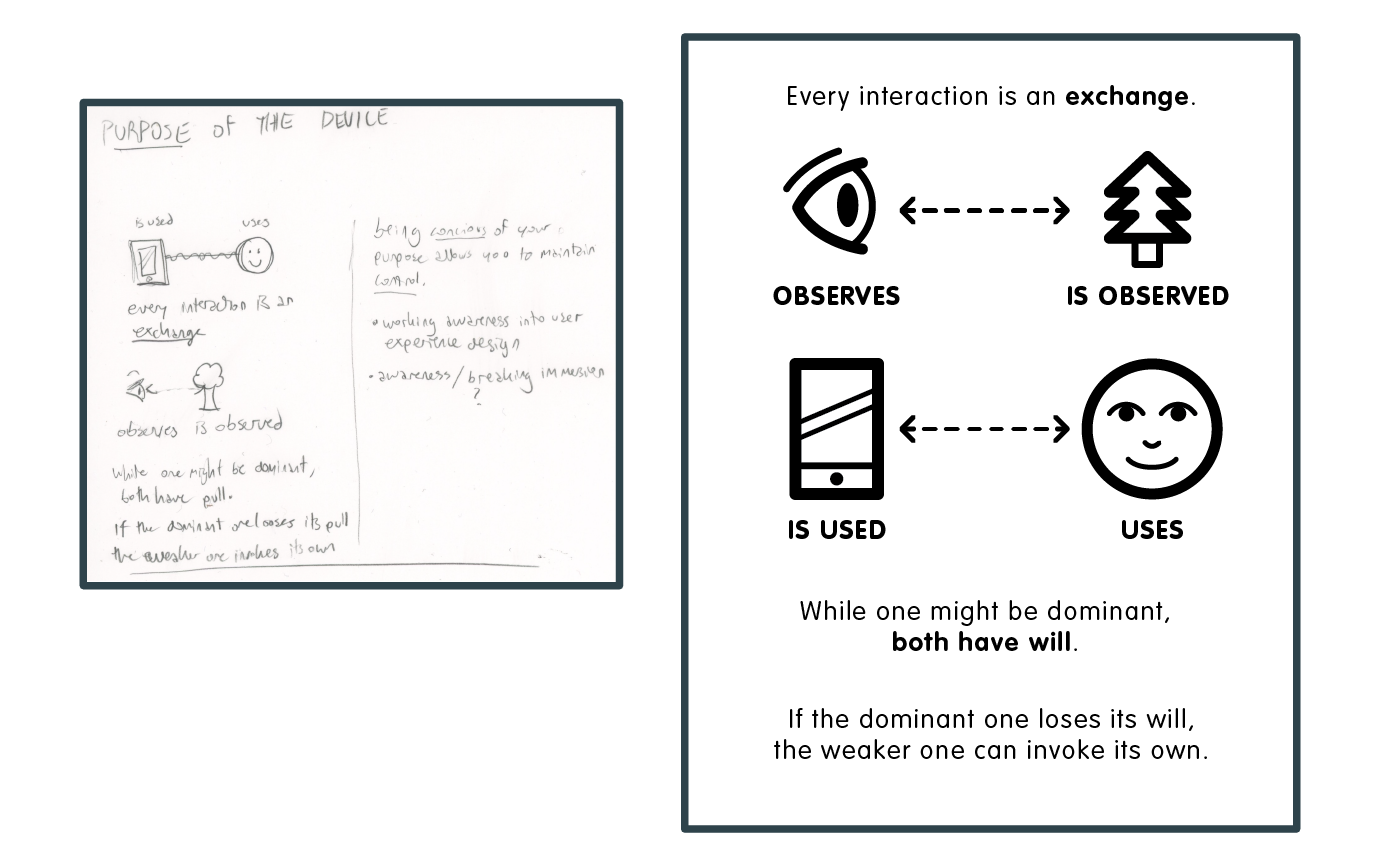
This new perspective allowed me to reframe the project in two parts, the Theory and the Prototypes. It occurred to me that one is significantly less valuable without the other, so I continued to pursue ideas in both areas.
Solution 2: Good Morning
At the same time, I had begun work on my second potential solution, Good Morning. This app was born from a problem that plagued me and many others that I spoke to.
Every morning I turn off the alarm on my phone, and promptly check all of the notifications I’ve received while I was sleeping. The vast majority of the time, these notifications are not pressing in the least and do not deliver any information that would affect my morning routine. When I finish the list, I often feel disappointed, not just in the lack of interesting or relevant messages, but in myself for insisting on making this my first task of the day, instead of doing something pleasant and meaningful, like exercising, enjoying a cup of tea, or reading a bit of a good book.
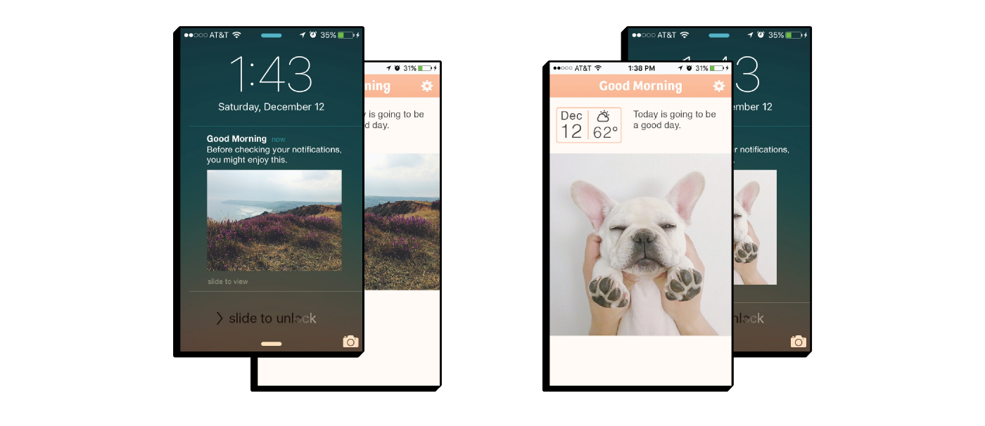
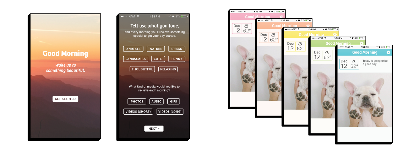
is dilemma inspired Good Morning as a way to interrupt the interface flow that encourages checking notifications immediately upon opening the phone. Good Morning takes inspiration from Flipboard’s content customization system and Mailbox’s inbox clearing interface. Including basic information like the date and weather, Good Morning supplies something relaxing and pleasant, with an interface that encourages no further use of the phone once it’s been opened. Good Morning syncs with the user’s alarm clock. When the alarm goes off, Good Morning pushes a notification with daily content that is curated especially for each user. Each morning users will receive a single photograph, audio clip, or video with content that will relax them and put a positive spin on their morning.
Solution 3: I'm Bored
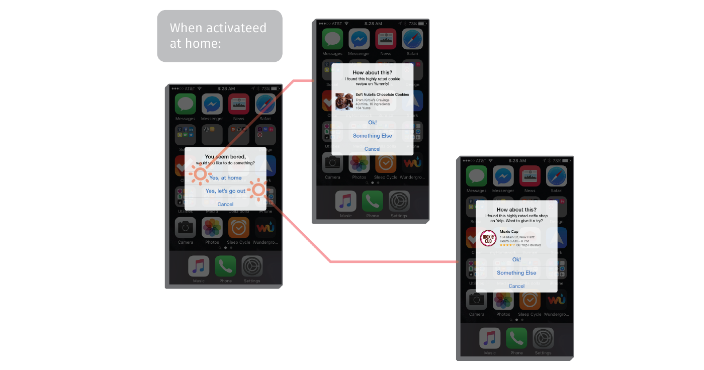
Soon after, I began working on my third potential solution, an idea based around interrupting destructive patterns called "I'm Bored." This app addresses the problem of purposeless phone usage, what can bring a user into the cycle of following interface queues indefinitely and without thought, resulting in a frustrating and impulsive opening and closing of apps. This is an app that’s main function is to break immersion by offering constructive and fun activities to the user, primarily when the app detects purposeless usage pattern indicating boredom and secondarily when the user opens the app in search of an activity. When using other parts of the phone, if the app detects cyclical & purposeless opening and closing of apps that indicates boredom. When this happens, the app will pop up a dialogue as follows: (one set of prompts for when the user is home, another for when the user is elsewhere)

Diving into Theory
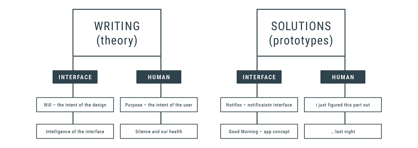
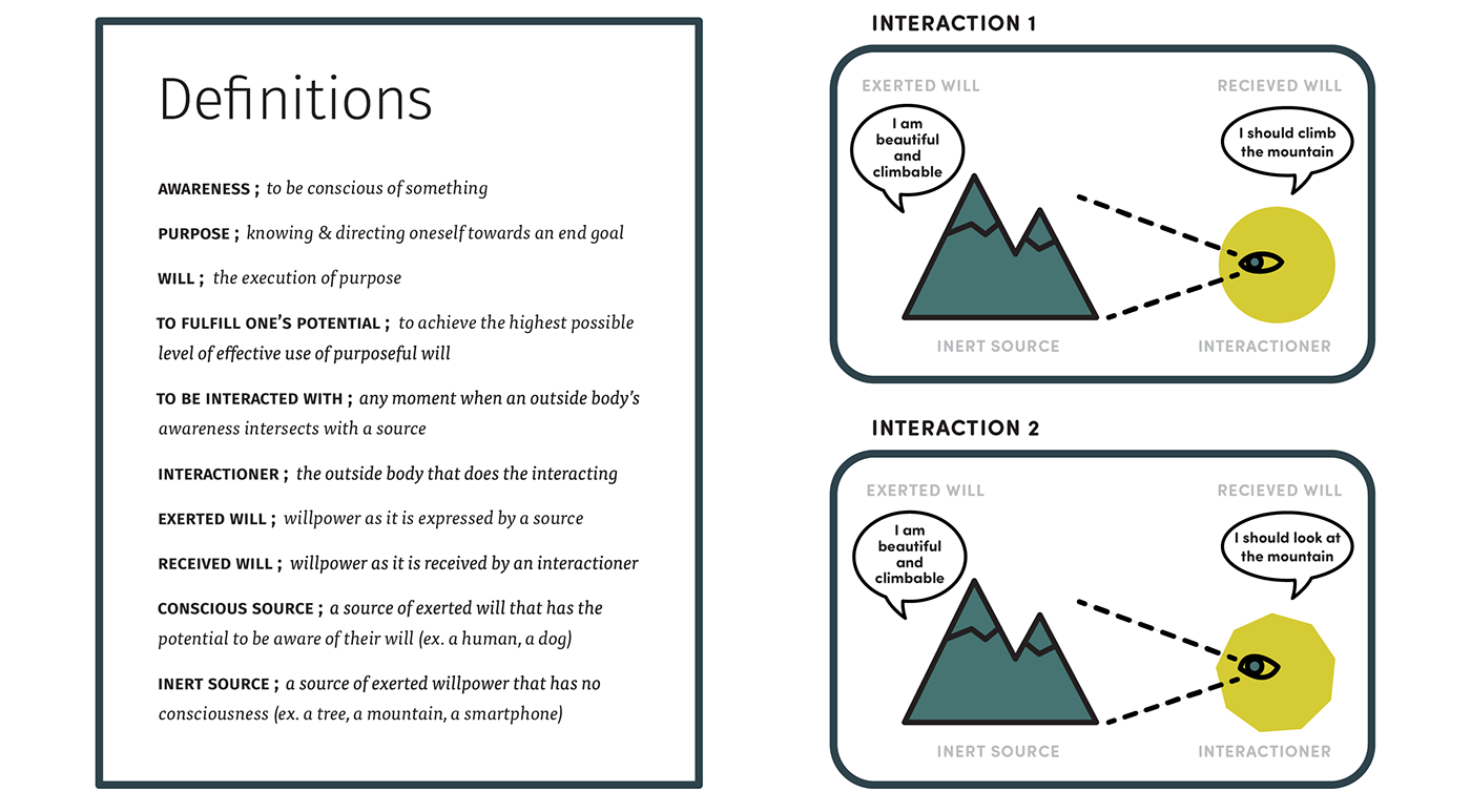
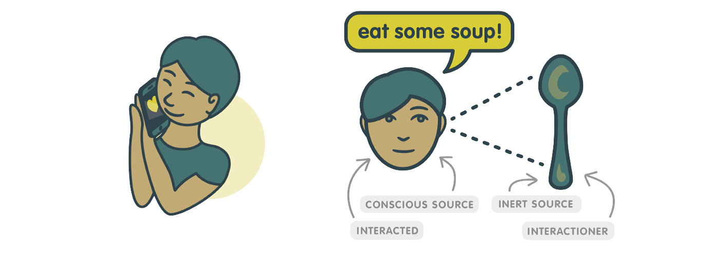
Feeling comfortable with my potential solutions, I decided to focus back in on my developing theory, which had been percolating in the back of my mind all the while. I did a free-writing exercise to extract these thoughts and found myself identifying and defining some of the most basic building-blocks of interactions, which I was able to develop and express as such:
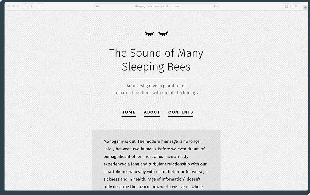
The Website
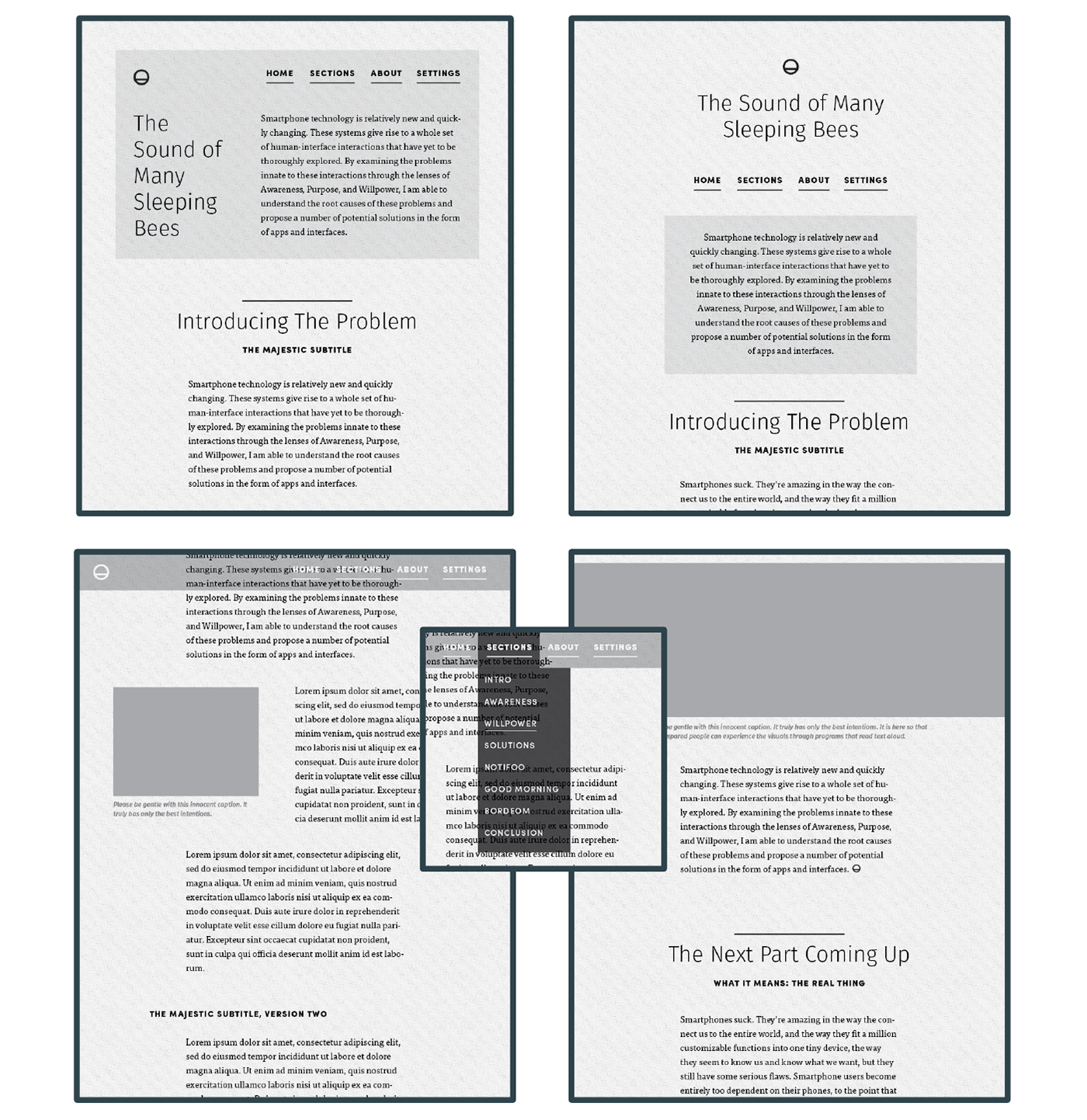
At this point in the project, with both sides of the equation decently outlined, I began working on the website, where the final product would live. I considered using a service like Squarespace to host the site and make it easy to build, but I decided in the end that if I was creating a project about interfaces, I wanted to have maximum control of the interface through which the viewer would experience the project. So, I began building the website from scratch.
My research and concepts were based on the idea that focus and control are desirable states, so I began with a moodboard that expressed those ideals.
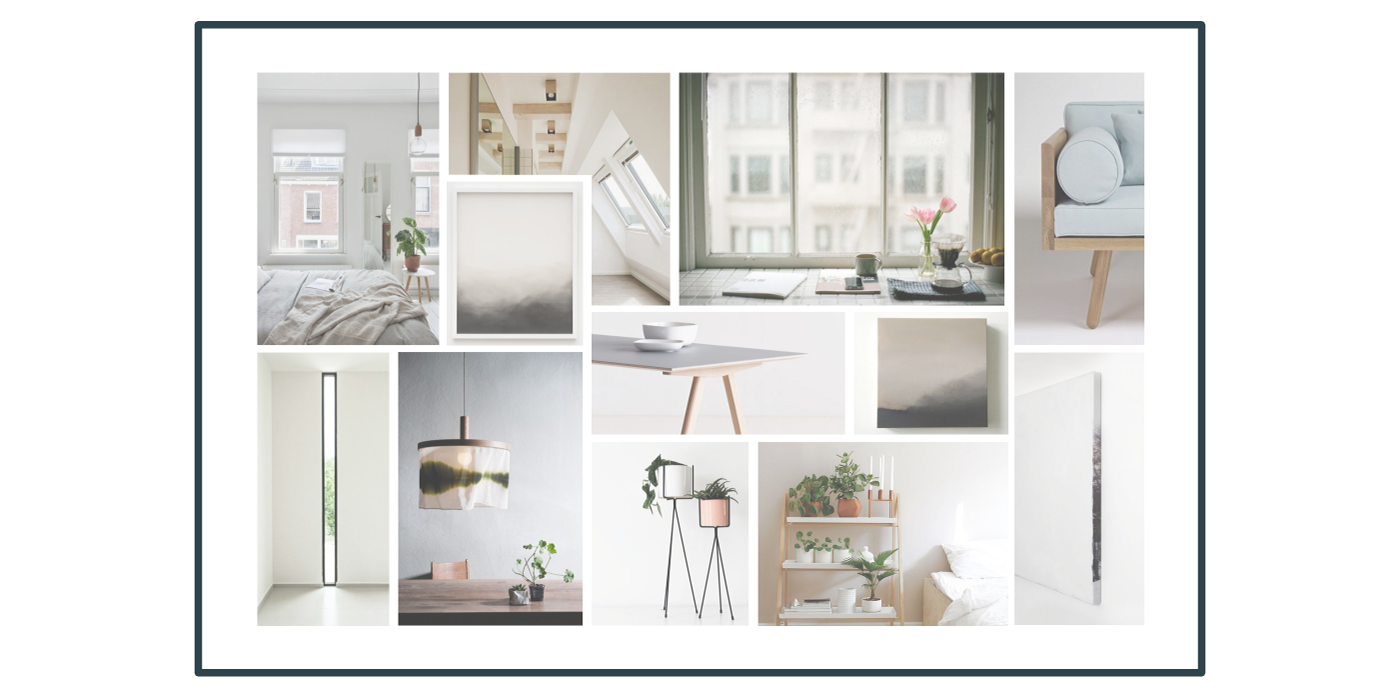
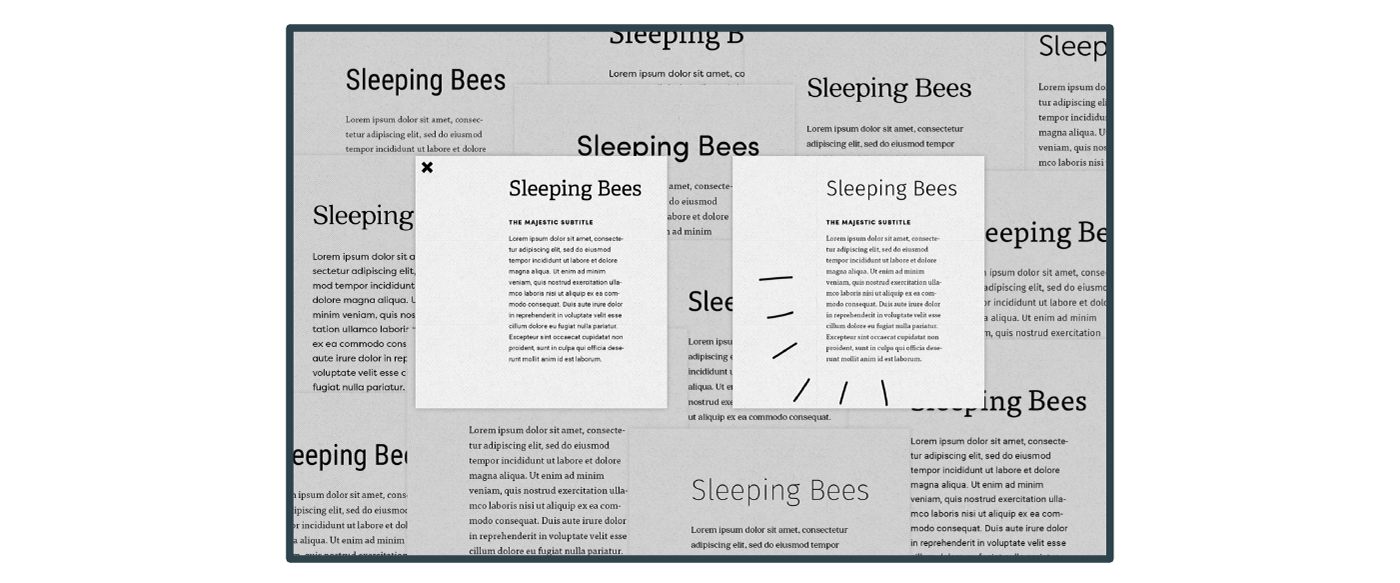
I went through a thorough font selection process, and decided on an official color palette and illustration style. I defined a style sheet that followed the ideals I began with, and then began mocking up sections of the site to give myself a solid guide before I began coding.

The Content
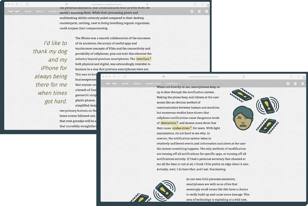
From here, it was time to get coding, which I did so just about until a few weeks before the Thesis Show. While I was writing HTML and CSS, I was also writing what turned out to be a lengthy paper in English. I've always struggled with papers, but I found that when writing about something I cared so deeply about and had spent so much time carefully considering and building original ideas around, I was inspired to do a fantastic job. I taught myself how to write effectively (as opposed to my usual ineffectively) in four passes: Rough outline, detailed outline, no-personality writing, much-personality writing. The result of which was the best thing I have ever written.
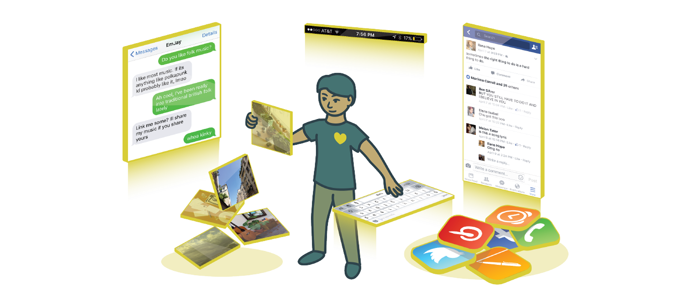
In the fashion of Snow-Fall style longform articles, I also created a series of illustrations to accompany my writing. I knew I wanted to include a reoccurring, relatable likeness of a person, but I had become keenly aware of the injustices of "relatable" illustrated human representations throughout media and web which almost always sport white or white-inspired skin tones. As far as I could tell, there were two acceptable options (aside from using constantly varying skin tones). Use completely abstract colors, or use an ambiguous medium brown as an "average" of the range of skin tones. I decided to go with the latter, because I felt that abstract colors still harkened to real skin tones, yellow being an equivalent to lighter tones and blue being an equivalent to darker ones. I cannot say if this was the most politically correct choice, but I am at least confident in my conscious decision to make this character of an ambiguous gender, which was a significantly easier choice.
The Show
With the bulk of the project finished or near complete, it was time to prepare for the Thesis Show. Although I felt like I had branded the project well, I found that I was lacking in certain assets.
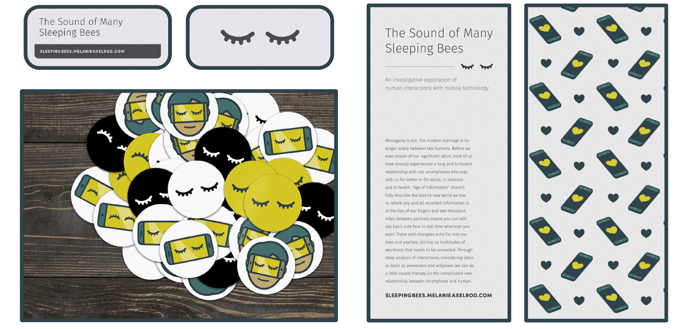
I had the mini cards and stickers printed with moo.com, printed the larger cards myself with the laser jet printers in the lab, and had an additional large banner printed with the campus print shop. Once all was done and collected, the only thing that remained was to find a table cloth and an iPad to borrow, and with that I was prepared for the show.