
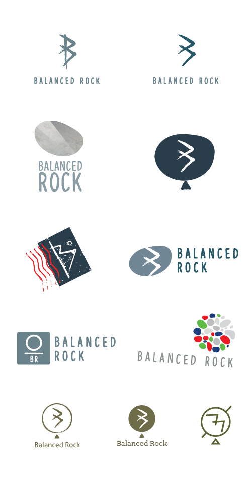
PROCESS WORK
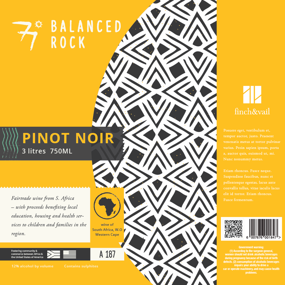
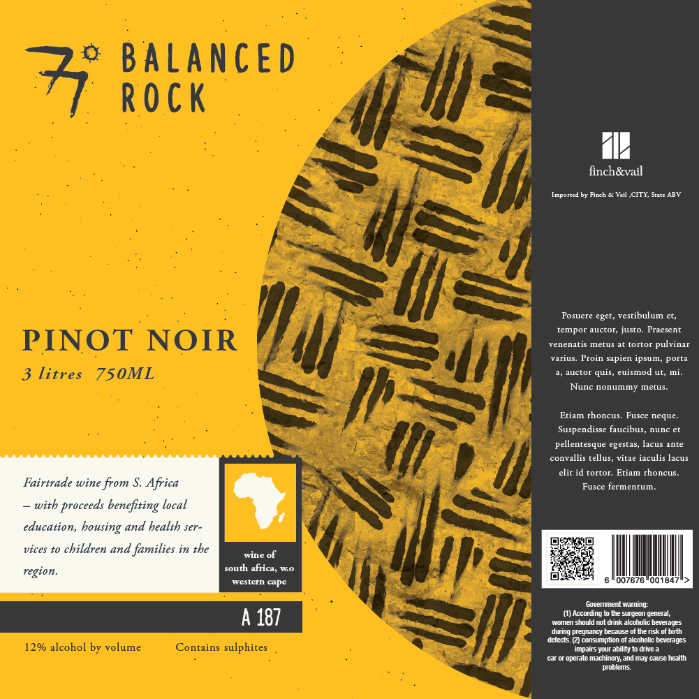

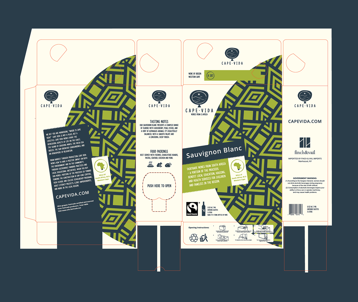
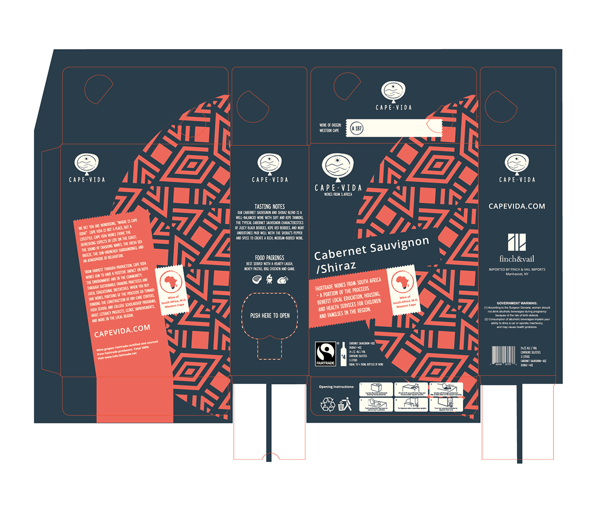
Establish a brand system for a premium boxed wine – imported from S.Africa. The packaging must look premium yet accessible with an obvious nod to its heritage.
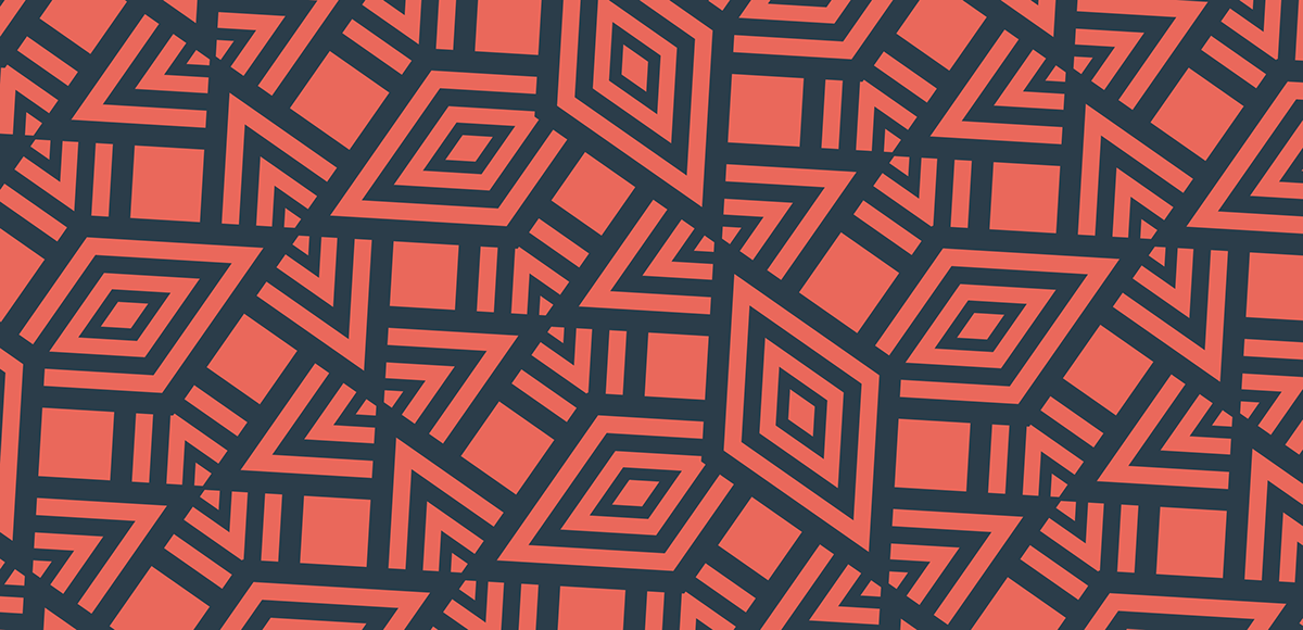
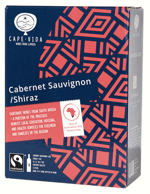
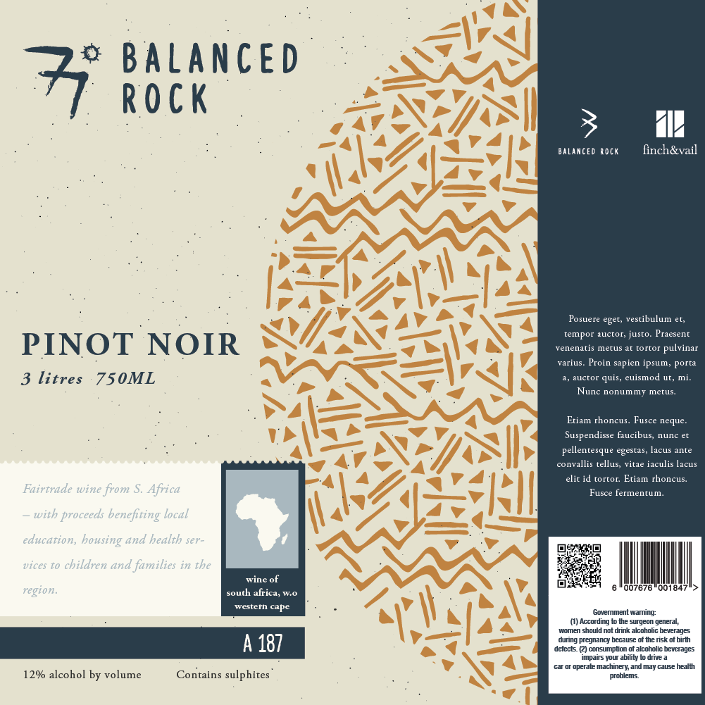
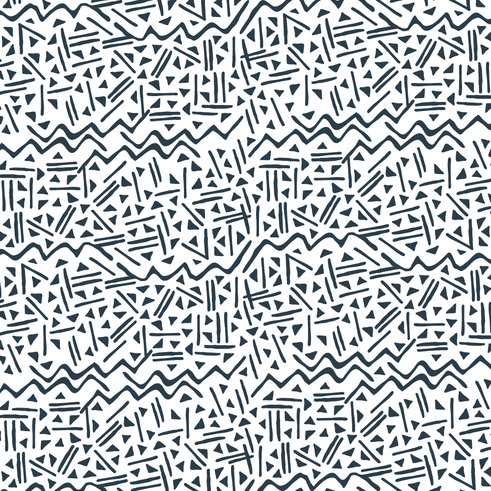
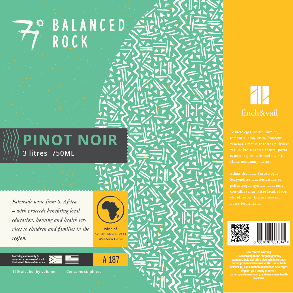
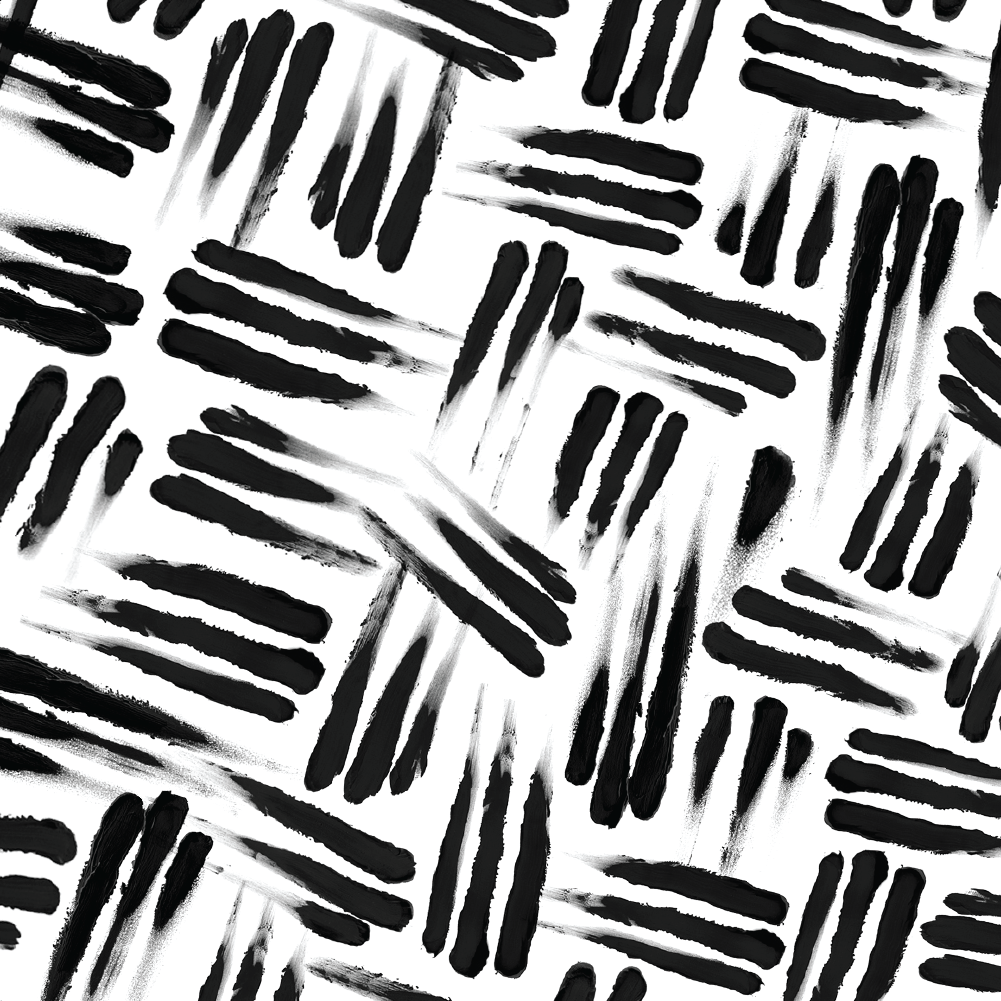
The creation of Cape Vida’s packaging and brand assets was first a research project into South Africa to study its cultural visual expressions. We took inspiration for the box from African Shweshwe cloth. Shweshwe is a printed dyed cotton fabric popular in South Africa – manufactured in a variety of colors and characterized by intricate geometric patterns. It enjoys a timeless popularity in South Africa.
Challenges:
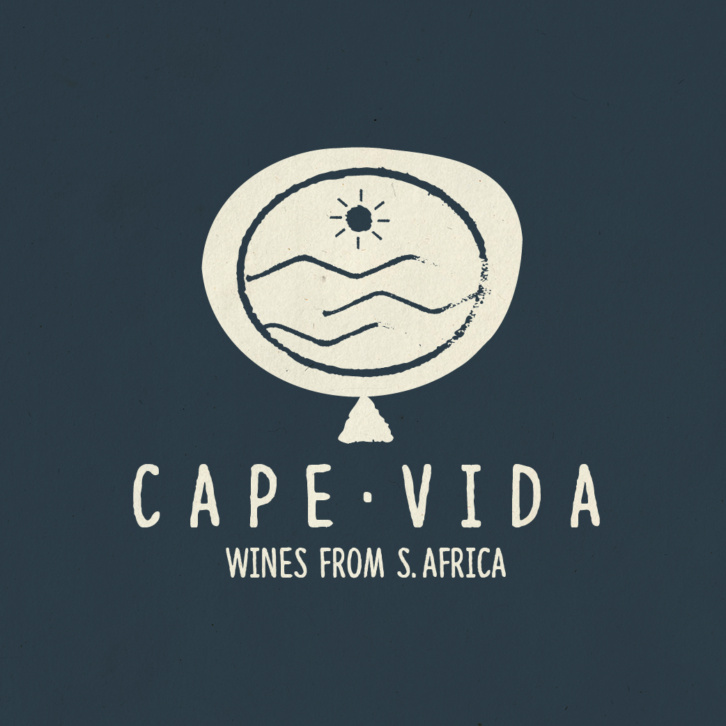
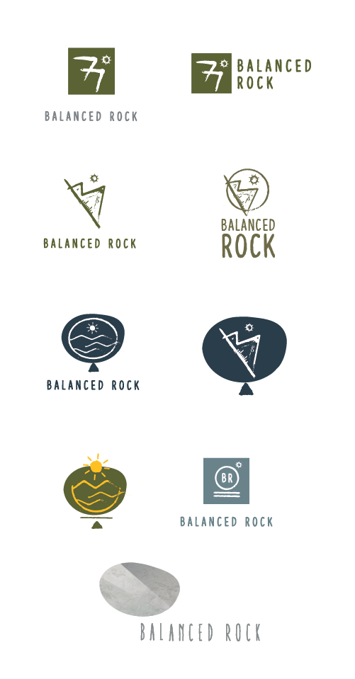
One of the biggest project challenges occurred deep into the branding process where the original brand name was changed due to legal copyright / competition concerns. The original name was “balanced rock” which if you look at the logo mark is more fitting. Since the name change occured deep into the process the only way to rectify the issue without having to redo the process was to find a suitable and legally sound alternative. I worked with my client to establish a list of options (which were then approved by legal) and our final selection boiled down to Cape Vida – a reference to the wine’s location and Vida which means life.


