BRANDING / PACKAGING
Our task was to develop a brand for premium Russian vodka from scratch.
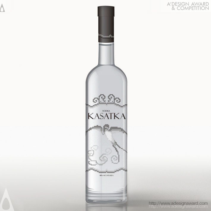
In Russia KASATKA is a barn swallow. Villagers believe that a swallow brings a spirit of joy and happiness into the home. In its folk-poetic use, KASATKA is also a gentle pet name for a woman. With this facts in mind we chose visual elements of cross stitch to bring emotional associations between consumption of the product and feminine spirit and warmness of the handmade.
The visual identity was inspired by ancient Russian and European cross-stitch embroideries.
The packaging design is minimalist, both in the form of the bottle and in the colours. A simple cylindrical bottle and a limited range of colours (white, black and the shades of grey) emphasise the crystalline purity of the product. The graphical approach is minimalist and elegant.