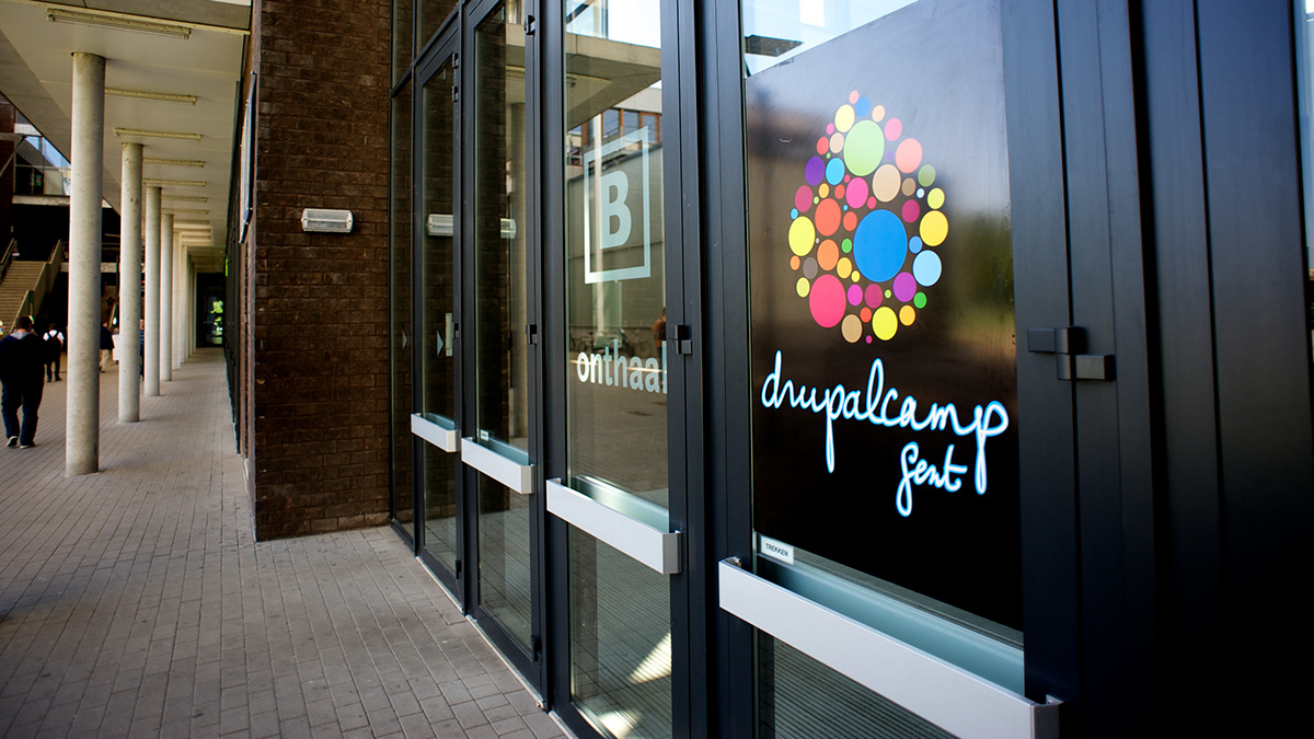
DrupalCamp Ghent
Creation of logo, wireframes, website-design and slicing, t-shirts etc.
Creation of logo, wireframes, website-design and slicing, t-shirts etc.
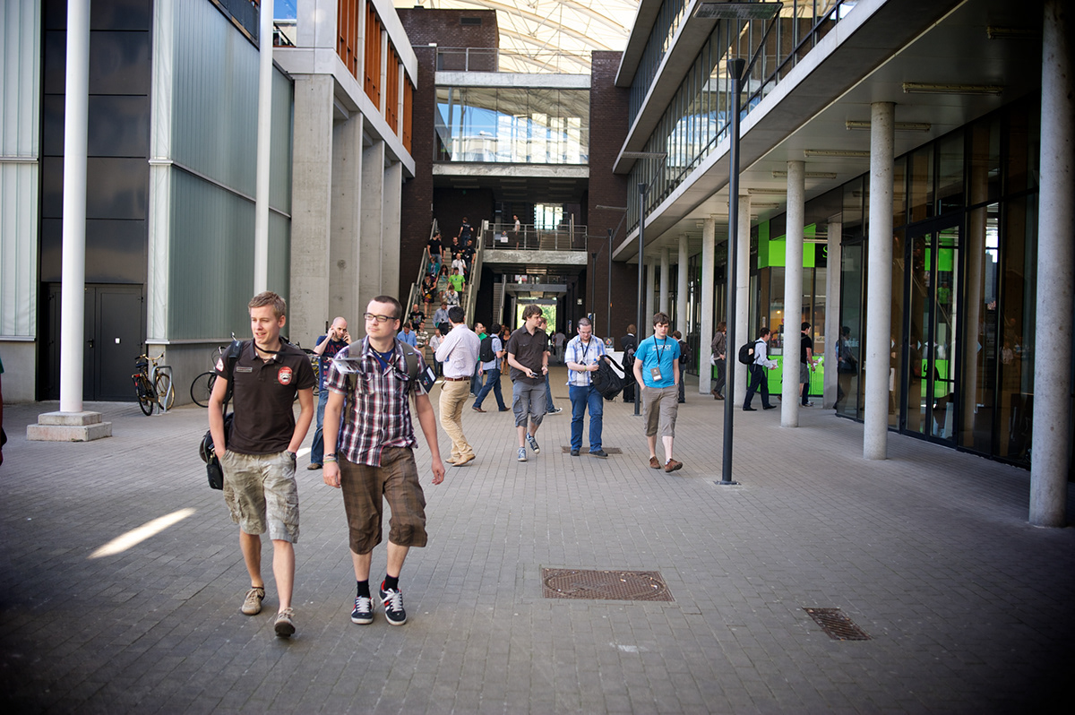
DrupalCamp is an event for anyone working with, or interested in, Drupal. The event is free and offers visitors two days of talks, presentations and social events. DrupalCamp is completely relying on volunteers; for this edition (DrupalCamp Ghent 2012), I took care of everything that is more or less related to design.
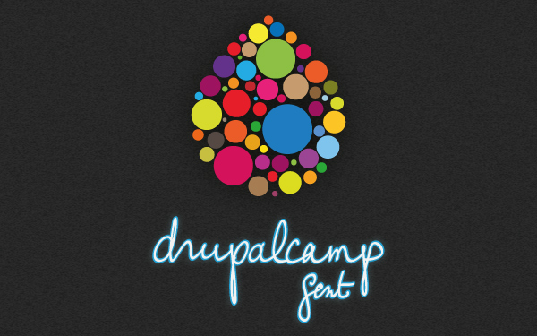
This is the logo I made for DrupalCamp. It was, like the whole project, made in a rather short time-period. After they dismissed my first proposal for being “too technical” (don’t worry, eventually I was very glad they did), I came up with this design. The font is custom made for this project.
The creation of site

The primary goal was to create the website. I started off with designing the wireframes (raw sketches of the site) since this is a good guideline for the content. When designing a website, I generally end up throwing away my first design and with this the exact interpretation of the wireframes. The final result is regularly a design that respects all the items already included in the wireframes, but some elements may have been placed differently. In my opinion, wireframes can also be a limiting factor and it is necessary to let go of these initial thoughts - or at least give it a try.
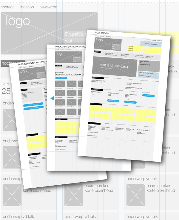
Some of the digital wireframes. Due to lack of time, I unfortunately had to drop the responsive idea for this project.
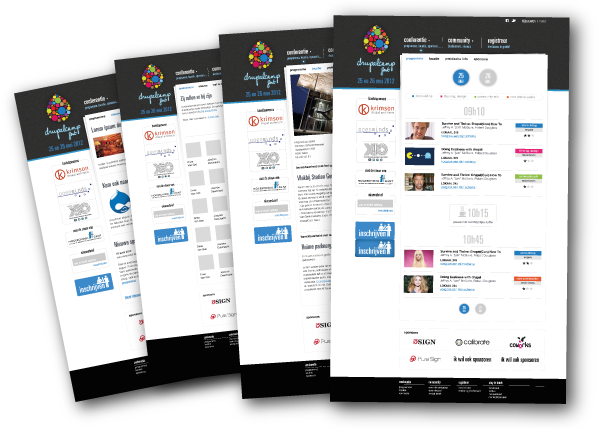
These are examples of the screens I designed. Here I’m using dummy content which I really like since it gives you the opportunity to put Chuck Norris on the website.
The actual implementation and development was done by several companies (including XIO and 3SIGN), and individual volunteers (Tim Leytens, Sven Decabooter).
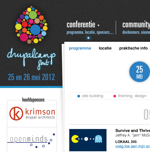
Detail of the final design. As you can see, the main sponsors ended up in the left column (in the wireframes they appeared in the top-section). After some remarks from visitors I also redesigned the submenu.

Sprites and instructions for the front-end developers.
FYI: sprites are buttons or small parts on a website with user interaction. To speed up the loading and responsiveness of the site, it is a good idea to incorporate all states of a button in one image. Only a part of this (=1 state) is shown to the user. When the user hovers the image some code quickly changes the visible part.
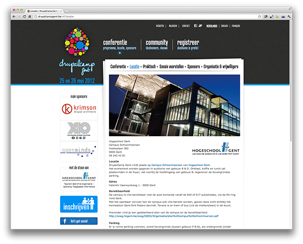
Final site on drupalcampgent.be
The design of the logo
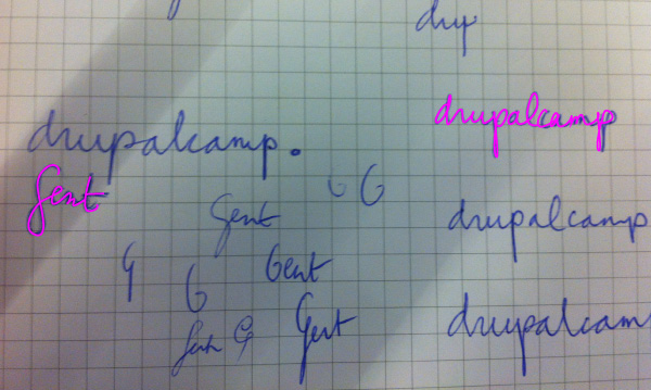
I almost exclusively work with Adobe Illustrator. For this logo I used my own handwriting. In most cases I start on a piece of paper, take a picture with my iPhone (I am too lazy to use the scanner) and then start to trace it. There are rare occasions at which I trace drawings using my tablet, but the drawings tend to be too small to do this accurately.
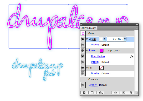
To draw the vector lines, I use one contrasting color, thin lines and Bézier curves. I always try to use as less anchor points as possible since it can be extremely hard to make a smooth line if you use too much anchor points. Adjusting is an even bigger pain in the ass if you use too much anchor points.
The next step is to optimize the lines and shapes.
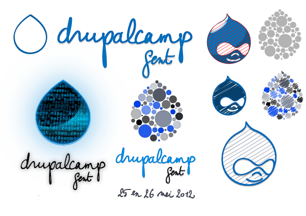
These are some of the dismissed designs. The logo at the left-bottom was the first proposal (remember? it was too technical).

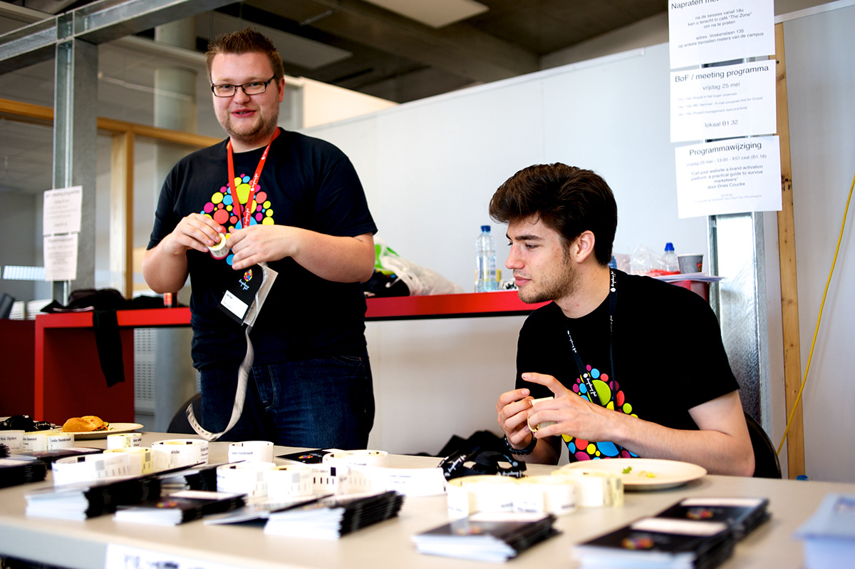
Badges for sponsors and attendees.
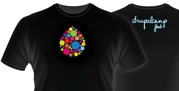
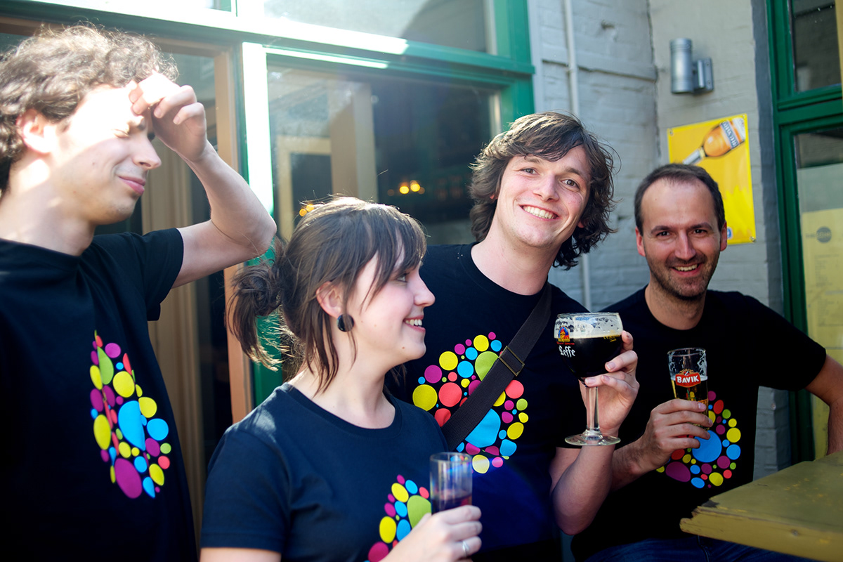
Proposal for the t-shirts. The logo is first printed in white and after this, five colours are added. The actual logo has a lot more hues but printing it in quadri is no option since this method is expensive and does not work very well on dark t-shirts. So I reduced the number of colours to five so that every colour can be printed separately which makes them much brighter.
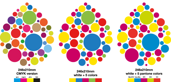
On the left you can see the original logo, at the right the five colour version. I also made a logo with four colours but this one did not resemble the original anymore.