//////////////////////////////////////////////////////////////////////////////////////////////////////////////////////////////////////////////////////////////////////////
NamasTea // branding project
-
THE IDEA
Once chosen a font I was asked to create a brand.
After some brainstorming, I thought about a Tea company and asked my-self:
how do Tea brands usually appear? Decorative, colorful, playful or classic (either way).
A typical tea inspired type-face would certainly be a serif. And the styling would rather be decorative.
So that day I felt a bit revolutionary and the Van Der Rohe mood Less is more kept pulsating in my mind.
Finally my challenge was to create a minimalistic styling without loosing the sense of "tea".
NamasTea wants to get out of the box, leaving tea to its pure form, and playing with space.
-
MEANING
Namas / Tea
Namaste (nʌməsˈteɪ) > an ancient Sanskrit greeting still in everyday use in India and especially on the trail in the Nepal Himalaya. Translated roughly, it means "I bow to the God within you", or "The Spirit within me salutes the Spirit in you" - a knowing that we are all made from the same One Divine Consciousness.
-
FONT
Futura
Futura
-
CODES
// green: green Tea
// red: black Tea
// yellow: yellow Tea
// white: white Tea
// blue: corporate identity
CODES
// green: green Tea
// red: black Tea
// yellow: yellow Tea
// white: white Tea
// blue: corporate identity


Corporate identity


Business cards
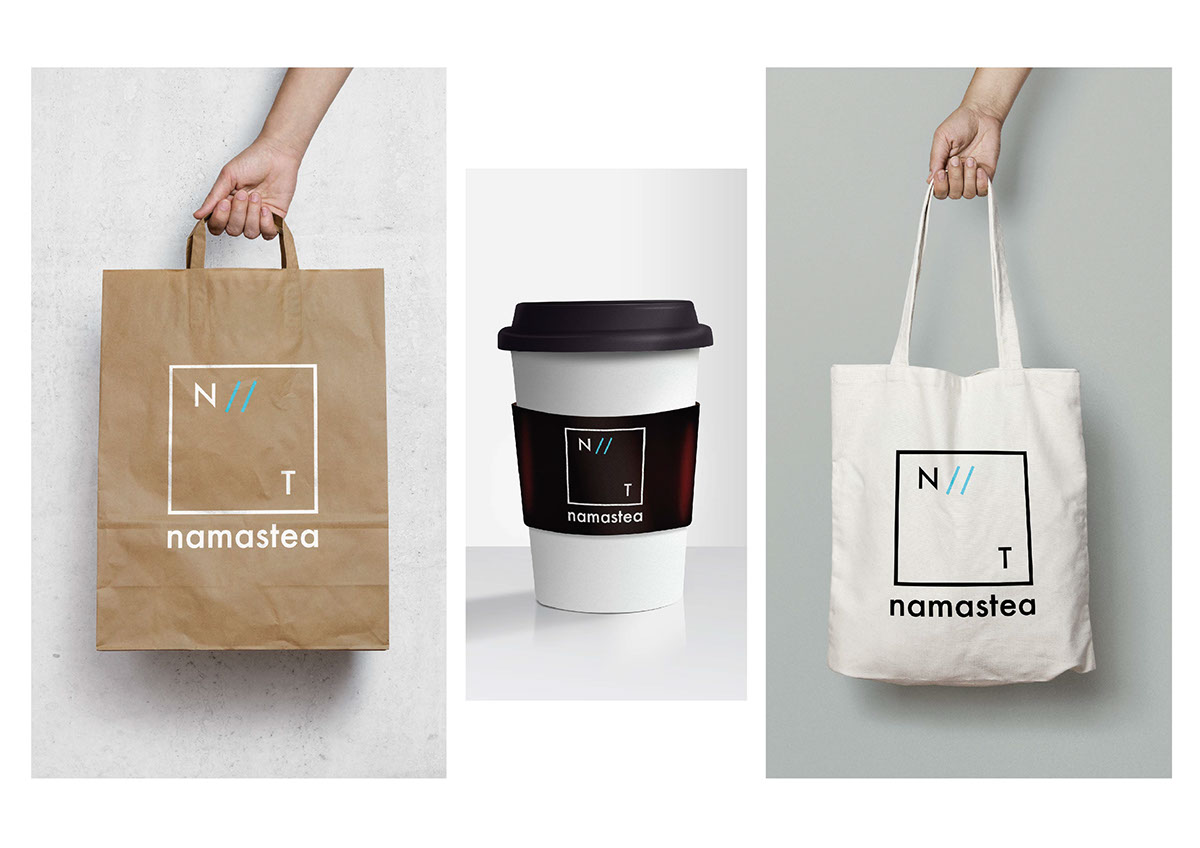
Gadgets

Brainstorming // Processing the idea

Corporate identity

Brainstorming // Processing the idea

// Green code

// Corporate identity
//////////////////////////////////////////////////////////////////////////////////////////////////////////////////////////////////////////////////////////////////////////
It's all about proper tea.
It's all about proper tea.


