Hårklipp - Concept and Logo
The objective in this project was to choose an object and repurpose it to a different meaning. The object chosen was the famous office style binder clips, converting its use to hair clips.
The name Hårklipp was created joining the translation of 'hair clip' from some Scandinavian languages. With that, the identity was created to be modern, urban and guided towards youth (18-25), avoiding the younger generations.
The following logos are the final versions for black & white and color, although the color version may have its colors altered, following stablished rules.


Hårklipp Magazine Ads
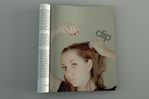
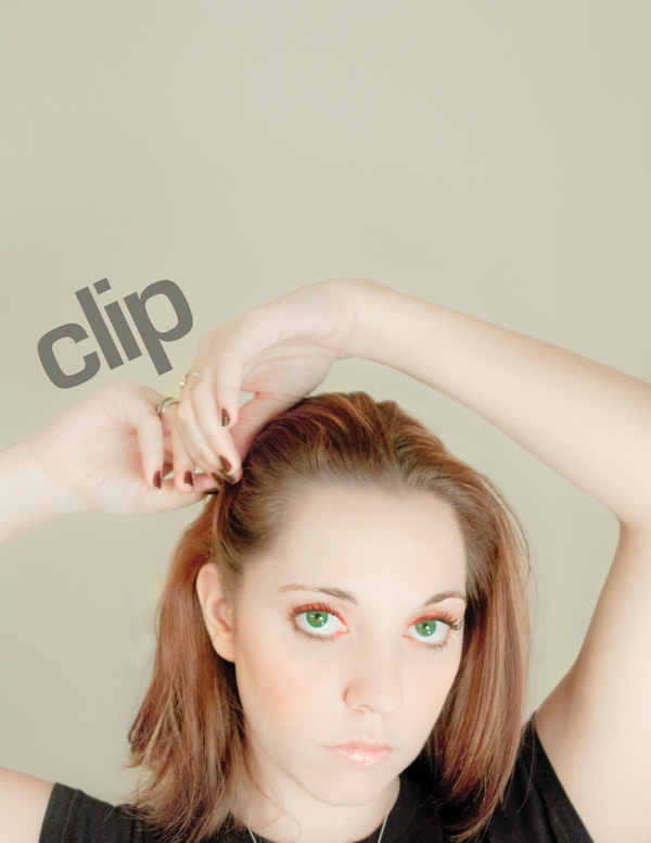
This is an ad series of 3 (on the same issue,building up to the last one) for the product Hårklipp. The idea is tograb the readers attention by a strong, clean image, and the interestand curiosity by not revealing what this is about in the first page.
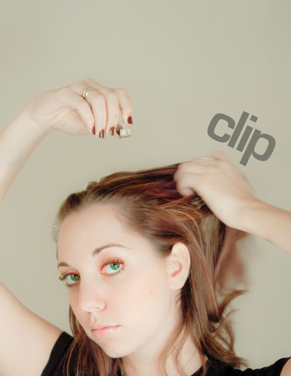
The second page has the same imagery of the first one, but with a hint of what is coming, since the product itself can be seen on the model's hand.
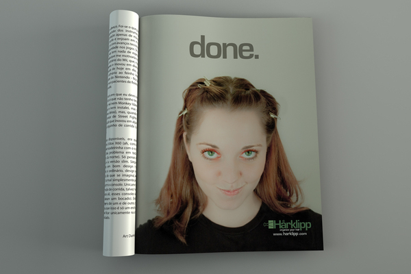
The conclusion comes in the third one, where the product can be seen in use, and the logo, tag line and contact information are displayed.
Concept, photography, editing, production and lay out: Leonardo Patat
Model: Alessandra Manes
This is an ad series of 3 (on the same issue,building up to the last one) for the product Hårklipp. The idea is tograb the readers attention by a strong, clean image, and the interestand curiosity by not revealing what this is about in the first page.
The second page has the same imagery of the first one, but with a hint of what is coming, since the product itself can be seen on the model's hand.
The conclusion comes in the third one, where the product can be seen in use, and the logo, tag line and contact information are displayed.
Concept, photography, editing, production and lay out: Leonardo Patat
Model: Alessandra Manes

Part One - Clean picture with nothing but a 'clip' to grab reader's attention.
Part Two - Same image treatment, 'clip' now on the other side, and a hint of the product on her hand.
Part Three - The conclusion has a brighter image, and the model shows the product in its full use. Brand, tag line and contact info revealed.
Part One - Flat Version
Part Two - Flat Version

Part Three - Flat Version
