

Hospitals are confusing and stressful environments
to all visitors and patients, and those with hearing,
vision or mobility impairments are at even more of
a disadvantage. I wanted to investigate this issue and
look into how to make hospitals easier to navigate.
to all visitors and patients, and those with hearing,
vision or mobility impairments are at even more of
a disadvantage. I wanted to investigate this issue and
look into how to make hospitals easier to navigate.
I created a wayfinding proposal that could help address some of the major pain points in hospital design.
This project was informed by hospitals that I visited, and people that I talked to who have visited and/or
worked in hospitals. It is also based heavily on research about wayfinding and accessibility.
This project was informed by hospitals that I visited, and people that I talked to who have visited and/or
worked in hospitals. It is also based heavily on research about wayfinding and accessibility.
Wayfinding is an interesting form of design to me, and one that I think often goes unnoticed, but plays
suchan integral part in our everyday lives. The idea of helping people through wayfinding was an
appealingsolution to me. I think that this problem is a very worthwhile one to tackle, and
something I wish I had the resources to impact more directly.
suchan integral part in our everyday lives. The idea of helping people through wayfinding was an
appealingsolution to me. I think that this problem is a very worthwhile one to tackle, and
something I wish I had the resources to impact more directly.

The colour scheme of this wayfinding system aims to be accessible to userts with colour blindness. For this reason, there is a high level of
contrast between all of the colours used, making them distinguishable for visitors and patients with different kinds of colour blindness.
contrast between all of the colours used, making them distinguishable for visitors and patients with different kinds of colour blindness.
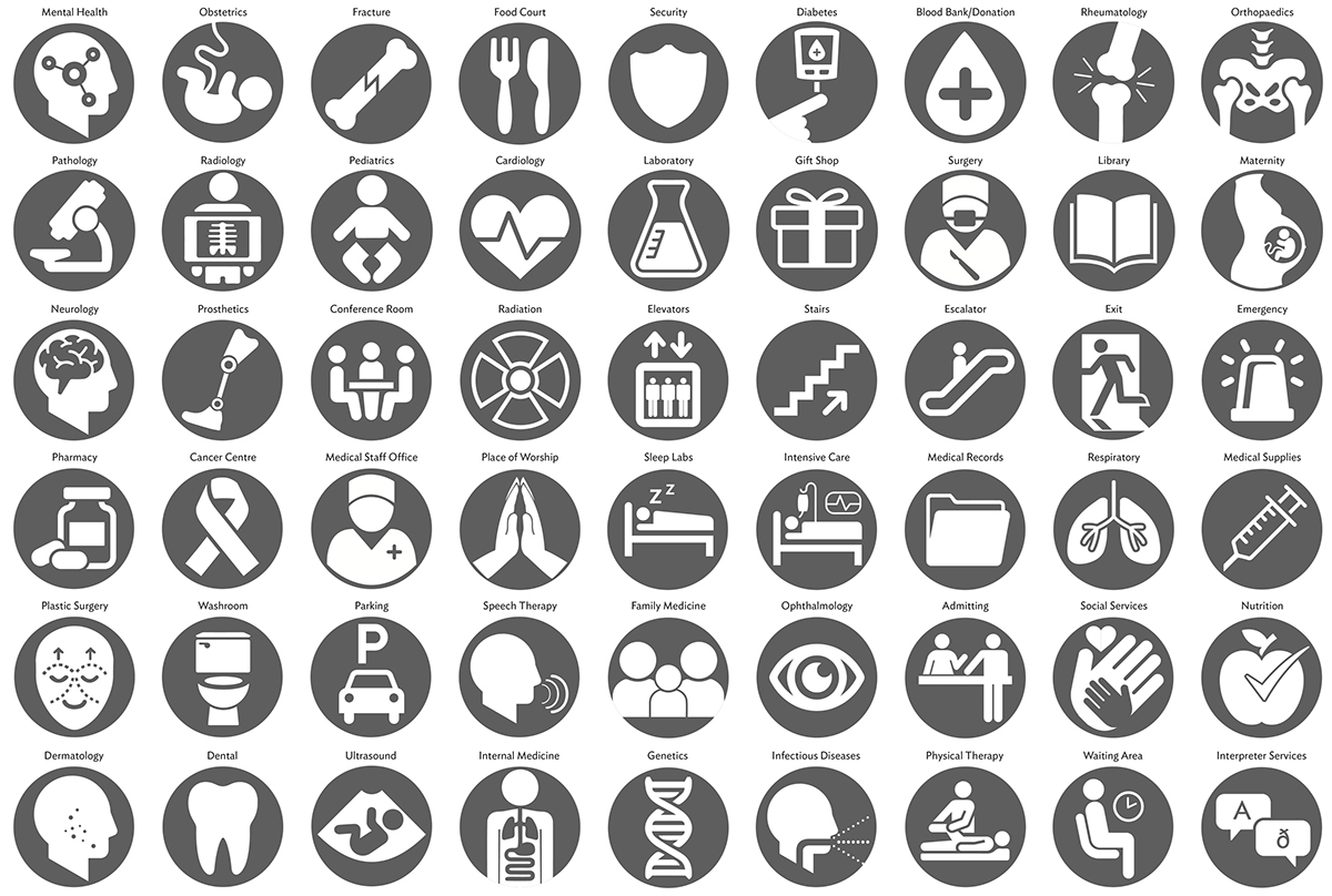
The icon system was a very important part of this wayfinding system. It allows visitors and patients who don't understand or read
English to find their way around quickly and efficiently, as well as bridging the gap between the general population and the
confusing world of medical terminology. Since most people find hospitals confusing and stressful environments, using
simple and clear iconography in the wayfinding can help users feel more at ease.
Most of the symbols were created by me, though some were borrowed from from the AIGA or other standardized symbols, and
used as is, or modified slightly. For users of this kind of system, reinventing the wheel would not be useful; if there is already
a symbol that is effective and understood, I should not try to create a new one and just cause confusion.
used as is, or modified slightly. For users of this kind of system, reinventing the wheel would not be useful; if there is already
a symbol that is effective and understood, I should not try to create a new one and just cause confusion.

This shows a sampling of all the different kinds of signage that would be used throughout the hospitals,
and how they would work together as a system.
and how they would work together as a system.
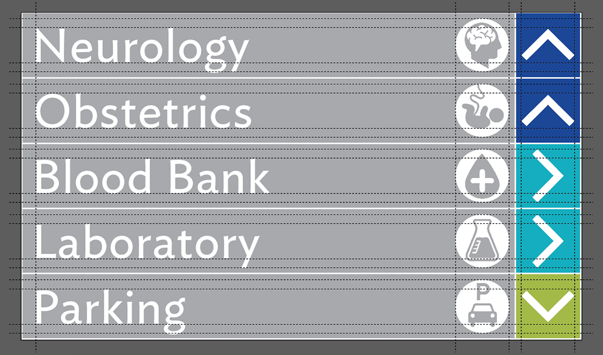
A closer look at a sample kind of signage, showing the grid used to make sure everything is properly aligned.
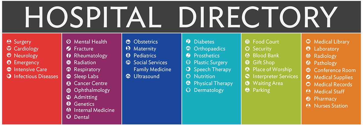
The hospital directory would show all the wards of the hospital, split into different wards.
The colour code is reflected in all the signage, as well as the maps.
The colour code is reflected in all the signage, as well as the maps.

An illustration of the family of elements, used together in this system. They are shown at the relative elevations they would
be in the hospitals, and are shown to scale with each other. Different silhouettes are shown on the left side to illustrate
the different groups of users targeted, and their different viewing heights.
be in the hospitals, and are shown to scale with each other. Different silhouettes are shown on the left side to illustrate
the different groups of users targeted, and their different viewing heights.
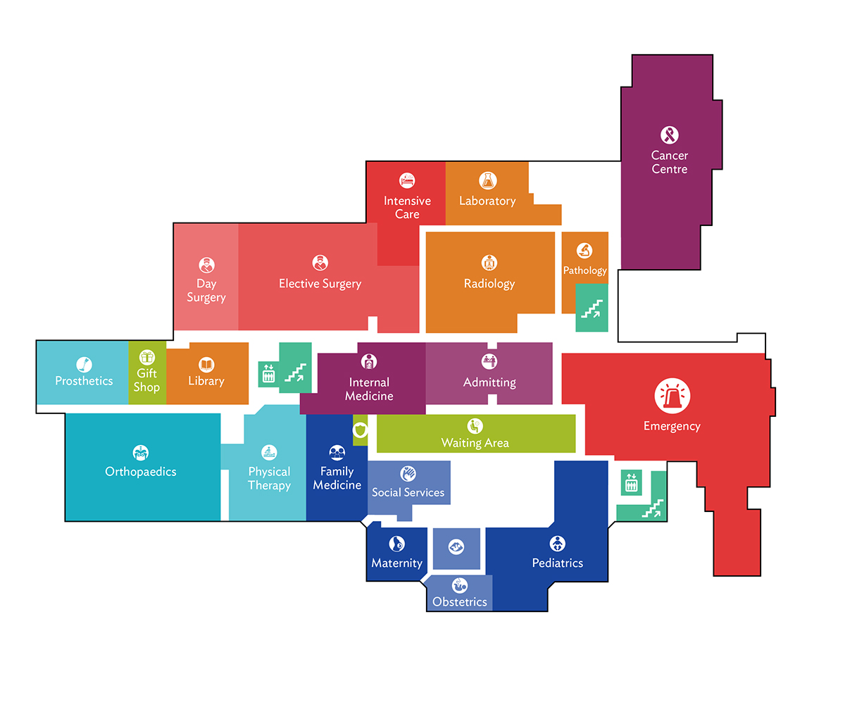
An example of what a map directory would look like, using this wayfinding system. It is easy to identify different departments of the hospital, understand the colour teal's use for elevators and stairways, and see the incorporation of the symbol system into all areas of hospital wayfinding.
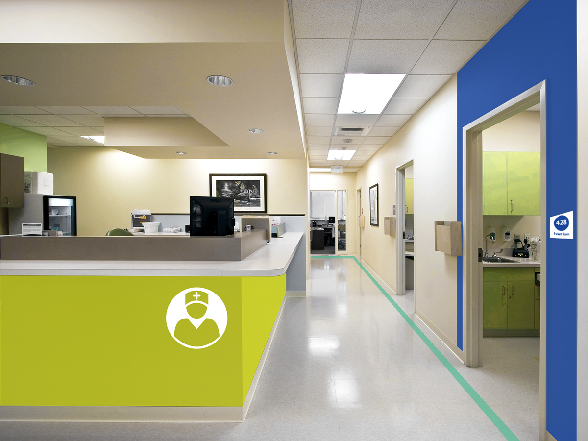
A nurses station would serve as a wayfinding landmark by being bright and easily recognizable, through use of the icon system.
This also shows the leading lines on the floor, and the treatment of patient rooms. The colour of the department they belong to would
be painted around the entrance to the room, as well as used in the room marker. This signage would be placed low enough to
accommodate a range of viewing heights.
This also shows the leading lines on the floor, and the treatment of patient rooms. The colour of the department they belong to would
be painted around the entrance to the room, as well as used in the room marker. This signage would be placed low enough to
accommodate a range of viewing heights.
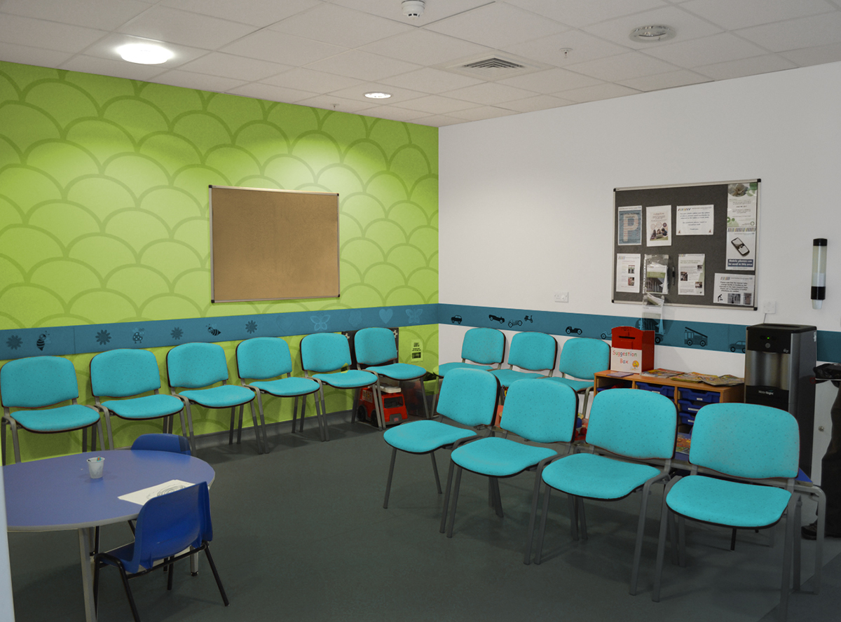
An example of a waiting room, using the colours of the wayfinding system. A simple
pattern could be used on the walls, to denote them as a visitor or family area.
pattern could be used on the walls, to denote them as a visitor or family area.
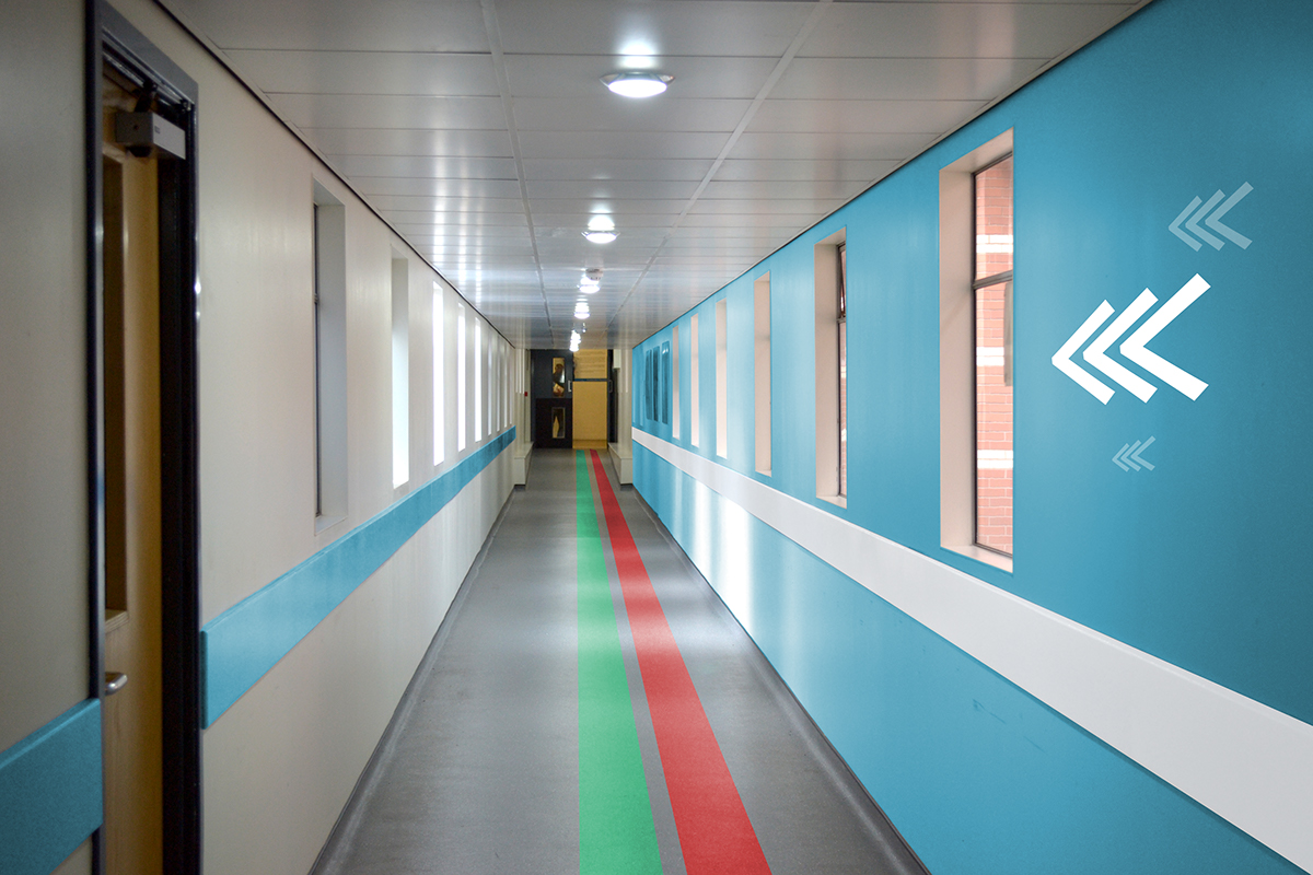
A sample of a hallway design, with coloured lines on the floor leading patients and visitors to the emergency ward and the elevators. These would be quickly visible my patients of all viewing heights, including those in wheelchairs. The guard rails are also treated with the colour scheme.
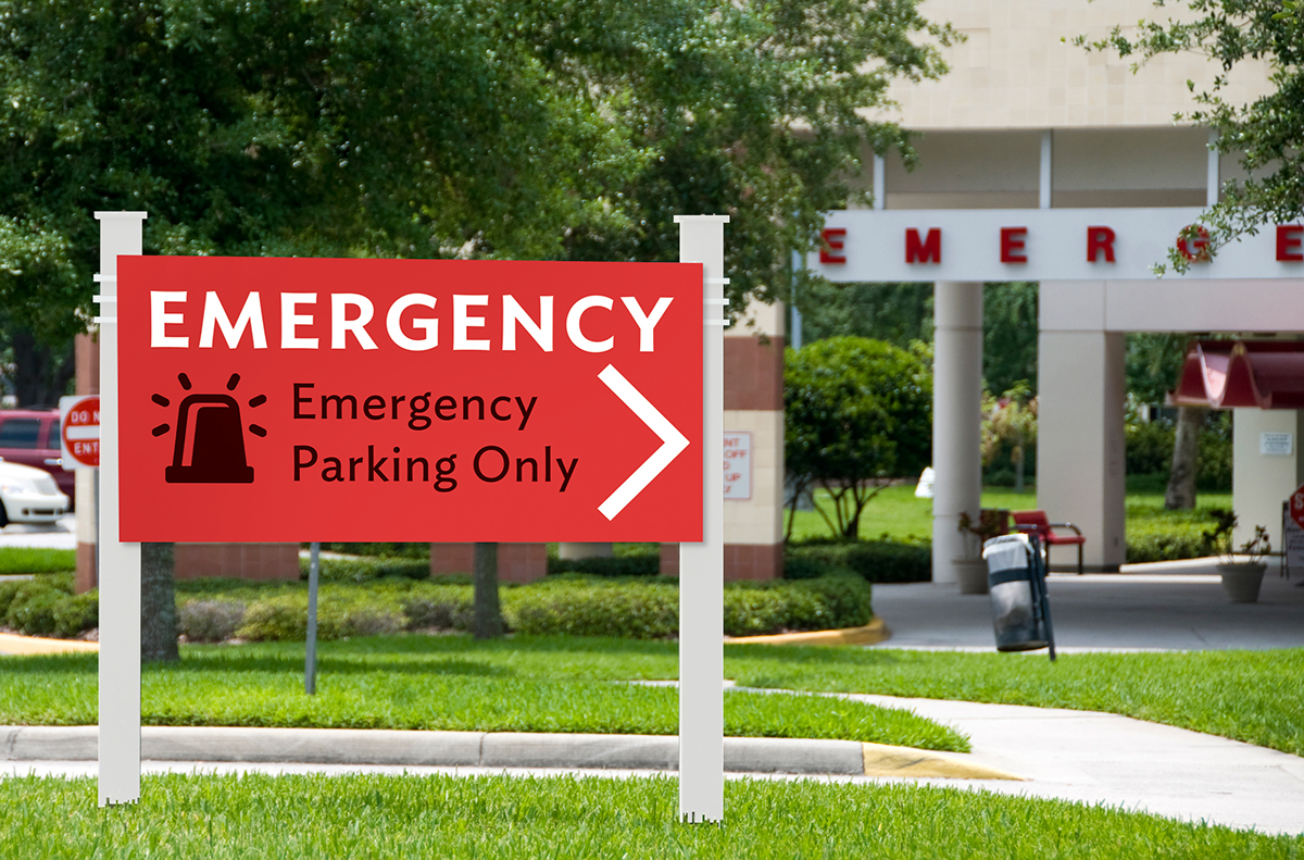
As well as designing a system for the interior signage of accessible wayfinding, I am starting on the exterior signage as well.
These will incorporate the colours, fonts and symbols used throughout the hospital. It will also be the first time patients and
visitors encounter the wayfinding system, so it will set the tone for their user experience.
These will incorporate the colours, fonts and symbols used throughout the hospital. It will also be the first time patients and
visitors encounter the wayfinding system, so it will set the tone for their user experience.


