

Context: A personal project to document New York City’s remaining neon signs included a free “digital guidebook.” With funds from Kickstarter I hired a developer to put together an iPhone app under my direction and following my wireframes, mockups, and using assets I created (photographs, icons, etc.) guiding users to signs around the city and allowing them to rate their favorites.
Goals: With a minimal budget and a staff of two (the developer and myself) I needed to create realistic mockups as quickly as possible to facilitate communication with the London-based developer and help test the app’s flow with potential users.
Tools Used: Primarily hand sketches, Photoshop, and Illustrator.
Additional information: The mockups worked very well in this context and the developer and I were able to work through iterations at a rapid pace. I had set a quick deadline in order not to lose the interest of backers, and we were able to achieve that with a smoothly functioning, easy to use app that was well received by users.
Impact of User Centered Design Process: When making the app I hadn’t yet learned all the tools of the user-centered design process, and I think additional prototyping might have been helpful. That said, the ability to rapidly mockup the design was a huge help, especially since the developer and I were in different countries, and it greatly contributed to a smooth process and also helped with testing before the app was released. In addition, the entire creation of the app came about due to frequent feedback from and interaction with users. The project began as a small photo set on Flickr, but due to overwhelming response and feedback, it continued to grow into a larger photo set, then a blog, and then the app. All along the way users continued to show their preferences for which photos they cared about, weigh in on app features desired, and share what information they found helpful about each neon sign. Without this ongoing feedback the whole project would have remained a small set of photos.
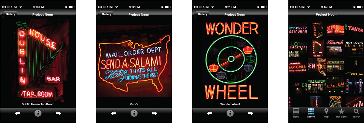
Photos for each sign can be accessed from several directions, including the gallery page at far right, and can be browsed with the arrow buttons.

When viewing a photo, turning the phone horizontally makes the photo full screen for optimal viewing.

The list of signs can be viewed in several ways, including alphabetically (the default), as a shorter list of most recommended signs, and by most popular signs (as rated by other users).

A map (second from left) shows nearby signs, and indicates the most notable signs in red. Screens for individual signs have various information including address, nearby subway stops, the type of business, the type of sign, and a brief description/review of the sign. In addition, users can rate the sign themselves and access Apple Map directions. On the far left is the splash page, which features the logo I designed (originally for the blog) as well as details from many of the photos.


