Self-initiated mock advertorial series for a fictional condominium complex.
The idea was to illustrate a bulbous, teetering on ludicrous structure presented here as a desirable dwelling for discerning city denizens.
Hubris was the germ-word that gave the idea traction, but it's also a word that one could imagine getting hijacked and re-appropiated for a marketing campaign- the original meaning and connotations of the word somehow (sadly) becoming irrelevant.


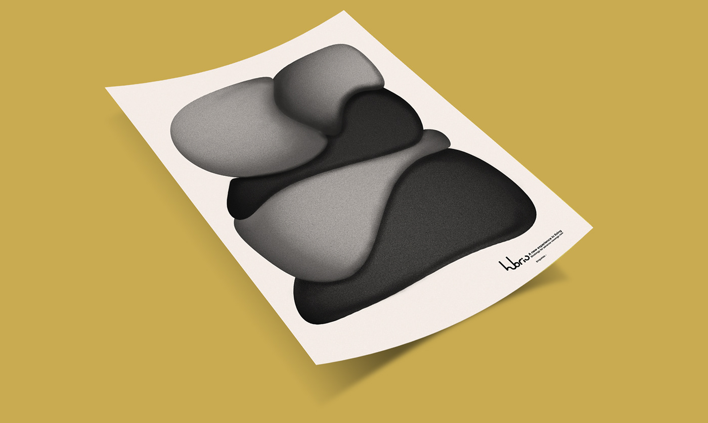
The first poster illustrates this proposed edifice in situ; spherical melted orbs that rest atop and alongside one another and burled to give a solid appearance. I had in mind that should such a building exist (and be structurally possible to exist), then it would become a similar talking point as the Lloyds of London building became in the 1980s.
The second poster I wanted to present as a purely typographical piece, whilst still maintaining some kind of structural form. The donor font was manipulated to create a healthy equilibrium of type and space.

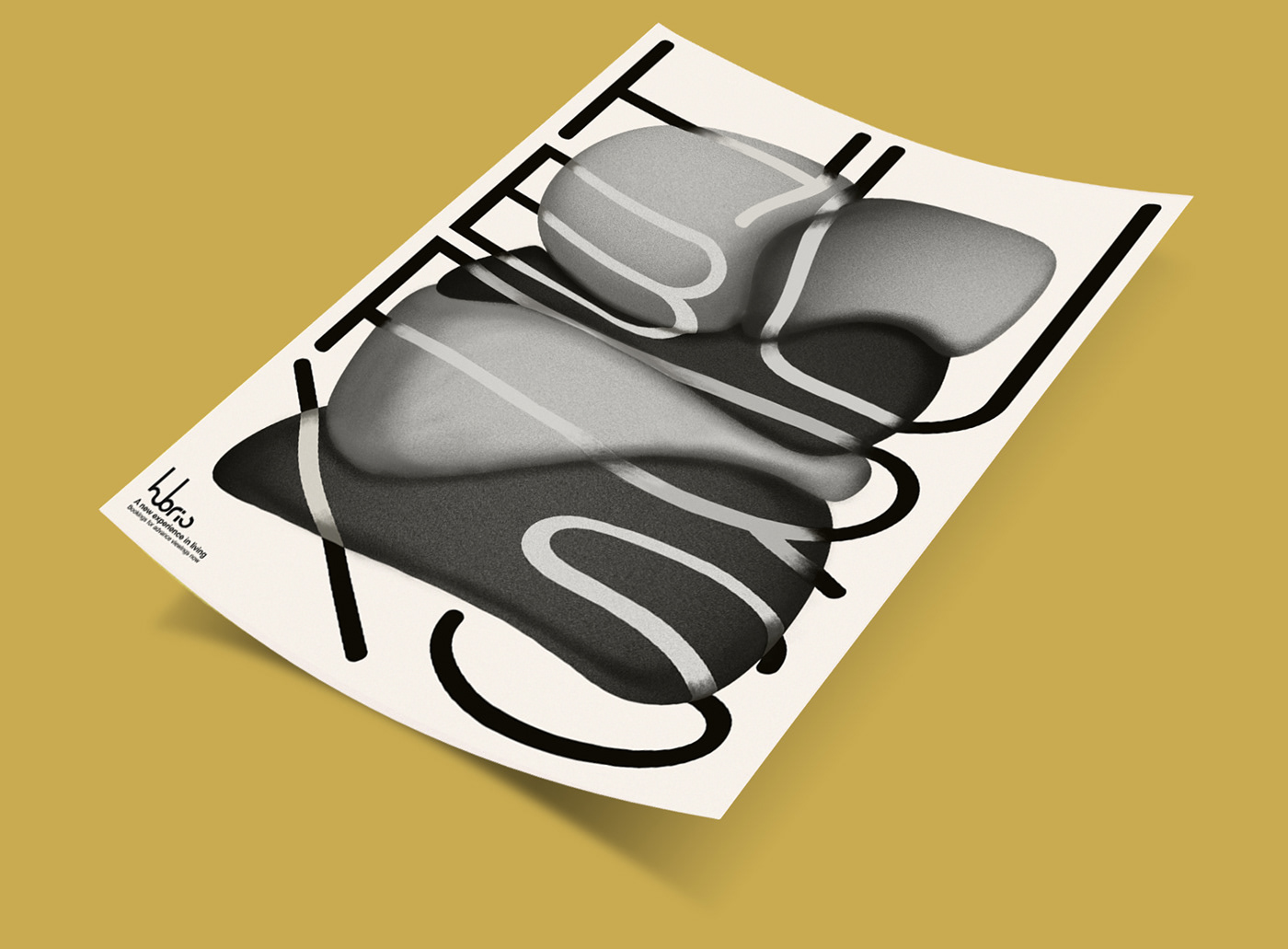
The third poster was conceived as an unholy union of the previous two, with the type straddling the bulbous body of the structure in some kind of an attempt to contain it. Here I wanted to play with the letter forms and textures and run riot a little; create something that would be fitting to the nature of what the project would be intended for.