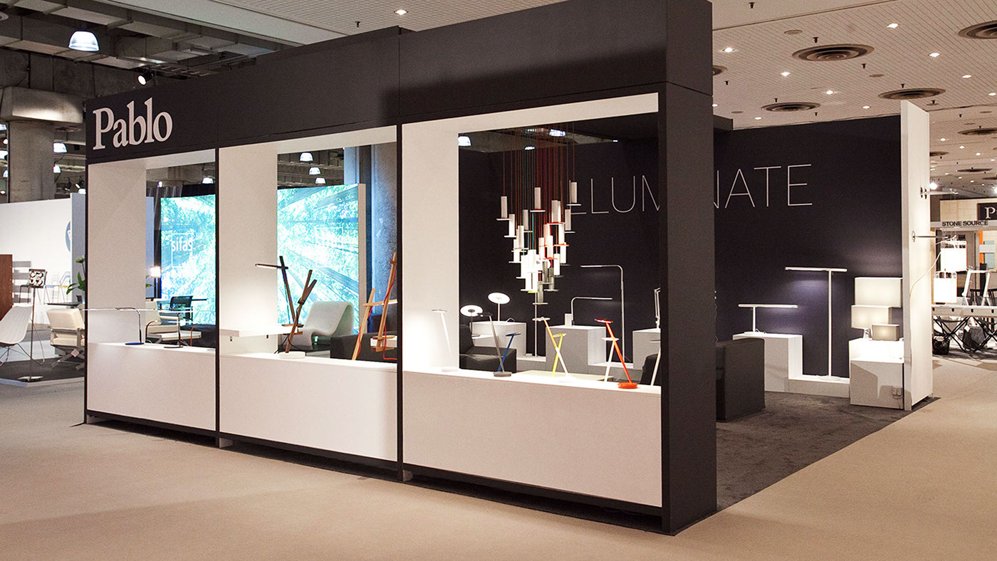
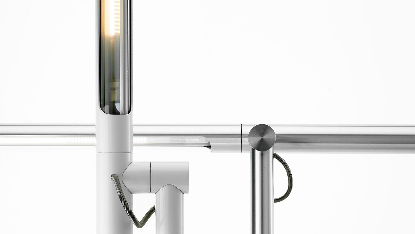
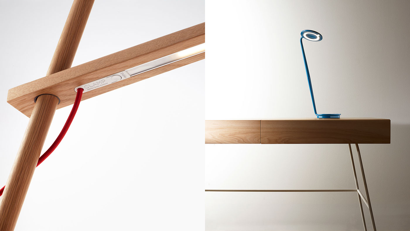
Every Pablo product perfectly distills the studio’s design philosophy—minimalist forms, carefully sculpted lines, and meticulous attention to all the ways light transforms its environment. As part of a refresh, the objective was to elevate Pablo’s designs as hero, creating a one-to-one relationship between product and brand.

Developing a strategic vision for Pablo helped anchor the studio around a common set of ideals that would influence each element of the brand experience.


The logotype was fine tuned for improved legibility. Product names and applications were rendered in a sans serif typeface to pair with Pablo’s logotype and design aesthetic.


Photography showcased the personality and design details of each product, and became a major vehicle for establishing the brand’s signature expression.

The clarity of Pablo’s design thinking extended effortlessly into every product touchpoint, including the brand’s website, product packaging and showroom environment.