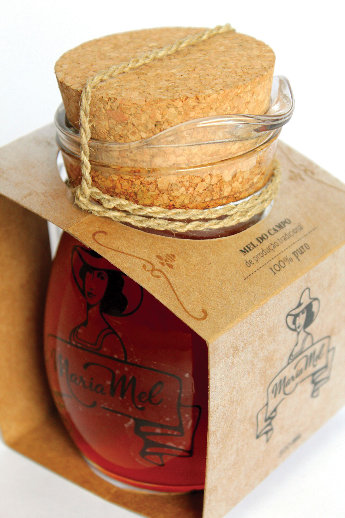
“Maria Mel” is a fictional brand of honey from the countryside, produced by manufactured ways and for the public who seeks to obtain quality honey, pure and competitively priced.
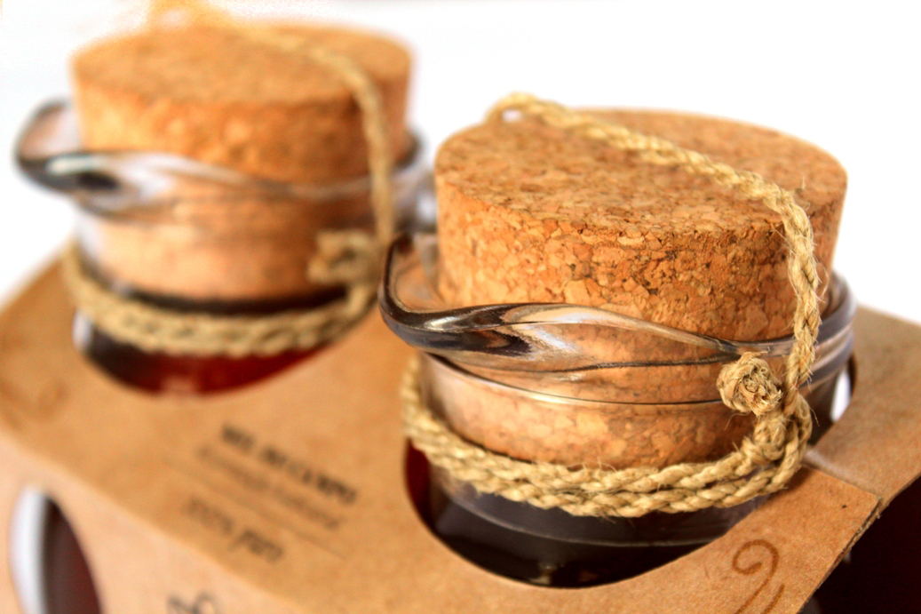
In order to offer a new alternative packaging, caring about the possible reuse or recycling of the same, were researched different containers and materials. The alternative selected is to use glass jars, allowing future reuse, either to other products such as honey, sealed with cork and ropes jute, natural and biodegradable materials.
_____________
First half of 2011.
Project realized in team.
First half of 2011.
Project realized in team.

The logo has classic character shown by the figure of the woman with characteristics of old paintings and illustrations. This is also assigned by the use of calligraphy on a tape in. For emphasizing and illustrate the brand name, it was used the figure of a woman working in the field to refer to beekeeping. This character shows simplicity by her clothes, hat and plain dress. It also conveys sympathy from her face serene and happy.

The construction of the brand originates from treated calligraphy brush strokes,providing good visibility and legibility of the mark, which enables its application in small size. There is also a great bond between the lines of the design, giving the brand strength and consistency.

The layout of the pack endorse the classic character elements used by the brand. There are adornments - abstracted drawings of a bee taking nectar from a flower - in order to strengthen the brand identity and visually unite the whole layout in the form of old frames.