Brief
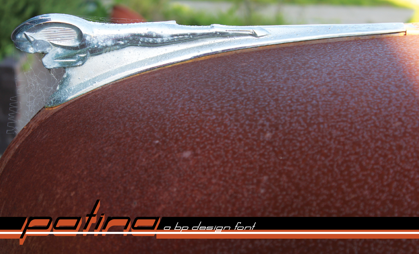
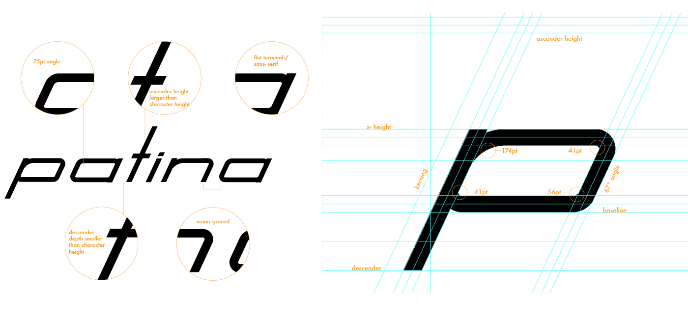
Patina is an italicized sans-serif mono-spaced display font inspired by 50’s & 60’s classic car typography. Created by bp design LLC. This font would be utilized for automotive graphics, emblems, etc... Patina was also chosen for the bp design LLC logo because It embodies the bp design philosophy of old school style with a modern twist.

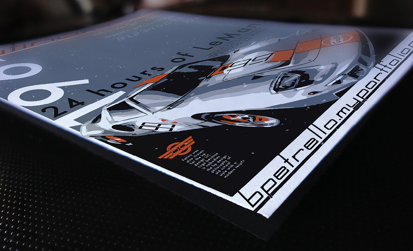
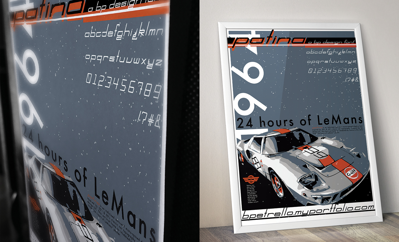
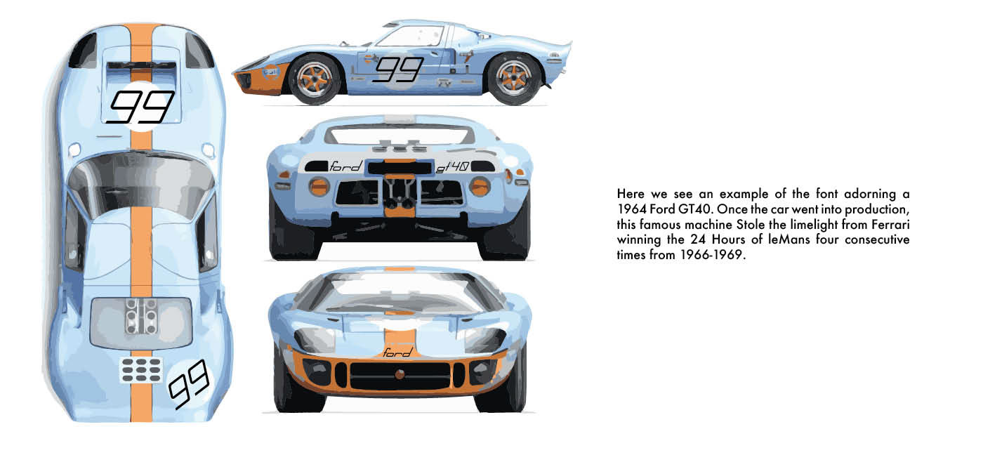
Patina is at home co-inhabited by Futura in this retro 1964 “24 hours of LeMans” poster.
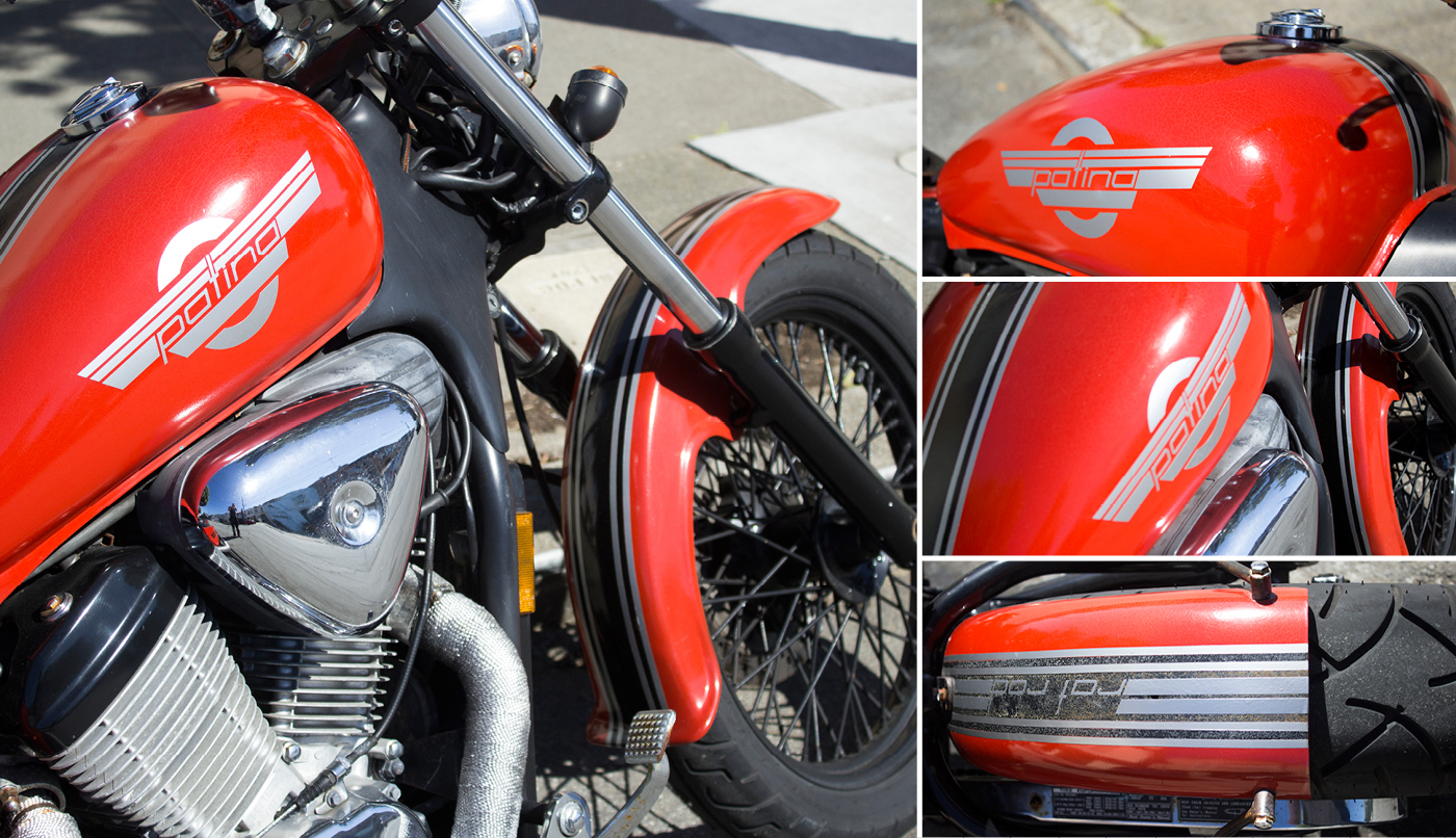
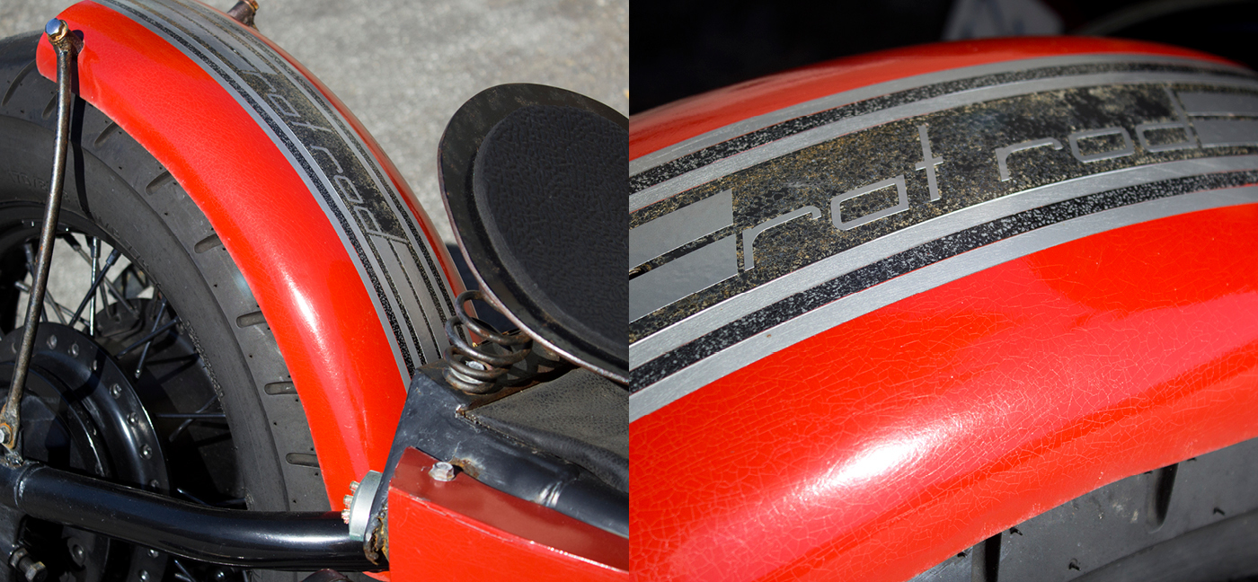
Patina is also a great font for graphics on cars or motorcycles. Whether vinyl or paint, the font looks natural adorning the gas tank and fender of this “rat rod” style bike.
Inspiration
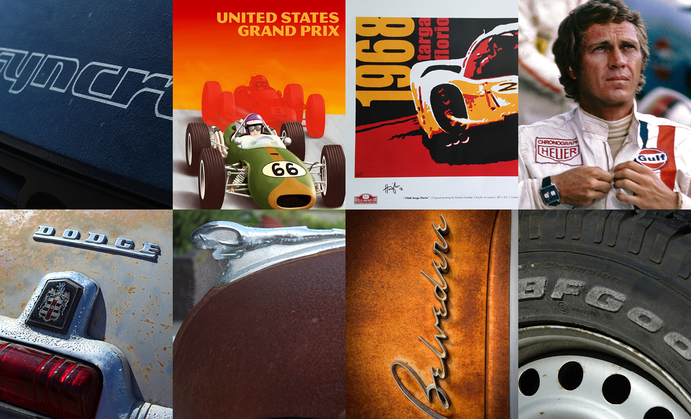
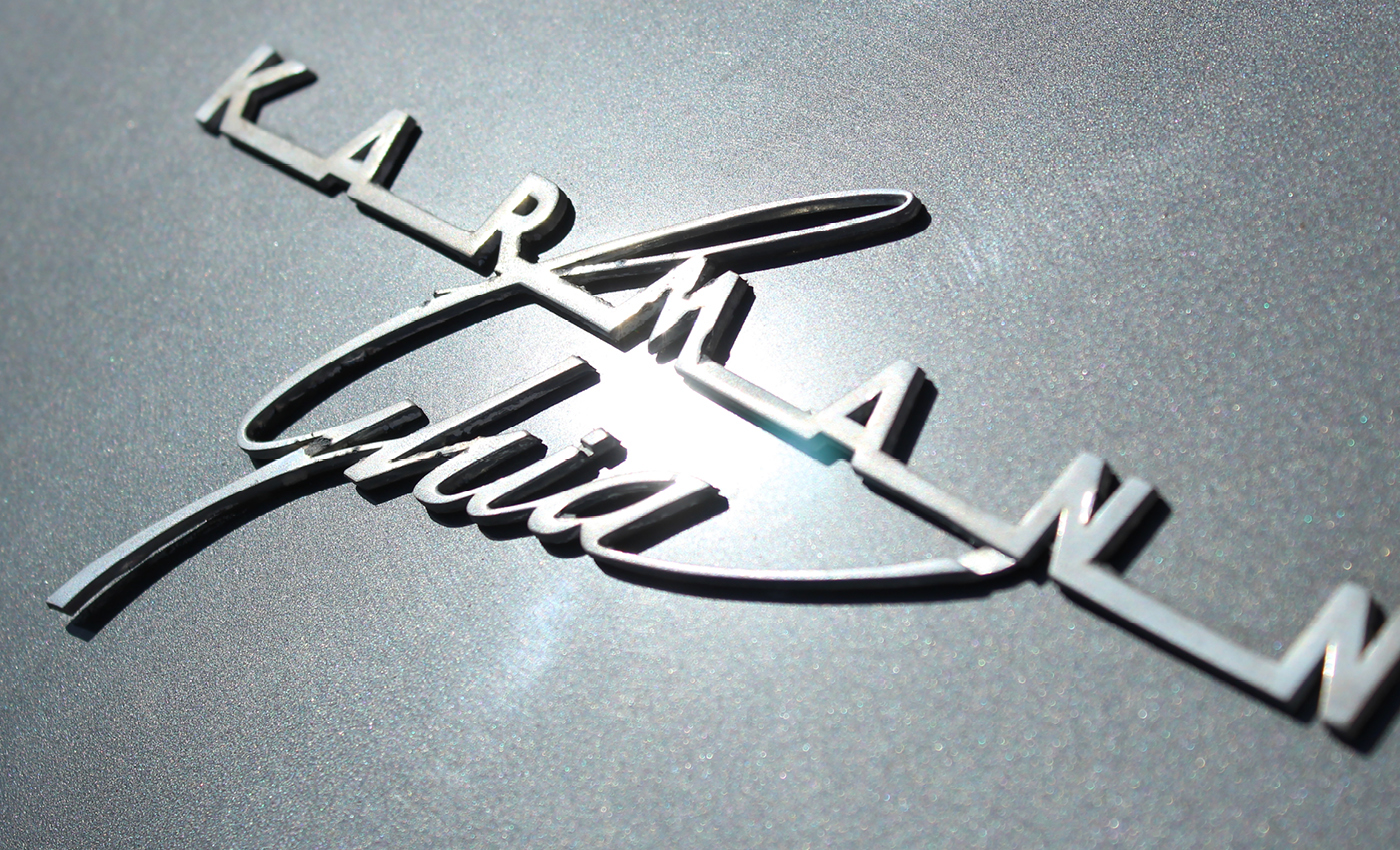
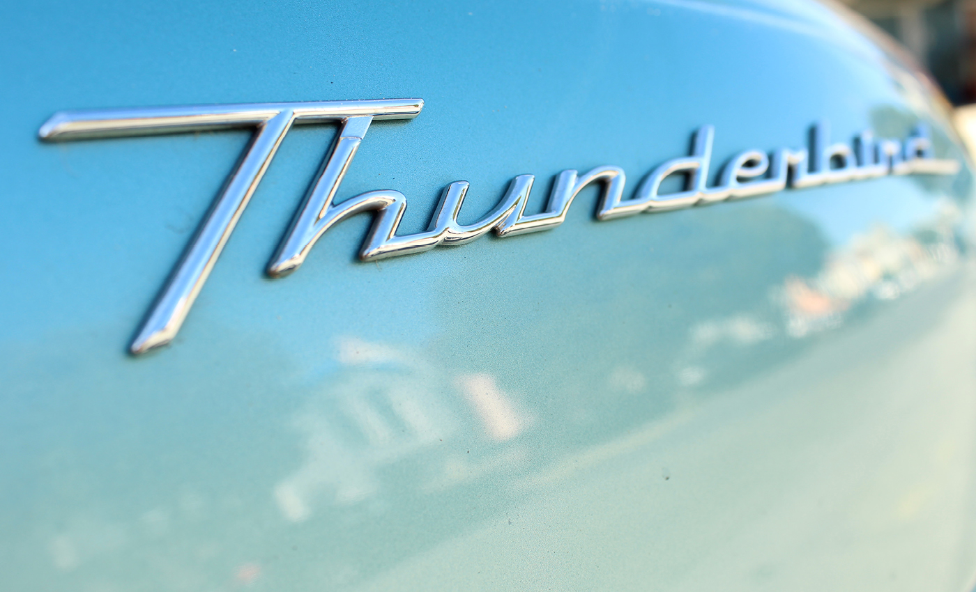
For inspiration I took dozens of photos of vintage car typography. I wanted to focus on the 50’s and 60’s hot rod era because this was one of the most fascinating times in American car culture. As I began photographing the various fonts on classic cars, one thing became evident, serif fonts were largely absent. I knew I wanted to create an angular, italicized font like the BF Goodrich and Thunderbird logos, while experimenting with connectivity like the KARMANN logo. One other thing was evident on all of these cars: rust!
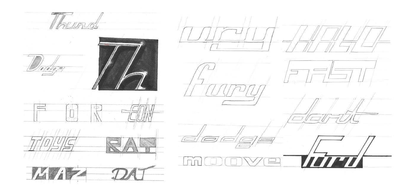
First Round Thumbnails
As I began sketching, I experimented with both connectivity in letters and italicized font styles. Eventually, I landed on a style similar to the “dodge” logo that I drew. I liked the mono-spacing and simple elegance of the letters. To me, the “g” reminded me of a Le-Mans style race track.

First Draft
My first draft was very different than the direction I eventually went. It is much more angular and has a thicker stroke. This draft also has a different method for the corners. Top left and bottom right were curved while the top right and bottom left were not. Changes in letter forms include the: a, e, f, j, l, x, q, y, z, and 4.


